Component Display Properties
Created: March 27, 2017 | Updated: June 15, 2017
| Applies to version: 17.1
Now reading version 17.1. For the latest, read: Component Display Properties for version 21

The Component Display Properties dialog
Summary
The Component Display Properties dialog allows you to configure how components are displayed in an Assembly view.
Access
From the Board Assembly View of the Properties panel, click the Components button (under the View region of the panel).
Options/Controls
Geometry Tab
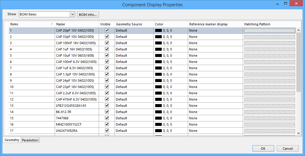
The Geometry tab of the Component Display Properties dialog
- Show - use the drop-down to select in which format you want the the component properties displayed: Components, Classes, Footprints, or BOM Items.
- BOM Info - click to open the Bill of Materials Configurations dialog in which you can set up the BOM table's available content and data grouping.
- Items - the item number.
- Name - the name of the item.
- Visible – toggle the visibility of a component's graphics.
- Geometry Source – use the drop-down to select the data source used for rendering the component's graphics:
- Default – the component graphics will be taken in order of priority from the options below.
- BodyProjection – the component's 3D model, if available.
- BodyProjectionSimple - the component's simple 3D body.
- SilkScreen – the silk screen printing layer.
- BoundingBox – dimensions derived from the component's contact pads.
- AssemblyDrawing – the component graphic data contained on a Mechanical Layer, as nominated in the Document Options dialog.
- Color – the color of the component graphics.
- Reference marker display – enable/disable a component's visual reference marker (typically a dot indicating Pin 1 on a component).
- Hatching Pattern – the visual pattern and color used to render the component's profile, such as when it is displayed in a board Section View.
Parameters Tab
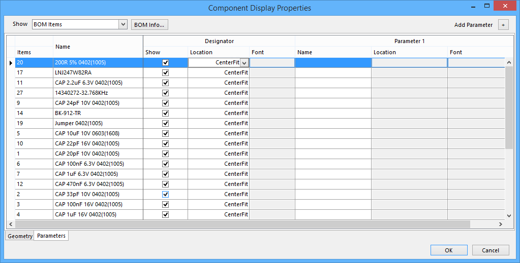
The Parameters tab of the Component Display Properties dialog
- Show - use the drop-down to select in which format you want the the component properties displayed: Components, Classes, Footprints, or BOM Items.
- BOM Info - click to open the Bill of Materials Configurations dialog in which you can set up the BOM table's available content and data grouping.
- Add Parameter - click the
 to add a parameter. A new Parameter [n] column appears in the dialog.
 - Items - the item number.
- Name - the name of the item.
- Show – toggle the visibility of a component's Designator notation.
- Location – use the drop-down to select the position settings for a component designator.
- CenterFit (default) – the designator is placed in the center of the component graphic and automatically scaled to fit.
- Center, TopLeft, Left, BottomLeft, Bottom, BottomRight, Right, TopRight, Top - the designator is placed close to the component outline, in the position selected.
- AssemblyDrawing – the designator, its position, and size are defined by the properties of the component designator (generally derived from a
.Designatorspecial string) on a specified Mechanical Layer)

