
Working with Panels
Parent page: Design Panels Reference
Workspace panels are essential elements of the Altium NEXUS environment. Whether specific to a particular document editor, or used on a more global, system-wide level, they present information and controls that aid productivity and allow you to design more efficiently.
Accessing Panels
When the software is first started, a number of panels will already be open. Some panels, including the Projects panel and Navigator panel, will appear grouped and docked to the left side of the application window. Others, including the Components panel, will be in pop-out mode and appear as buttons on the right-hand border of the application window.
At the bottom-right of the application window the Panels button provides quick access to the available workspace panels, in context with the document editor you are currently using.
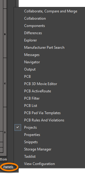 Use the Panels button at the lower right of the workspace to quickly access available panels,
in context with the document editor you are currently using.
Click on an entry in the menu to open the corresponding panel. If a panel is open but not visible, for example it is a non-active panel in a group of docked panels, or it is currently in pop-out mode, clicking its entry in the menu will make it visible, and it will become the active panel.

Panel Display Modes
Depending on the particular document editor that is currently active, a large number of panels may be accessible, or indeed open, at any given time. To facilitate the layout and use of multiple panels in the workspace, various panel display modes and management features are provided.
Three different display modes are supported for panels:
- Docked Mode - panels are permanently displayed within the workspace.
- Popup Mode - panels are hidden, appearing when their button is hovered over, or clicked on.
- Floating Mode - panels float over the workspace, becoming transparent whenever the cursor approaches.
Docked Mode
In this mode a panel can be docked horizontally, or vertically, within the main application window. Right-click on a panel's title bar (or tab) and choose Allow Dock from the context menu to configure its docking capability - Horizontally and/or Vertically. When docking vertically, a panel will dock to the right or left of the main design workspace. When docking horizontally, a panel will dock either above the main design workspace (and below the main menus) or below the main design workspace (and above the Status Bar).
 For ease of access, frequently used panels can be docked within the main environment.
Popup Mode
This mode is essentially an extension of the standard docked mode. A docked panel can be put into this mode by clicking on the pin symbol next to the panel's close cross. The pin symbol will change to indicate the mode:
 - the pin symbol in this case appears as
  , indicating that the panel is in docked mode.
 - the pin symbol in this case appears as
  , indicating that the panel is in popup mode.
In this mode, a panel will appear as a button on the application border, giving back valuable workspace. Moving the cursor over the panel button will result in the panel sliding out from the border. Moving the cursor away from the panel will cause it to slide back again.
 Example panel in popup mode, accessed by hovering the cursor over the panel button on the application border. The illustration ends by showing how the panel can be quickly
toggled between popup and docked modes using the pin symbol.
The speed at which the panel slides in and out is configured on the System - View page of the Preferences dialog.
 Configure popup panel display attributes as part of your software preferences.
Floating Mode
In this mode a panel can be placed anywhere within, or outside of, the design environment. This is the standard opening mode for panels that have not been previously placed in docked, or popup modes.
 An example floating panel, which can be placed over, or outside of, the main application window.
A floating panel positioned over the editing area of the main design workspace can also be made transparent when carrying out an interactive operation in the workspace, in accordance with options defined on the System - Transparency page of the Preferences dialog.
 Configure floating panel transparency attributes as part of your software preferences.
These options allow for making such panels (and toolbars for that matter) transparent immediately when launching an interactive editing process. You can also make the transparency dynamic, so that floating entities become more transparent as the cursor approaches, as illustrated below.
 Floating panels can be configured to become transparent whenever performing an editing action in the workspace, and also dynamically as the cursor approaches, so as not to impede your activity.
Grouping Panels
Panels may be grouped by dragging and dropping one panel on top of another. Two modes of grouping panels are supported:
- Tabbed Grouping - this mode displays a set of panels as a tabbed group, with only one panel in the group visible at any time.
- Fractal Grouping - this mode displays a set of panels as a fractal grouping, with multiple panels in the group visible at the same time.
The resulting display of the group depends on where exactly you drop the panel being added. If you drop it on the center of the target panel they will become a tabbed group. If you drop the moving panel onto one of the small arrows that appear on each edge of the target panel, they will become a fractal group.
Tabbed Panel Grouping
To group a panel with other panels, in tabbed fashion:
- Click on the source panel's name and drag it over the center of the target panel (or existing group). The entire target panel will become shaded blue, indicating that the panels will become a single tabbed group.
- A small positional arrow will appear to the right of the target panels' tabs, indicating that the source panel will be added to the group as another tab. You can control where the source panel will appear in the tabbed set, by moving the mouse near the existing tabs.
- Drop the source panel now (release the mouse) to group the panels together.
 An example of dragging a source panel onto an existing tabbed grouping of panels.
Once grouped, use the small down-arrow at the top-right of the panel grouping to change the visible panel. Alternatively, make another panel in the group the visible panel by clicking directly on its tab. The order of the panels in a tabbed group of panels can be changed at any time - click on a panel's tab and drag to the left or right as required. A positional arrow will appear marking the position in the group order at which the panel will be placed when the mouse button is released.
 Illustrating how to change the visible panel, and panel tab ordering, within a tabbed grouping of panels.
Fractal Panel Grouping
This mode displays a set of panels as a fractal grouping, with multiple panels in the group visible at the same time. Fractal grouping is similar to horizontal/vertical tiling of open windows - you can drag a panel to dock it within another panel, effectively tiling them. A fractal grouping can consist of individual panels and/or standard tabbed panels.
To group a panel with other panels, in fractal fashion:
- Click on the source panel's name and drag it over the target panel. The entire target panel will become shaded blue, with icons presented at the top (
 ), bottom (
  ), left (
  ), and right (
  ).
). - Move the cursor over the required icon - only that side of the target panel will become shaded, indicating where, in relation to the target panel, the source panel will appear.
- Drop the source panel now (release the mouse) to group the panels together.
 An example of dragging a source panel onto an existing fractal grouping of panels, to further split the region occupied by a target panel.
To make a panel active in a fractal grouping, click on it. If the required panel is part of a tabbed grouping within the overall fractal structure, make it visible/active either by clicking on its corresponding tab, or by choosing the required panel from the menu associated to the small down-arrow, at the top-right of the panel grouping.
 Illustrating how to change the active/visible panel, within a fractal grouping of panels.
Moving Panels
The following points relate to moving workspace panels within the Altium Design environment:
- A single floating, or docked panel, is moved by clicking within the panel's title bar, and dragging it to a new position. For a single panel that has been put in popup mode, it can be also moved by clicking on its corresponding button in the application border and dragging the panel to the required position.
- When multiple panels have been grouped, clicking within a panel's caption bar and dragging will move all panels in that group. To move a single panel out of a group, click and drag the panel name in the caption bar (or its tab if available).
- Moving a panel to an application border that already contains one or more panels will result in the panel being added in the same mode (docked or popup) as those already present.
- To take a panel out of fractal grouping mode (where it has been tiled) and back into a standard tabbed grouping, drag the tiled panel by its caption bar into free space, or to a target panel, or existing tabbed group, until a positional arrow appears (target becomes fully shaded) and then release - the panel will be added to the tabbed grouping.
- As you move a panel close to another floating panel, the edges will snap together. Similarly, moving a panel towards the extremities of the desktop will snap the panel to the desktop's edge. This 'snap-attraction' feature allows for easier arrangement of floating panel sets within the environment.
- To prevent a moving panel from automatically docking, grouping, or snapping, hold the Ctrl key.
Closing Panels
A panel can be closed by:
- Right-clicking in its caption bar and choosing the Close command from the context menu.
- Right-clicking on its tab (where available) and choosing the Close command from the context menu.
- Clicking the close cross at the far right of the panel's caption bar.
Maximizing/Restoring Panels
When in floating mode, a panel (or grouping of panels) can be maximized by right-clicking in its caption bar (or on its tab, where available) and choosing the Maximize entry from the context menu. To restore a maximized panel (or grouping of panels) back to its original size, right-click in its caption bar (or tab) and choose the Restore command from the context menu. Alternatively, double-click in the caption bar to toggle between maximized and restored state.
Resetting, Saving, and Loading Panel Arrangements
You can save and reload panel arrangements, and also reset them to the installation defaults, using the buttons available for layouts, in the Desktop region, on the System - View page of the Preferences dialog.
 Access controls for managing desktop layouts, as part of your software preferences.
For example, to reset all panels back to their default locations and visibility, click the  button.
 button on the System - View page of the Preferences dialog), which can then be reloaded at any time (using the
  button on the System - View page of the Preferences dialog).