
Browsing a Connected Workspace with the Explorer Panel in Altium Designer
Parent page: System & Environment Panels

The Explorer panel gives access to data stored in a server.
Summary
The Explorer panel is the primary interface between Altium Designer and a connected managed content server, making it an integral part of the Design Data Management System. A managed content server stores your valuable company design data, including components, managed sheets and templates, and completed designs. From the Explorer panel, you create and manage the organizational structure used in the managed content server and also create any number of Items, each representative of a design-side object. From the panel, you also can access detailed Item information and manage the revision and lifecycle settings for the Items, as well as where-used and supply chain detail.
Panel Access
To display the Explorer panel, click the Panels button on the bottom-right of the workspace then select Explorer. Alternatively, you can access the panel through the View » Panels » Explorer.
 to install. Altium Designer must be restarted to complete the installation process.
Choosing the Working Server
The Explorer panel can only interface to one server at a time. The field at the top-left of the panel indicates the currently open server – the server whose content you will be able to browse and modify. To refresh the content display for the active server, click the  icon at the end of the address bar or right-click in the Server Folders region then select Refresh Server.
Use the drop-down arrow to the right of the server name or click on the server name itself to select a different server.
If Altium Content Vault is chosen, the Content Vault replaced with Manufacturer Part Search dialog opens.
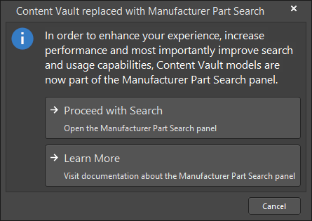
As the dialog states, items in the Content Vault are now part of the Manufacturer Part Search panel. Click Proceed with Search to open the panel and search for the required item. You can read about the Manufacturer Part Search panel by clicking Learn More.
Organizing a Server
Maintain order within a server by creating a tree of folders for the various Items stored in the server. A number of folder types are available. Use these folders to categorize the server content. Right-click in the Server Folders region of the panel to add folders and define a storage structure of folders and sub-folders that suits your organization.

The right-click menu includes commands for defining a folder hierarchy. Note that the options change depending on where you click.
Server Folder Types
You have full control over the folder type and it can be changed at any time by right-clicking on a folder then select Properties to open the Edit Folder dialog.
Server Folder Properties
When you add or edit a folder, a dialog will appear in which you can define the properties of the folder. The content of the dialog is the same whether a top-level or sub-folder is being added.

The dialog presents the following folder-related properties:
- Folder Name – enter a meaningful name for the folder, perhaps an umbrella term that reflects the relationship of the Items that will be stored within it. The name can be a maximum of 160 characters.
- Folder Type – this is already set to the folder type selected on adding the folder, either through a menu entry or through the Choose Folder Type dialog. If you need to change the type, click the arrow at the far right of the field then choose the required type from the drop-down list.
- Description – enter any description for the folder, perhaps describing the content it is to hold. This field has a maximum of 255 characters.
-
Item Naming Scheme – this field provides a set of default naming schemes that can be used to quickly define the unique ID for any item subsequently created within the folder. Using a default naming scheme, the software will automatically assign the next available unique ID based on that scheme, having scanned the entire server and identifiers of existing items. You can create your own scheme for a folder by typing it within the field, ensuring that the variable portion is enclosed in curly braces (e.g.,
SYMBOL-001-{J000}). See the Defining Naming Schemes for Item Revisions page for more information. - Share – click this link to access the Share For dialog in which you can specify the visibility of the folder in terms of who can 'see' and access it.
Navigating a Server
You can navigate the content in a server in several ways:
- Click on a folder whose contents you want to peruse.
- Use the Address Bar at the top of the panel. The Address Bar reflects the current folder being browsed along with the hierarchical path to that folder.
- Use a server's search feature. Enter a keyword-based on a comment or description then press Enter or click the magnifying glass icon. The entire server will be scanned and the results of the search listed in terms of matching Items.
Moving a Server Folder
Server folders can be moved to a different location within a server's folder structure in the following ways:
- Click and drag the folder entry to the desired position within the Server Folders hierarchy structure.
- Right-click on the folder entry then choose Move Folder. The Move Folder dialog will appear. Select which of the existing folders your chosen folder should be moved under. You also can move the folder to be a top-level folder in the server.
Deleting a Folder
A folder can only be deleted if it is empty, that is, it contains no sub-folders or items. To delete a folder, right-click then select Delete Folder.
Server Items
Each entity that is stored in the server is called an Item. To support the need to be able to update an Item over time, what is actually stored in the server is a series of Item Revisions that are specific revisions of that Item whose name is based on the chosen Revision Naming Scheme. Each new Item is created in a folder and once you have defined the required folders within a server, you can create new Items in the selected folder in the Item region of the panel.
► Refer to the Server Items page to learn more about server items.
Viewing Revisions
You can configure the revisions that are displayed in the panel by clicking the  icon to access a drop-down of revision choices.
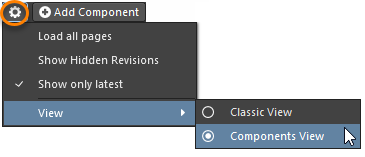
- Load all pages – select to load all revisions.
- Show Hidden Revisions – select to show any hidden revisions.
- Show only latest – select to only show the latest revisions.
- View - select whether you'd like to view the items in Classic View or Components View.
Interpreted Views
The panel also offers two special, interpreted views that apply to Components and Projects. The view will automatically switch to this style when a Component or Project is selected unless the panel display option has been changed to the Classic View mode.
The Classic or interpreted view (Component View / Project View) options are available from the view menu when one of the special item types has been selected.
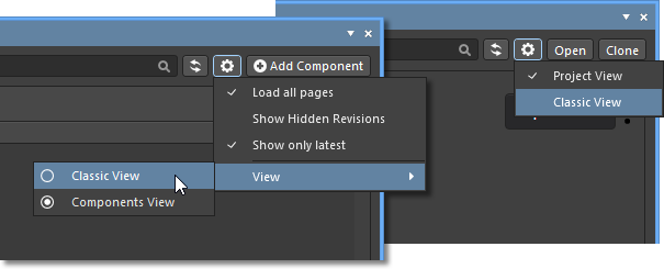
- Classic View – select to show just Items and their Revisions.
- Components View – select to show revisions and interpreted component data.
- Project View – select to show a structured graphic version of the project that includes access to Project Release data and project Parameters. See Project View below for more information.
General Item Commands
Along with the view options, the panel's options area also includes the Add <item> command button, which applies to the currently selected type of component.
This command invokes the creation of a new server item of the selected type. When a component is selected in the panel, for example, an  button is offered. This will open a newly created component of that type in the Component Editor. Similarly, a
  button is shown when an Output Job Template has been selected, and so on. The
  button will follow a component search, as entered in the component path field at the top of the panel, which creates a Part Request activity that applies to the component selected in the search results.
The exception is when a project is selected, where the  and
and  buttons are presented:
- Open - use to open the currently selected project in the Projects panel.
- Clone - use to create a copy of the selected project via the Clone Project dialog.
Browsing Items
For each Item revision in a server, the Explorer panel allows you to browse different aspects of that revision, where applicable. This is done using one or more views for that revision by using the tabs at the bottom of the panel.
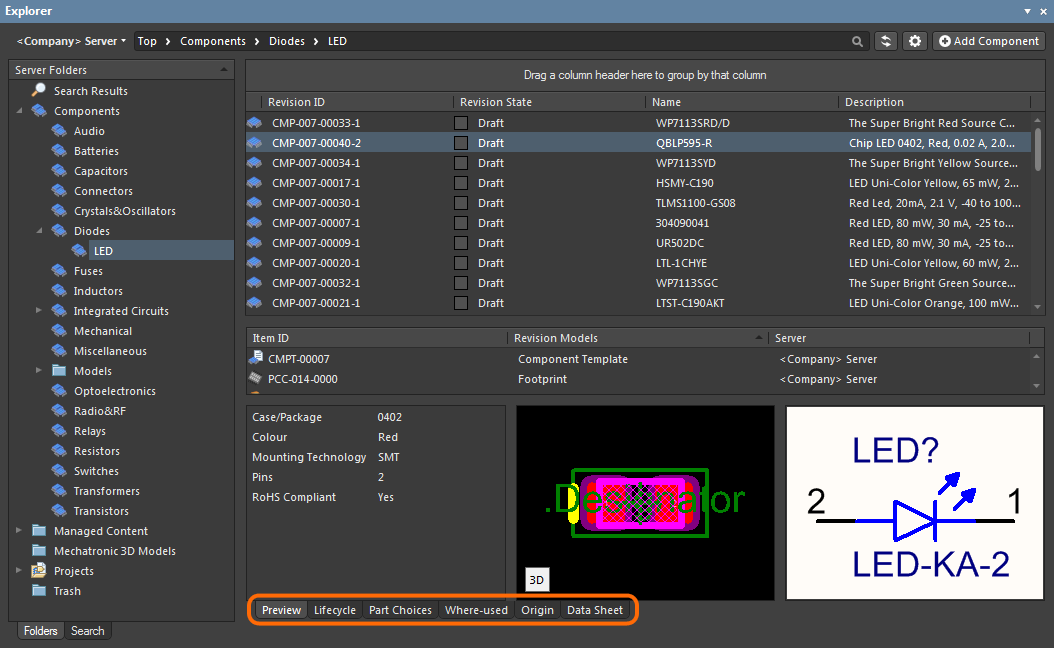
The default-level view is the Preview. Click additional tabs to view more information (the available tabs will depend upon the type of Item that is currently selected):
- Preview – view a composite depiction of the selected Item that includes graphic representations of documents and models, parameter data, associated sub-items, etc. The view is automatically set for different types of Items and whether the Classic or interpreted view modes (see above) are selected for Components and Projects.
- Lifecycle – explore the Item's revisions levels and Lifecycle state change. The Lifecycle may be progressed through the states that are assigned to the item type – for example, the Component Lifecycles states (
Draft,Prototype, etc) for a Component item. - Children – view sub-elements of an Item, such as the generated fabrication documents (Gerber, NC Drill, etc) in the Fabrication package (
FAB<project name>_PDB) of a released Managed Project or the schematic document and components used in a Managed Schematic Sheet. - Part Choices – view or add to the Part Choices (manufacturer part entries with associated supplier data) that are assigned to a component.
- Where-used – view where the selected Item revision is used by another server item, for example, a Managed Project that uses the currently selected Component Item.
- Origin – view from where the Item originated, such as a Component that has been acquired from Altium's cloud resources. Full details of the source item are shown, where possible.
- Data Sheet – view or add file-based datasheets stored with the selected Component Item.

Browse different aspects of an Item revision using its associated views.
Accessing the Search Facility
The interface for the search facility, the Search view, is accessed through the Explorer panel by clicking the Search tab at the bottom-left of the panel.
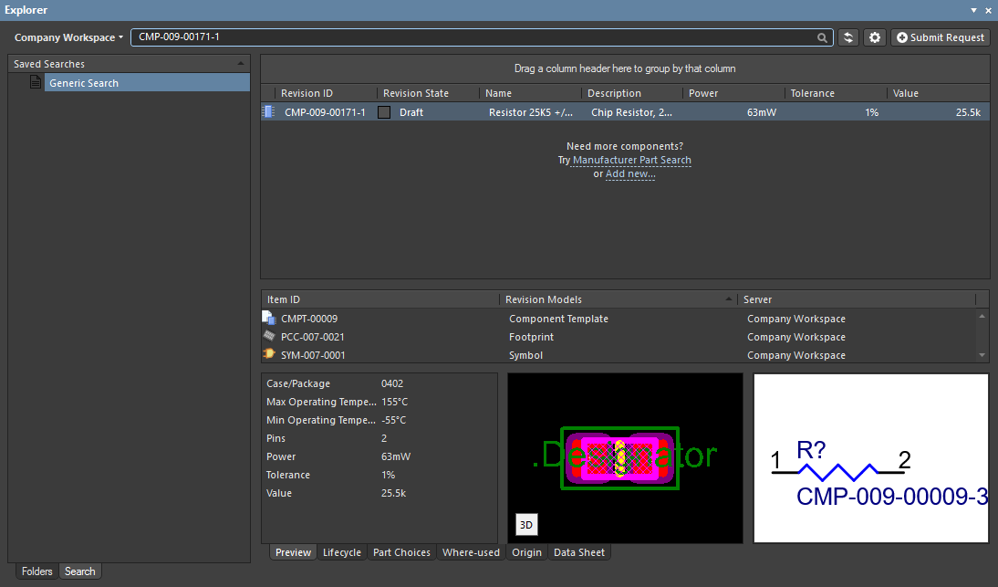
Use the generic, standard-type Search bar, which provides a single search field for entry of search strings. Enter a search string and press Enter. To create a new saved search, right-click in the Saved Searches region and choose New from the context menu. The New Search dialog will appear, in which to define the search.
To modify an existing saved search, select it in the Saved Searches region, right-click and choose Edit from the context menu. The Edit: [<SavedSearchName>] dialog will appear, from where to make any changes to the search as required. Once changes have been made, click the Save button - the search will be applied in accordance with its new settings.
To remove an existing saved search, select it in the Saved Searches region, right-click and choose Delete from the context menu. Click Yes in the subsequent confirmation dialog - the search will be removed from the listing of saved searches.
To create a new saved search, right-click in the Saved Searches region and choose New from the context menu. The New Search dialog will appear, in which to define the search.
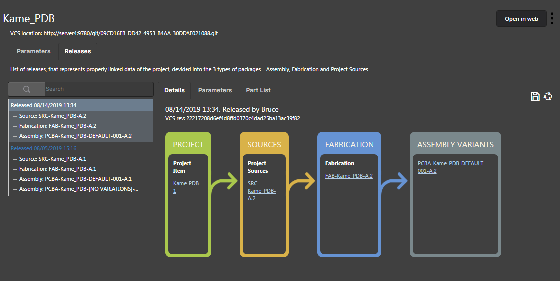
Project View
The panel's interpreted Project View displays the selected project in a process-orientated view that provides direct access to the relevant project data and its releases.
The tabs available in the view are:
- Parameters tab – a grouped list of all parameters associated with the project, which includes:
- Project Parameters – stored in the project and editable in Altium Designer.
- Server Parameters – stored and editable in the server.
- Server-generated Parameters – stored in the server and generated by the server's analytics engine.
- Releases tab – a compilation of the Project Release(s) associated with the selected project, which includes a summary of each release and its constituent packages. Information on the selected release is presented under three sub-tabs:
- Details tab – a flow orientated view of the release structure that corresponds to the project and its released packages. Select a link in the flow view to navigate to the Item itself.
- Parameters tab – a list of the parameters associated with the selected project release.
- Part List tab – a detailed view of the component parts in the selected release, which is derived automatically from the project source data.
The view's command options include:
- Open in Web – select the
 button to open the project on the server's CAD-centric Projects Management page. This is a work-in-progress visual review that is available prior to the project being released.
 -
 menu:
menu:
- Edit – opens the Edit Project dialog for modifying the project's name, description or storage options, or to add/remove its associated server parameters.
- Remove – delete the project from the server. Note that the base project item and folder will remain.
- Download (under Releases tab) – use the
 button to download a zipped collection of all release packages of the currently selected project release.
 - Web Review (under Releases tab) – use the
 button to open the currently selected project release in the server's Projects Management page for a comprehensive review of the project's Design, Manufacturing and BOM data.
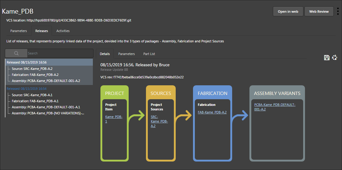
The tabs available in the view are:
- Parameters tab – a grouped list of all parameters associated with the project, which includes:
- Project Parameters – stored in the project and editable in Altium Designer.
- Server Parameters – stored and editable in the server.
- Server-generated Parameters – stored in the server and generated by the server's analytics engine.
- Releases tab – a compilation of the Project Release(s) associated with the selected project, which includes a summary of each release and its constituent packages. Information on the selected release is presented under three sub-tabs:
- Details tab – a flow orientated view of the release structure that corresponds to the project and its released packages. Select a link in the flow view to navigate to the Item itself.
- Parameters tab – a list of the parameters associated with the selected project release.
- Part List tab – a detailed view of the component parts in the selected release, which is derived automatically from the project source data.
- Activities tab – a detailed list of all active or closed process activities that relate to the current user. Use the Active/Closed drop-down menu to switch the view to Closed activities. Further information on the selected activity is presented under three sub-tabs:
- Diagram – a representation of the process stages in the activity flow, including an indication of who has a pending task to perform to move the process along.
- Data – a collection of information data, in Name-Value pairs, that relate to the selected activity. The listed data are determined by the type of activity, and will typically include the names of users involved, any related files, and so on.
- History – a sequential history of the actions taken in the activity's workflow, and who has performed those actions.
The view's command options include:
- Open in Web – select the
 button to open the project details in the server's Detailed Project View.
 - Web Review – select the
 button to open the project in the server's browser-based Web Review mode. This is a work-in-progress Web Review that is available prior to the project being released.
 - menu:
- Edit – opens the Edit Project dialog for modifying the project's name, description or storage options, or to add/remove its associated server parameters.
- Remove – delete the project from the server. Note that the base project item and folder will remain.
- Download (under Releases tab) – use the button to download a zipped collection of all release packages of the currently selected project release.
- Web Review (under Releases tab) – use the button to open the currently selected project release in the server's Web Review.
- CSV (under Activities tab) – use the
 button to export details of the currently listed activities in a comma-delimited CVS format.
Right-click Menus
Various commands are available from right-click menus in the panel. The exact listing of commands will depend on the region of the panel in which you right-click and the object currently in focus within that region. The following sections cover the commands available.
Commands for the Server Folders Region
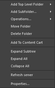
- Add Top Level Folder – use to add a new top-level folder into the server folder structure. A sub-menu offers folder types Components, Generic Folder, and Other Folder Type. To browse and choose a different folder type, click Other Folder Type. The Add Folder dialog will appear in which you can define the new folder properties.
- Add Subfolder – use to add a new Components sub-level folder into the server folder structure. To browse and choose a different folder type, click Other Folder Type. The Add Folder dialog will appear in which you can define the new folder properties.
- Operations – use to Copy Folder Structure or Paste Folder Structure to another location.
- Move Folder – use this command to access the Move Folder dialog, which can be used to change the currently selected folder's location within the overall server folder structure.
- Delete Folder – use this command to delete the currently selected folder. Deletion can only be made provided the folder is empty (contains no sub-folders or Items).
- Add To Content Cart – use to add all Components in the selected folder to the Content Cart using the Content Cart dialog.
- Expand Subtree – use this command to fully expand the currently selected folder and all of its sub-folders.
- Expand All – use this command to fully expand all folders in the server folder structure.
- Collapse All – use this command to fully collapse all folders in the server folder structure.
- Refresh server – use this command to refresh the connection with the server currently being browsed.
- Properties – use this command to access the Edit Folder dialog in which related properties for the currently selected folder can be view and modified.
- Project Permissions – use this command to access the Share For dialog in which the access permissions for the selected project can be viewed and modified.
Commands for the Items Region
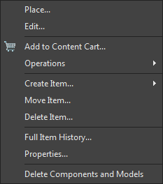
- Place – use to place an instance of the currently selected Item-Revision where such placement is supported, for example, placement of a Component Item or Managed Sheet Item onto an active schematic sheet. The symbol for the component or the managed sheet symbol will appear floating on the cursor ready for placement.
- Edit – use to open an item, such as a Component, Managed Sheet or Template, in its associated editor. Once edited it is released back to the server as a new revision of the item.
- Upload – use to upload a constituent object into an Item, such as a schematic document into a Managed Schematic Sheet or an OutJob file into an Output Job Template, via the Create new revision dialog.
- Add to Content Cart – use to add the currently selected Item(s) to your Content Cart using the Content Cart dialog.
- Operations – use to access a sub-menu of commands including:
- Download – use to download the currently selected Item and save it to another location using the Browse for Folder dialog.
- Change state – use to open the Batch State Change dialog to change the state of the currently selected Item Revision.
- Clone – use to copy the currently selected Item-Revision. A cloned component is opened for editing in its associated editor, such as the Component Editor when cloning a Component Item. A cloned Project is opened for configuration in the Clone Project dialog.
- Change component Type – use to access the Component Type dialog, where the selected component's
ComponentTypeparameter may set to a different type. - Export Data – use to open the Select columns for data export dialog to specify the column data to be exported. The exported, semicolon-delimited, CSV file will include the data for all items in the current list grid view.
- Create Item – use to add a new content item of the type that matches the current folder (Components, Templates, Managed Schematic Sheets, etc), which then will be opened in its associated editor. To create a different type of item, select the Other Item Type sub-option and then select an alternative type from the Create New Item dialog Content Type menu.
- Move Item – use to access the *Move Item dialog to determine the new placement of Items.
- Delete Item – use to permanently delete an Item.
- Full Item History – use to access a detailed view for the currently selected Item, opened as a new tabbed view within Altium Designer. The Item View provides a highly detailed view of the Revision and Lifecycle history of a specific Item, as well as showing all of the elements that make up that Item. The view also includes a Timeline. Use the Timeline to examine the exact time and date of any change made to the Revision level or Lifecycle State of that Item and who made the change.
- Properties – use to access the View Item dialog in which you can view the properties for the currently selected Item. If no revisions for that Item have yet been released, the properties can be modified.
- Delete Components and Models – use to remove a component and its associated symbol/footprint models from the server. Multiple components can be selected for removal. Models will not be deleted if they are in use by other components.
 button (top right).
Commands for the Lifecycle View
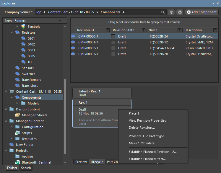
- Place <Revision> – use this command to place an instance of the currently selected Item Revision, where such placement is supported. For example, placement of a revision of a Component or Managed Sheet onto an active schematic sheet. The symbol for the component, or the managed sheet symbol, will appear floating on the cursor, ready for placement.
- View Revision Properties – use this command to access the Properties for Item Revision dialog, which provides a listing of properties associated with the parent Item of the selected Revision. Other properties are also listed, such as parameters for a component Item, or the parent design and configuration for a released board design Item.
- Delete Revision – use this command to delete the selected Item Revision. Note that you must delete Items from the 'top-down'. That is, you cannot delete a child Item Revision that is used by a parent Item; you first need to delete the parent Item.
- Promote <item to State> – use this command to promote the Item revision to its next Lifecycle State, which may also transition it to the next Lifecycle Stage. The available Lifecycle States are determined by the Lifecycle Definition that applies to the type of Item. The
Component LifecycleDefinition would typically apply to Components, for example. - Rollback <item to previous State> – revert the Item revision's Lifecycle state back to its previously assigned state. Say, from
Productionback toPrototypewhen theComponent LifecycleDefinition applies. - Make <item unusable> / Abandon <item> – use this command to change the Item revision Lifecycle State to
Abandoned,Obsolete,Deprecated, etc, rather than promoting it to the next higher level. This would be anObsoletestate for theComponent Lifecycledefinition, for example. - Establish Planned Revision <level for Item ID> – Use this command to create the next revision level for the Item, which will be in the initial
PlannedLifecycle state. The Create Revision dialog will open that provides all controls necessary to fully define the Item revision. - Establish Planned Item – use this command to create a new Item based on the currently selected item, in the initial
PlannedLifecycle state. The Create New Item dialog will open that provides all controls necessary to fully define the Item.
► See Managing Lifecycles for Items for information on working with Lifecycle Definitions.
Tips
- The Explorer panel may be docked horizontally and/or vertically. Right-click on the panel's name and configure docking as required from the Allow Dock sub-menu.