
Scripting Graphical Components in Altium NEXUS
This reference outlines the supported graphical components for scripting and their main properties and methods.
The visual form components available for use in Altium NEXUS scripts are mostly derived from Embarcadero's Visual Component Library (VCL), which is a collection of defined visual components for developing Windows applications using Delphi and C++ languages.
Developed as a visual class library, the VCL classes descend from the TComponent object (itself a descendant from the TObject root object) in a linear object hierarchy. Therefore a common script component, such as the TButton object, inherits the properties, methods and events from its ascending objects. In this case the class hierarchy is: TObject → TPersistent → TComponent → TControl → TWinControl → TButtonControl → TButton.
Note that the components that descend from the TControl object are generally visual components (controls), and common components that descend from TWinControl are mostly wrappers around the Windows API.
► See Embarcadero RAD Studio VCL for an overview of the VCL architecture and components.
When creating a Form in the Altium NEXUS Script Editor, the components are accessed from the Tool Palette panel. Script Forms have an associated *.DFM file that includes details of the form's configuration, its component locations and other attributes – the file can be found in the script project's host folder. Altium NEXUS allows the components to be used by either DelphiScript or VBScript when designing Script Forms.

The Tool Palette Panel contains categorized visual controls that can be dropped onto a script Form.
The Tool Palette panel (accessed from the  button in the bottom status bar, or the View » Panels » Tool Palette menu option) contains categorized selections of components that can be placed on a Script Form. The available components are assembled in expandable sections in the Tool Palette panel, categorized as Standard, Additional, Win32, System, Dialogs, Altium Standard and Instrument Controls.
The components (or 'controls') available in the Palette are visual components when used on a script form, meaning that a user can see a control and possibly interact with it at runtime. All controls have properties, methods, and events that describe aspects of their appearance, such as the position property of the control, methods to paint or move the control, and events that respond to user actions.
The properties and events are available in the Object Inspector panel for the currently selected form component, including the form itself. The methods are procedures and functions supported by that component.
Script Forms Overview
Script Forms
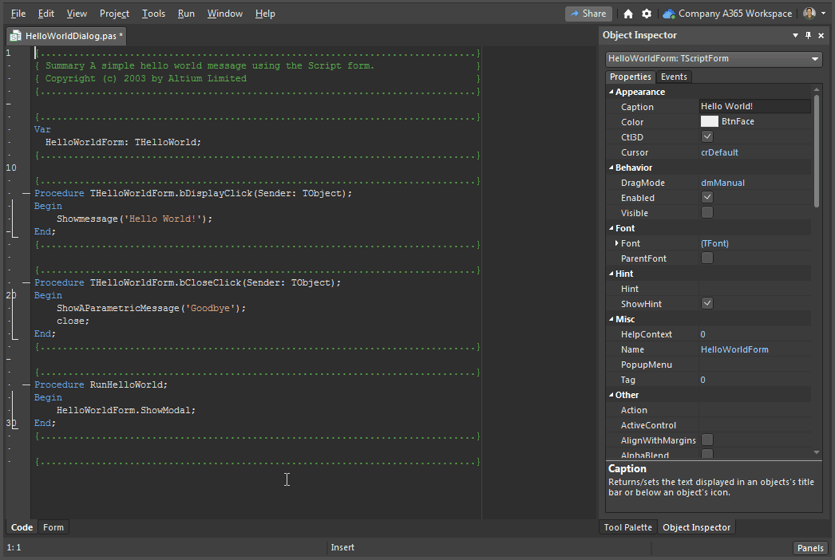
A Script Form is the primary user interface in scripts, although there are other forms such as dialog boxes, secondary windows and so on. To create a new Script Form, with a project open in Altium NEXUS, select File » New » Script » Script Form or right-click on the Script project name and choose Add New to Project » Script Form. If the VBScript langauge is enabled, the command is avaiable for both VB Script and Delphi Script.
A new Script Form appears with the Form1 form name as the default, which can be changed through the Name property (under Misc) in the Object Inspector panel. Script form names should be unique in a project.
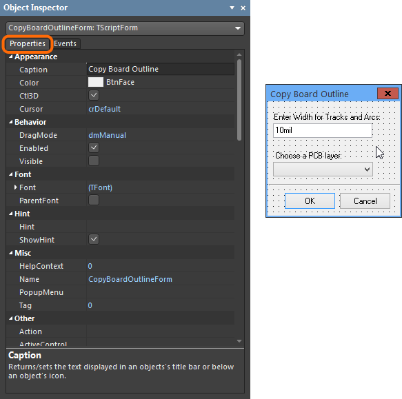
 When designing a script Form, open the Object Inspector Panel from the Script button in the lower status bar.
A blank form is basically a visual window that controls can be added to. A dialog and a panel are different types of forms, and by default, a form includes standard window functionality such as:
- Controls
- Minimize and Maximize buttons
- Title bar
- Resizable by border dragging
These features, along with any other available form property, can be changed at design time using the Object Inspector panel. Since a Script Form is a VCL component it has the three following items:
- Properties – The characteristics of an object that influence its visible behavior or operations. For example, the
Visibleproperty determines whether an object can be seen on a script form. - Events – Actions or occurrences detected by the script. A script must include code for each Event handler, which is designed to capture a specific event such as a mouse click.
- Methods – Script procedures that are is associated with objects (in this case component objects) and define their behavior.
► See Writing Scripts for a basic guide to developing a form-based script.
Form Properties, Methods and Events
The Tool Palette panel's controls are based on the Embarcadero Visual Component Library (VCL). For full details on the methods, properties and events for the Form component (TForm), refer to the Embarcadero VCL documentation.
► See the Embarcadero TForm reference
TForm Properties
The available Properties for the TForm component object, the base script form, can be viewed in the following ways:
- Via the Object Inspector Panel – In the editor's Form view (Form tab selected), click in the body of the form itself and select the Object Inspector's Properties tab.
Note that only visual component objects will appear in the panel. Non-visual objects, that act as behind the scenes controls, are not displayed on the form.
- By using the Code Completion Feature – In the editor's Code view (Code tab selected), the context-sensitive Code Completion window will display all code options for an object name.
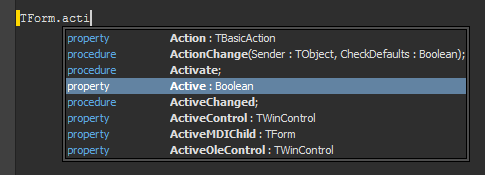
For the Form object, enter TForm. (note the period) to activate the window. Narrow the search by typing the first few letters of a desired property – note that both properties and methods are shown.
- From the Embarcadero reference documentation on the TForm Properties reference page.
TForm Methods
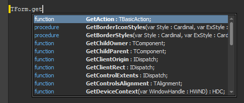
The available Methods for the TForm component object can be viewed in the following ways:
- Use the Code Completion Feature – In the editor's Code view, type a component name followed by a period. The Code Completion window will open to display the code methods (and properties) for an object name. Note that the code window can be manually activated with the Crtl+Space shortcut keys.
- Refer to the Embarcadero reference documentation on the TForm Methods reference page. Note that this shows all inherited Methods, however the option can be deselected.
TForm Events
The available Events for the TForm component object can be viewed in the following ways:
- The Object Inspector Panel – In the editor's Form view, click in the body of the form itself and select the Object Inspector's Events tab.

- The Embarcadero reference documentation on the TFrom Events reference page.
Component Properties, Events and Methods
The Tool Palette panel's controls are based on the Embarcadero Visual Component Library (VCL). For full details on the methods, properties and events for the majority of components, refer to the component categories in the Embarcadero VCL documentation. Some Component types in the Tool Palette, in particular the Altium Instrument Controls, are exclusive to Altium NEXUS and not included in the Embarcadero reference documentation.
► See the Embarcadero VCL Components Categories Index
Component Properties
To see a list of Properties for a component:
- Select a component on the Form and activate the Properties tab in the Object Inspector panel – as shown above for the
TFormcomponent object. - Select the Properties link (at the top) on the appropriate component reference page in the Embarcadero reference documentation. In the case of the
TButtoncontrol for example, select the Standard Component category, the TButton page and then the Properties view.
Component Events
To see a list of Events that a component can react on:
- Select a component on the Form and activate the Events tab in the Object Inspector panel – as shown above for the
TFormcomponent object. - Select an appropriate component reference page and then its Events link in the Embarcadero reference documentation. Note that this is useful as a guide to available events for a component and may not fully match the events available for the Altium NEXUS scripting components.
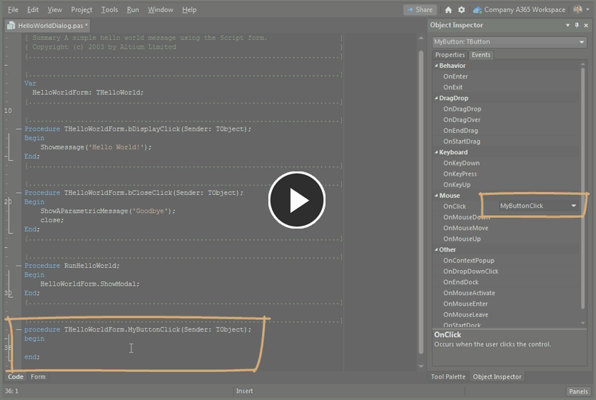
To create an event handling procedure, choose the event that the component should react to in the Object Inspector Events tab and double click in the Event entry field. The event handler procedure, named from the component and the event action, is then generated automatically in the script. If the event is renamed in the Object Inspector panel, then the corresponding code procedure is renamed accordingly.
Component Methods
Refer to the Component Categories documentation for information on the available Methods for a Tool Palette component.
This includes references for the following control object categories.
- Standard
- Additional
- Win32
- System
- Dialog
- Altium Standard
- Instrument Controls
In the most part, these categories collect together types of visual form controls based on standard Delphi-type VCL components. The Altium Standard and Instrument Controls categories are the exception, since they offer components that are exclusive to Altium NEXUS's scripting system.
► See the Tool Palette Component Categories.
Working with Forms and Components
Customizing Script Forms
- To make a form stay on top of other open panels for example, set the
FormStyleproperty tofsStayOnTop. - To define the default behavior of a form, set the
FormKindto one of the following values;fkNone, fkNormal, fkServerPanelorfkModal.- If
fkModalis selected then the form will be a modal form. That is, a form waiting for user input before proceeding with actions such as closing the form. - If
fkServerPanelis selected then the form will be shown as a Server panel. - If
fkNormalis selected then the form acts as a normal non-modal form.
- If
- To add/remove a form's scroll bars, change the value of the
HorzScrollBarandVertScrollBarproperties. - To make the form a MDI (Multiple Document Interface) frame or child, use the
FormStyleproperty. - To change a form's border style, use the
BorderIconsandBorderStyleproperties. (The results are visible at runtime.) - To change the icon for the minimized form, use the
Iconproperty. - To specify the initial position of a form in the application window, use the
Positionproperty. - To specify the initial state of a form, (for example; minimized, maximized or normal) use the
WindowStateproperty. - To define the working area of a form at runtime, use the
ClientHeightandClientWidthproperties. Note thatClientHeightandClientWidthrepresent the area within the form's border, whereasHeightandWidthrepresent the entire area of the form. - To specify which control has the initial focus in a form at runtime, use the
ActiveControlproperty to choose from the available components. - To pass all keyboard events to a form, regardless of the selected control, use the
KeyPreviewproperty. - To specify a particular menu, if a form contains more than one menu, use the
Menuproperty.
Refresh Forms and Components
In some instances the visual aspect of a script form can become out of date, for example if intensive background processing from a script causes the controls to be not updated or repainted, and appear frozen or corrupted.
The Update method of the script form provides a programmatic way to refresh the graphical contents of a form or specific control(s). In the below code example, the Update method code lines are highlighted in gray.
Using the Update method to refresh the Status Bar:
Procedure TConverterForm.loadbuttonClick(Sender: TObject);
Var
   I, J : Integer;
Begin
    If OpenPictureDialog1.Execute then
    Begin
        XPProgressBar1.Position := 0;
        XStatusBar1.SimpleText  := '  Loading...';
        XStatusBar1.Update;

        // loading a monochrome bitmap only
        Image1.Picture.LoadFromFile(OpenPictureDialog1.FileName);

        // Check if image is monochrome, otherwise prompt a warning
        If Image1.Picture.Bitmap.PixelFormat <> pf1bit Then
        Begin
            For J := 0 to Image1.Picture.Height – 1 Do
                For I := 0 to Image1.Picture.Height – 1 Do
            Begin
                If Image1.Canvas.Pixels[I,J] <> clWhite Then
                    Image1.Canvas.Pixels[I,J] := clBlack;
            End;
        End;

        ScalingFactorChange(Nil);

        convertbutton.Enabled  := True;
        LoadButton.Enabled     := False;
        XStatusBar1.SimpleText := '  Ready...';
        XStatusBar1.Update;
    End;
End;
Refer to the PCB Logo Creator script project located in the Scripts\Delphiscript Scripts\PCB\PCB Logo Creator folder of the downloadable scripts collection.