Typography
Typography defines Altium’s visual voice, ensuring clarity and consistency across all brand communications.
Brand Typeface
Typography shapes how our voice is seen. It brings clarity, structure, and recognizability to our brand across every touchpoint — from interfaces to presentations.
Inter is our primary typeface. It’s modern, open, and designed for digital environments — a natural extension of how we speak: clear, confident, and direct. We use it consistently to create a cohesive experience, while allowing enough flexibility for different contexts and content types.
By following our typographic system, we maintain visual rhythm, reinforce our tone, and ensure a strong, unified presence wherever Altium appears.
nopqrstuvwxyz
0123456789 &→
nopqrstuvwxyz
0123456789 &→
See Inter in Action
Try out our brand typeface and explore how size affects tone, impact, and readability. Use the slider to preview text in different scales — from bold statements to quiet details.
Font Size
80
80
Style
Creation of Modern
Electronics
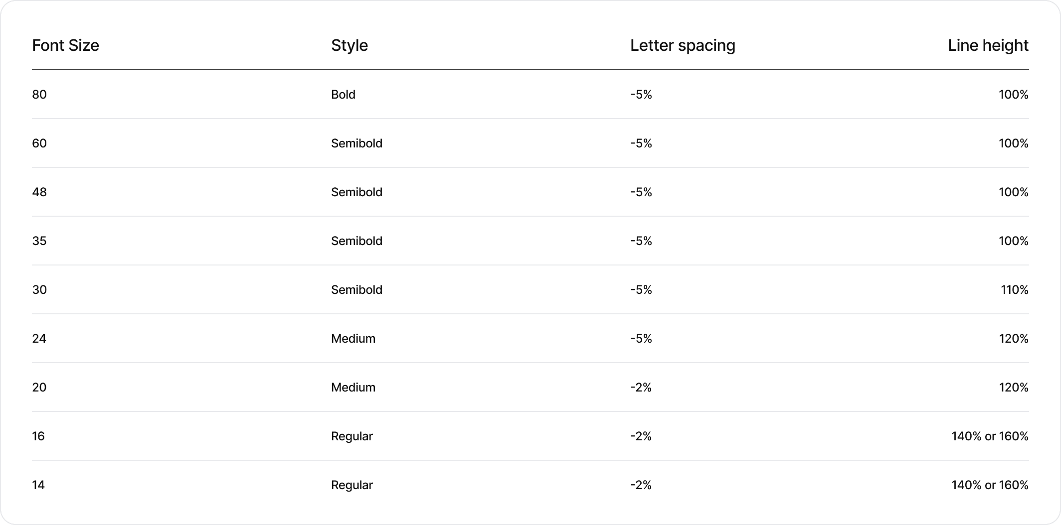
Typography Scale
As a general rule of the style and rhythm, the line height of text should be reduced as the size of the text increases. For body text, the line height should increase to give the text room to breathe and space for the reader’s eye to rest.
At large sizes, our display fonts look best with tight leading. It gives the type drama and impact and makes it look tight and considered.

- Font Size48
- Line Height100%

- Font Size16
- Line Height140%
Below are some common type sizes and their corresponding tracking and leading values. To ensure that our typography is handled consistently, please follow these guidelines. When setting a title or headline, make sure the text is ragged left. Smaller sizes have progressively increased leading to enhance legibility. Leading percentages should be used as approximations and rounded to the nearest whole number where possible.
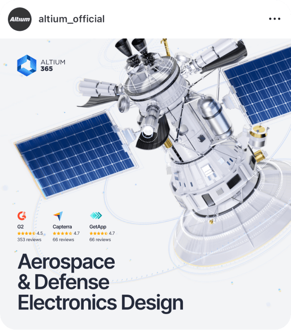
Example of Use
This example illustrates how our typographic styles work together in real contexts — from bold headlines that lead the message to supporting text and detailed body copy. Each style has a role: to guide, inform, and create a clear hierarchy that improves readability and reinforces our brand tone.

- StyleBold
- Line Height100%
- Letter Spacing-5%

- StyleMedium
- Line Height120%
- Letter Spacing-5%

- StyleRegular
- Line Height140%
- Letter Spacing-2%
Inspiration
These samples reflect correct and consistent use of Inter across various formats. Use them as references when creating brand-aligned content.