
Searching for & Placing Components
Altium Essentials: Schematic Capture
This content is part of the official Altium Professional Training Program. For full courses, materials and certification, visit Altium Training.
The heart of any electronics design is the components. The component that you ultimately solder onto the board needs to be represented, or modeled, in each design domain as a symbol on the schematic, as a SPICE model in the simulator, as a footprint on the board, and as a 3D STEP model in the file you hand off to the mechanical designer.
Learn more about Building & Maintaining Your Components and Libraries.
Altium Designer's Components panel provides a powerful interface that you can use to interact with all your components - both Workspace and non-Workspace. You can search for the required component by specifying the category and using straightforward search mode by entering a query (a full or partial component name, value, etc.) in the search field. Additionally, the panel provides a filter-based parametric (faceted) search capability for specifying target component parameters for your Workspace components. The panel also offers options to edit a Workspace component through the Component Editor in its Single Component Editing mode, view the component in its source Workspace, and perform component management functions such as component creation and cloning or editing the selected component's Part Choices and Type. A component can be placed on the schematic by dragging it or using the Place command from the component's right-click menu.
The Components panel provides direct access to available Workspace components and database and file-based library components in Altium Designer.
The panel sources components from a connected Workspace and any open or installed libraries. The panel offers full details of the selected component (Parameters, Models, Part Choices, Supplier data, etc.), component comparison, and for Workspace components, a filter-based parametric search capability for specifying target component parameters.
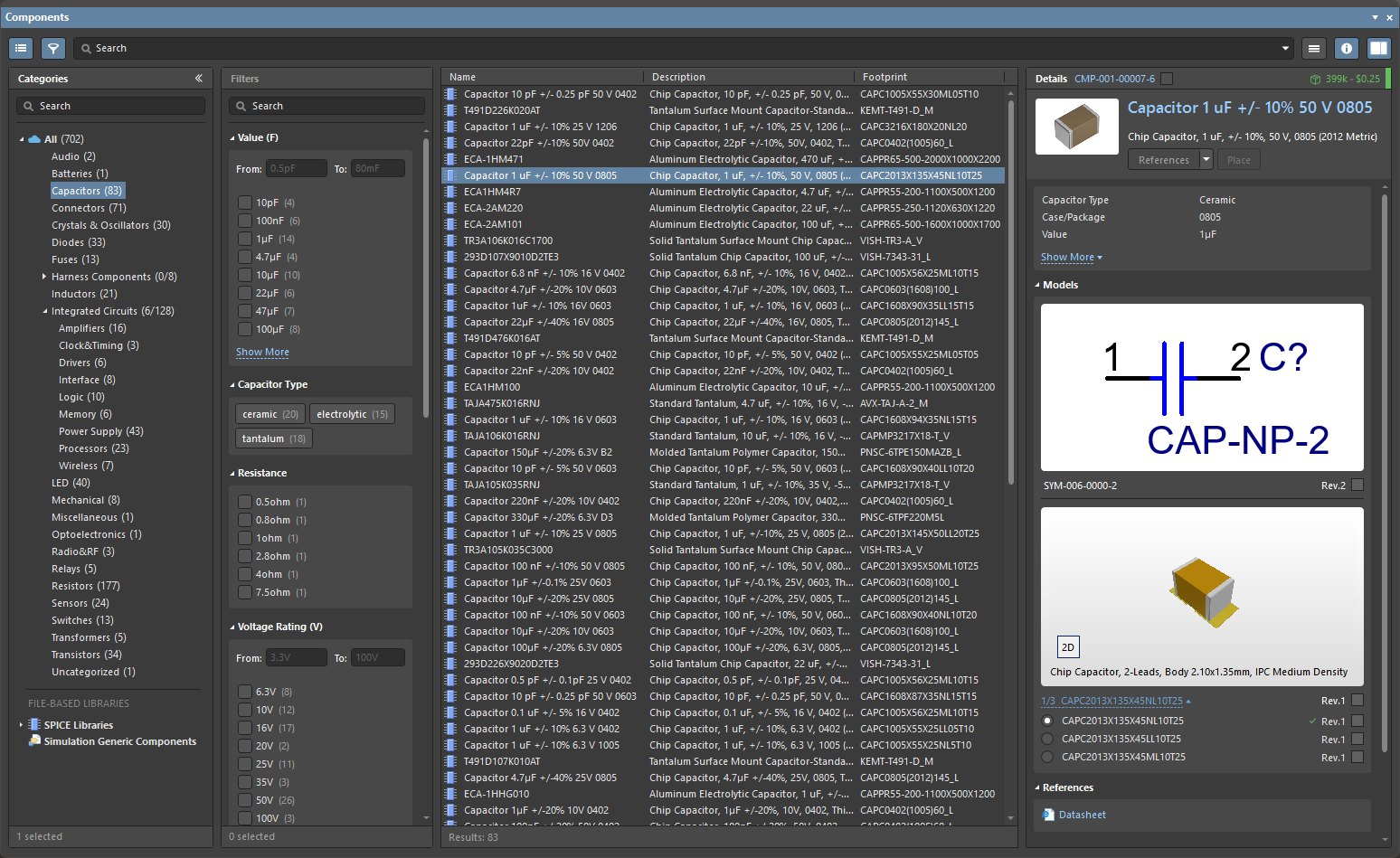
The Components panel uses the basic search engine functionality and view that is applied in the Manufacturer Part Search panel. While the Manufacturer Part Search panel harnesses the Altium Parts Provider service and focuses on the component manufacturer and supplier data searches, the Components panel is populated with ready-to-place components from your connected Workspace and database and file-based library sources.
Components Panel Access
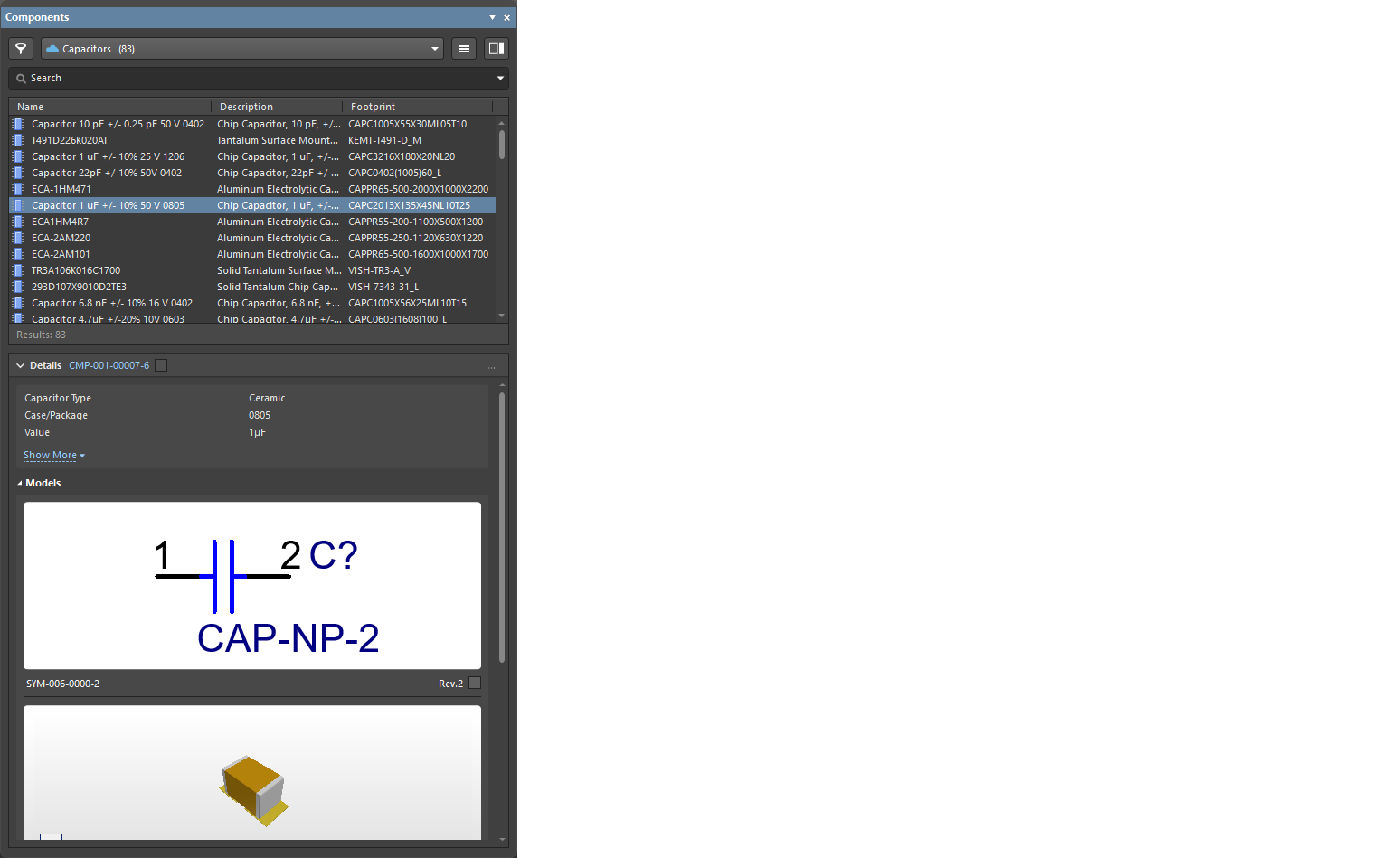
To open the Components panel, select View » Panels » Components from the main menus or the Components option from the  button menu at the lower right of the main screen. Using a responsive design configuration, the panel layout will dynamically adapt between full-screen normal mode (
 ) and its compact mode (
 ) where the Categories/Filters options collapse to menus.
From within a schematic document, use the P, P keyboard shortcut to open the Components panel. You can also use the Place » Part command from the main menus, the Place » Part command from the right-click menu of the schematic editor design space, or the Part button ( ) on the Active Bar.
From within a PCB document, use the P, C keyboard shortcut to open the Components panel. You can also use the Place » Component command from the main menus, the Place » Component command from the right-click menu of the PCB editor design space, or the Component command ( ) on the Active Bar.
At the first launch of the Components panel in the current Altium Designer session, the following controls are available when connected to a Workspace:
-
Use Existing Components – click to browse the component type currently selected in the panel's top drop-down.
-
Delete Existing Components – click to open the Delete Existing Components dialog followed by the Data Cleanup page of your Workspace's Settings where you can select the content types to be removed.
-
Import Library – click to open the standard Windows Open dialog then select a database or file-based library saved on your local or network folder. After opening a library file, the Library Importer in its Simple mode will launch with the selected library loaded.
-
Create Component – click to open the Create New Component dialog followed by the Component Editor in Single Component Editing mode ready to define a new component.

The panel’s Categories pane (or the drop-down menu in compact mode) lists all available Workspace components under the All category entry and any available libraries. When the panel is in its normal mode, click the Categories list icon  or the « icon to collapse or expand the display of the column and use the
  button (top right) to toggle the visibility of the component Details pane. When sifting through the Categories pane, the Up/Down and PgUp/PgDn keyboard shortcuts may be used to walk through the list. The Left/Right keyboard shortcuts may be used to open and close the individual branches.
The Categories grouping for Workspace components is derived from the Component Type parameters associated with each component. For example, if the Component Type for a component has been specified as Resistor, then that component will be listed under the Resistor category in the Components panel (regardless of the workspace folder it resides in).
Operations Menu
The operations menu options provide you the ability to set file-based libraries preferences, perform searches, and specify if component models collection is visible. To access these options, select the operations menu  button at the top right of the panel.
- Create Component – select to open the Create new component dialog followed by the Component Editor in Single Component Editing mode ready to define a new component.
- Import Library – select to open the standard Windows Open dialog and select a database or file-based library saved on your local or network folder. After opening a library file, the Library Importer in its Simple mode will launch with the selected library loaded.
- Clean-up Library – select to open the Delete Existing Components dialog followed by the Data Cleanup page of your Workspace's Settings where you can select the content types to be removed.
-
Models – select to include library model collection entries in the Categories listing. The additional entries in this browsing mode include Symbol, Footprint and Simulation model collections sourced from the connected Workspace, and also installed PCB footprint libraries (
*.PcbLib). - File-based Libraries Preferences – select to open the Available File-based Libraries dialog, where you may view controls to add database and file-based libraries to or remove libraries from the current project, install libraries, and specify library search paths. Refer to the Managing Available Database and File-based Libraries section of the Searching for Components in File-based & Database Libraries page to learn more.
- File-based Library Search – select to open the File-based Libraries Search dialog, where you may search for a component when you do not know which database or file-based library contains it or if it is even available. Refer to the Searching for Components in Database and File-based Libraries section of the Searching for Components in File-based & Database Libraries page to learn more.
- Refresh – click to quickly refresh the panel. The current component selection will be saved.
Components List
Within the component listing grid itself, the content that is included in the list is managed by:
- Setting the component listing sort order – click a column heading to sort the component listing by that column data. Click the heading again to reverse the sort order.
- Setting the order of the displayed columns – drag and drop a column heading to a new position.
-
Specifying which parameter columns are shown – right-click in a column header and choose Select Columns to open the Select Columns dialog then toggle a parameter column’s visibility and move its positional order with the Up/Down buttons.

The Select columns dialogOptions and Controls of the Select Columns Dialog
- Search - enter characters by which you want the list filtered.
-
Left
 icon - click to toggle between various view modes:
- (All) - click to display all items featured on the list.
- (Blanks) - click to display no items featured on the list. This feature will only clear the items in the Select columns dialog, not the Components panel.
- (Non blanks) - click to display all items featured on the list, despite any previous alterations to items.
-
(Unchecked) - click to view all unchecked items in the list, which are denoted by the
 icon. Click the
  icon to uncheck an item.
-
(Checked) - click to view all checked items in the list, which are denoted by the icon. If an item on the list displays the icon, click it to enable the checked icon.
The columns may be filtered to only display checked, blank, non blank, unchecked, check, and all columns. When a view mode is selected, the icon will turn blue
 .
.
-
Right icon - click to open a drop-down from where you can choose the column to display. When a specific column is selected, the icon will turn blue .
-
List - this is a list of all possible columns that can display in the Components panel. When an item displays , that column will be displayed in the Components panel. When an item displays , that column will not be displayed in the Components panel. Click the symbols to toggle the show/hide function.
- Up/Down - click to move the selected item up or down in the list. Only items that are checked may be moved. This determines the order in which the columns will appear in the Components panel.
-
Grouping the list by column data – right-click in a column header, select the Enable Columns Grouping option then drag a column header (e.g.,
Footprint) into the grouping space at the top of the list. The list entries will be collected under each unique parameter (e.g., type of footprint) from the specified grouping column. -
Filtering the listing by a specific column entry – select
 in a column header to display a list of its unique parameter entries then select an entry to constrain the listed components to those that include the specified parameter (e.g., a footprint type code). Select the All option to reset the filter. Select (Custom) to open the Filter Editor dialog in order to further refine the filtering in the selected column.
Displaying Columns
There are various manners in which you may display the contents within the Components panel. When right-clicking on the names of each column (Name, Description, Footprint) you may select from the following options, depending on how you wish to display the components:

-
Best Fit – merges the contents from the Name and Descriptions columns together so they are closely placed, with no excess room between each column.
-
Best Fit All Columns – merges the contents from all columns together so they are closely placed, with no excess room between each column.
-
Clear Sorting – used to undo the sorting of columns.
-
Enable Columns Grouping – allows you to drag column headers by a specific column, allowing you to change the order of the Name, Description, and Footprint columns.
-
Select Columns – opens the Select Columns dialog, which allows you to select other columns you would like visible in this section.
-
Apply Column Visibility to Child Categories – in cases when the selected category has a child category, use this command to ensure the possibility of pushing column visibility settings from parent categories to child categories. This command is available only when a child category exists.
Component Search and Functions
Searching for Components
To search for available components in the Components panel, enter a phrase in the Search field and/or use the panel's Categories and Filters selections to narrow the component listing to your specific needs. Filters are supported for Workspace components only, and as in the Manufacturer Part Search panel, the Components panel supports unit-aware (text to number) search filters. The search functionality prioritizes results according to the entered search criteria.
The Search function allows you to select then edit or add to an active Search string.

Click the 'active' search string to enter it into the Search field. You can reuse or edit that search from the Search field.
The Find Similar Components dialog accessed by right-clicking on a listed component, then selecting Find Similar Components, provides the possibility to define search preferences based on the selected component.

The final search results will depend on the selected component type, be it Workspace or non-Workspace components, and your Workspace connection status. For example, Workspace components will often display more parameters than a non-Workspace component. To specifically gather components and parameters that are the same or different from the one selected, the drop-downs may be utilized to select Same, Any, or Different choices.
Options and Controls of the Find Similar Components Dialog
The dialog is divided into three primary sections that list the attributes of the chosen component, sectioned off by Component, Parameters, and Models.
Attribute Grid
The grid of attributes for the chosen component is divided into three columns:
- Left Column - lists the names of all the attributes of the chosen component.
-
Center Column - lists the value of those attributes taken from the chosen component.
-
Right Column - provides a drop-down list of options used for specifying how the associated attribute should be used to find similar components. The options are:
- Any - find similar components with any value for this attribute.
- Same - find similar components with the same value set for this attribute as that of the chosen component.
- Different - find similar components with a different value set for this attribute as that of the chosen component.
Additional Controls
-
OK - click to save your selected criteria and close the dialog.
-
Apply - click to test your search criteria to yield the desired results without closing the dialog.
Placing Components
A selected component is placed on a schematic by dragging and dropping, selecting Place from its right-click context menu, using the  button in the Details pane, double-clicking on the entry for the required component, or using the Enter hotkey.
To place a component from the panel, you can:
-
Click the Place button in the Component Details pane – the cursor automatically moves to be within the bounds of the schematic sheet and the component appears floating on the cursor; position it and click to place. After placing a component, another instance of the same component will appear on the cursor; right-click to drop out of placement mode.

-
Right-click on the component and select Place from the context menu. The component appears floating on the cursor; position it and click to place. Note that if the panel is floating over the design space, it will fade to allow you to see the schematic and place the component. After placing a component, another instance of the same component will appear on the cursor; right-click to drop out of placement mode.
-
Click, Hold&Drag – click and drag the component from the grid region of the panel onto a schematic sheet. This mode requires that the cursor is held down; the component is placed when the cursor is released. After placing the component, you are free to select another component or another command.
Placing a Multi-part Component
If the component being placed has multiple parts, the part selected under the symbol preview image in the Models region of the panel will be initially placed.
Once a part of a multi-part component is placed, it can be changed to another part of this component using the Part drop-down in the Properties panel when the part is selected, or it can be switched to the next available part using Edit » Increment Part Number command from the main menus or the Part Actions » Increment Part Number command from the part's right-click menu.
 ).
). ).
). ).
). ).
). ).
).Filtering Through Components
When viewing Workspace components, the Filters pane is populated by selected filter options based on the current search and available parameters. Parametric filtering of the listed components provides further options for locating a specific component or type of component. Open the Filters pane from the  button above the Categories pane. In the panel's compact mode, click the button to pop out the Filters as a panel extension.
Note that filters are only supported for Workspace components. Use the Filter Search field within the pane to find a specific parameter filter.


The panel Filters options can be tailored to your needs by selecting particular parameter types as Favorites, which then shift to the top of the list for the current component Category. Hover to the right of a parameter filter’s name and click the  icon to set the filter as a Favorite. Favorite filter settings apply to and are saved for individual component Categories.

For Workspace components, the right-click menu offers options to edit the component through the Component Editor (Edit) and perform component management functions such as component creation and cloning, or editing the selected component's Part Choices and Type (Operations).

Additional information options in the component Details pane include: viewing a model image, viewing online datasheets (References), live Supplier information (Part Choices), seeing where the part has been used in Workspace projects, managed sheets, and reuse blocks (Where Used), and through the right-click menu, the ability to copy selected or all component parameter data (technical details) in a tab-delimited format, and resetting parameters marked as favorites to the five default parameters.

When browsing the components in a connected Altium 365 Workspace and if any issues regarding the health of the selected component are found, an indication of it will be presented by the  (for errors) or
  (for fatal errors) icon in the Component issues line above the component parameter list. The number at the right of the icon indicates the number of found issues. Click the down arrow at the right of the number to see the short descriptions of the issues.

An example of library health issues found.
You can use the custom filtering feature to further refine filtering in the Components panel.

The feature is available by:
-
clicking the filter (
 ) icon in the header to display the Filter dropdown,
-
which supports filtering by selecting a Filter Value (the default), or by configuring a user-defined Filter Rule. If you select a value from the list, it is automatically converted into an expression (which can then be edited).
-
If you select Filter Rules to define your own filter, you then choose an operator from the first dropdown,
-
then either select or enter a filter value in the second dropdown.
-
The current filter is displayed below the result list, click the
 button to open the Filter Editor dialog and edit your filter.
Where Used
Select a Workspace component in the Components panel to view information about where the latest revision of it is currently used in the Where Used region. The region provides quick-filter information for:
-
Projects – the Workspace projects in which the component has been used. Information is only presented once the project has been saved to the Workspace.
-
Managed Sheets – the managed schematic sheets on which the component has been used.
-
Reuse Blocks – the Reuse Blocks stored as part of a connected Workspace's library.

 ).
).Component Data Caching
When using the Components panel, the data for Workspace components are cached to the local machine from the Workspace. This provides an offline access mode for Workspace components when Altium Designer is not connected to the Workspace, and therefore allows normal component browsing and placement, etc.
At the first launch of the Components panel in the current Altium Designer session, a warning will be shown in the panel when in offline mode, along with controls to keep using the cached component data or to clear the cache.

Click the Use Cached Data to use the cached components. This condition will be indicated by the Offline mode – cached data is being used warning text in the lower bar of the panel’s component list pane. Note that Filters are not enabled in this mode.
The cache builds up component data over time and may be cleared at any time (for all Workspaces) using the Clear Cache option that is available under Known Servers in the Data Management – Servers page of the Preferences dialog.
Part Choices List
Edit the Part Choices List associated with a Workspace component by selecting the Operations » Create/Edit Part Choices option from the entry’s right-click menu.
Use the following Edit Part Choices dialog’s  button to open the Add Part Choices dialog, which will automatically search for part manufacturers by the selected component's
 Name parameter. Deselect the predefined search term to manually search for alternatives. Functionally, the dialog is a modal version of the Manufacturer Part Search panel.

Part Choice list can be ranked by selecting an appropriate star icon level, where the list will automatically be reordered with the highest-ranked manufacturer choice at the top.

Part Choices are carried with the component wherever its data is applied, such as in a Schematic design, BOM document, Output Report, and so on.

Components Panel Right-click Menu

The right-click pop-up menu for the panel provides the following commands:
-
Place [ComponentName/FootprintName/SimulationModelName] – use to place the currently selected component or simulation model onto the active schematic document or currently selected footprint onto the active PCB document.
-
Find Similar Components – use to open the Find Similar Components dialog to set up search criteria to find components similar to the selected component.
-
Navigate to [ComponentName] – use to open the chosen Workspace component in the Explorer panel, where you can access detailed Item information and manage the revision and lifecycle settings for the Items, as well as where-used and supply chain detail, amongst other options.
-
Edit – click to edit the selected Workspace component(s) through the Component Editor (in its Single Component Editing or Batch Component Editing mode) or selected domain model (symbol, footprint, or simulation model) in its editor. If the current component type is different from the template that is currently being used, the Change component type dialog will open (
 ). Use the dialog to change the component type of the selected component.
-
Create – click to open the Create new component dialog to select the type of component when adding a new component.
-
Delete – click to delete the selected component(s) from your connected Workspace.
-
Operations – use to access a drop-down menu of additional functions for Workspace components as described below.
-
Submit Request – use to access the active part request process definitions. If no active process definitions are available for the Part Requests process theme, the Submit Request button will be grayed out (not available). You may need to sign out of the Workspace and back in again or restart Altium Designer to refresh.
-
Download – use to download the selected component(s) to a zipped compiled Integrated Library (
*.IntLib), with its source library package (*.LibPkg) and library files. Select multiple component entries to download those components in a single session. -
Make a copy – click to copy the selected component. The component editor opens in the Single Component Editor mode.
-
Change Component Type – use to open the Choose component type dialog (
 ), from where you may alter the current component's type to one of the other existing defined types in the list. The dialog displays information regarding any component template associated with a component type and the folder within the connected Workspace into which components of that type can be found/saved. Click the
  button to manage the list of available Component Types on the Data Management – Component Types page of the Preferences dialog.
-
Change State – use to change the revision state of the selected component(s). After using the command, the Batch state change dialog opens, which allows you to change the revision state of the component(s).
-
Create/Edit Part Choices – use to access the Edit Part Choices dialog, where you may create or edit the part choices list associated with the Workspace component.
-
Full Item History – use to access a detailed view for the currently selected component, opened as a new tabbed view within Altium Designer. The Item View provides a highly detailed view of the Revision and Lifecycle history of a specific Item, as well as showing all of the elements that make up that Item. The view also includes a Timeline. Use the Timeline to examine the exact time and date of any change made to the Revision level or Lifecycle State of that Item and who made the change.
-
-
Refresh – click to quickly refresh the panel. The current component selection will be saved.
Component Compare Feature
The Compare feature allows you to compare the parameters of two selected components (parts). This feature is accessed by selecting two components in the grid region with the icon enabled (blue). The Selected Component Details region opens to the right of the grid region. The upper region (region 1 in the image below) displays an image, the name, description, and price of the selected components side-by-side. Click the Datasheet button to open the manufacturer's datasheet (if available) for the associated component. Click the Place button to place the component in the design space. The component will appear floating in the design space; click to place the component in the desired location. You can continue to place additional components or right-click or Esc to leave placement mode and return to the Components panel.
The lower region (region 2 in the image below) displays a side-by-side view of the components' parameters, with differences highlighted in red text for easy comparison.

The Compare feature is also available when the Components panel is in compact mode, though it works a tad differently. This feature is accessed by selecting two components in the grid region. The Selected Component Details region opens below the grid region. The upper region displays the name, price, and view of the components' parameters, with differences highlighted in red text for easy comparison. The lower region displays a side-by-side view of the components' Symbols and Models.

Editing Component Symbols and Footprints
The symbol and footprint of a given component can be hidden within the Models section of the Details pane, which is accessed by clicking on the upper right. Once hidden, the symbol and footprint will be replaced with clickable links that revert the hidden items to their original view. Also included is the ability to scale the size of the displayed models. For both the symbols and footprints, click and drag the lower perimeter of the model area to resize the image.


For a Schematic Library (*.SchLib) file being browsed in the Components panel, the symbol and footprint of the selected component can be edited using the  button at the bottom-right of the model preview.

The ability to edit a footprint is made available when accessing the Components, as long as valid and linked footprints are already present.
Component Selection Dialogs
The search engine and view used in the Components panel is also applied in other Altium Designer applications where a component choice is made. The component search functionality is included in these (modal) dialogs, along with an OK confirmation button and minor variations in the available action commands. The dialog is typically called Component Search.
- ActiveBOM document – the Components search view is used when changing a Workspace component to an alternative component. Right-click on a listed component item and select Change [component name] from the context menu to open the Replace Component dialog.
- Item Manager – the Components search view is used when manually choosing a Workspace component to replace the current component. Right-click on a listed component item and select Choose manually from the context menu to open the Replace Component dialog.
- Variant Management – the Components search view is used when choosing an alternate component project variation. Select an Alternate part as a Component Variation, then Choose in the Edit Component Variation dialog to open the Replace Component dialog.
Accessing and Placing Generic Components

To expedite the process of laying out the early stages of a design, the concept of standard, basic Generic Components is available. Generic components can quickly be placed in a design without the need to find and choose a specific manufacturer part from the available component sources. Generic components are intended as placeholders that are easily replaced by a suitable component later in the design process – they also can be considered as virtual or parametric components.
To learn more about generic component creation, refer to the Creating Generic Components page.
When Altium Designer is connected to a Workspace, the available Generic Components can be accessed from the panel where they are exposed when the All option is selected in the Categories pane – or from the top drop-down menu when the panel is in its compact mode. Click on the button within a Generic Component tile to attach the component to the cursor for placement in the active schematic document. When the component is placed in a schematic, the symbol's pin, line and border primitives – effectively its outline – are colored red to indicate that a generic component is being used. Selecting the tile itself in the Components panel will open that component type category in the panel.

Placing a generic component from the Components panel
Select a placed Generic Component to access its properties in the Properties panel, which provides only those settings and parameters that are relevant to this type of component. The available parameters are determined by the related Component Template (Resistors in the example shown here). Parameter values can be manually entered, or selected from a drop-down menu list that offers values sourced from all the available components of that type.
|
Specifying parameters of a generic component – selecting parameter values from the drop-downs. Specifying parameters of a generic component – the result. |


Support for Jumper Components
Jumpers, also referred to as wire links, allow you to replace routing with a Jumper component, which is often an essential ingredient to successfully designing a single-sided board. Altium Designer supports use of jumper components through a special component type of Jumper.
While you can start by placing the Jumper footprints directly onto the PCB, a suggested workflow starts at the schematic. To learn more, refer to the Working with Jumper Components page.