An important distinction to make between the Explorer panel and the Components panel:
-
In the Explorer panel, you are browsing in the tree on the left by Folder Name. When you click on a Folder in the Explorer panel, the components stored in that folder are listed in the panel. These components do not have to be of the same Component Type.
-
When you are browsing your Workspace components in the Components panel (or via the browser-based interface), you are browsing by Component Type - not by the name of the folder the components are stored in. The Components panel and the browser-based interface automatically search all Component Folders in the Workspace, and group the components by Component Type.
The association between the Component Type and the Component Folder is defined in the Data Management - Component Types page of the Preferences dialog. It is these settings that are used when you create a new component. When you create a component, you select a Component Type in the Create new component dialog. Your new component is then assigned the Component Type that you just chose and is stored in the Default Folder defined for that Component Type in the Preferences dialog. These settings can be checked by expanding the Advanced Settings section of the component properties during editing. (show image )
)
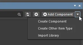
Component Folder Type Controls
When a folder of the Components type has no components in it yet, a number of controls will be presented here to assist you in populating the folder with components.
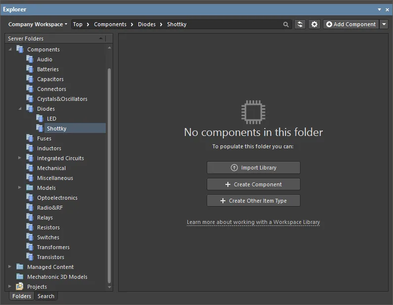
Use these controls to perform an appropriate action:
-
Import Library – click to open the standard Windows Open dialog and select a database or file-based library saved on your local or network folder. After opening a library file, the Library Importer in its Simple mode will launch with the selected library loaded.
-
Create Component – click to open the Component Editor in its Single Component Editing mode ready to define a new component.
-
Create Other Item Type – click to open the Create New Item dialog and create a new item of any type.
Irrespective of if there are components in the folder or not, these actions can also be performed using the options of the menu associated with the Add Component button at the top-right of the panel.
Library Health View
When browsing the content of a connected Altium 365 Workspace, the Explorer panel provides access to the Library Health view from where you can run health checks and inspect component health issues. Select the Library Health entry in the Server Folder region of the panel to access this view in the panel.

The Library Health view accessed from the Explorer panel
The top region of the view provides a summary of the health of your components, since last running a health check. Below are the health check analyses that are supported, gathered into various Issue Themes. Clicking on a health check analysis tile will provide a more detailed description of the check with steps to resolve (where available), as well as a detailed listing of all components failing that health check.
The
Library Health view shares the same interface and functionality as the detailed
Library Health dashboard page accessed from Altium 365 Workspace browser interface. See
Accessing the Main Library Health Dashboard for more information on this page.
Component View
The Components type folder supports two viewing modes – the Classic View and the Components View. The latter, which is the default view for this folder type, allows you to browse the parametric data associated with all components in the current folder. What's more, you can set up the view exactly how you like it for different folders of components, and those configurations will remain between sessions.
To toggle between these two viewing modes, browse to a Components folder in the Explorer panel, click the  button at the top-right of the components listing, and choose either the View » Classic View, or View » Components View command from the associated menu.

Access the Components View for a Components-type folder, presenting the components in terms of their parametric data. Hover over the image to see the result of switching back to the Classic View.
Take a look at the following sections for more information on working with the Components View.
Controlling the Display of Columns
Each column in the view corresponds to a specific parameter. Configuration of which columns are displayed – so which parametric information is presented – is performed from the Select Columns dialog. Access this dialog by right-clicking within the column headers area, and choosing the Select Columns command from the context menu that appears.
By default, the following parameters are presented – Revision ID, Revision State, Name, Description, Note.

The Select Columns dialog is control central for defining which parametric data is presented in the Components View.
Options and Controls of the Select Columns Dialog:
-
Search - type characters in the text box to filter the list of columns, showing only those columns whose name includes the typed characters.
-
Visibility column - the left-most column is used to control if a column is visible in the Explorer panel. Click the eye icon to toggle a column between being visible (
 ) and not visible (
 ). Visible columns are always listed at the top of the dialog.
-
Column Name - this column displays the title of the column name in the Explorer panel.
-
Up / Down - these buttons are used to move the currently selected column up or down the list. The result is that column will move left or light in the Explorer panel when OK is clicked. Note that only visible columns can have their position in the order changed.
-
 - click to open a drop-down then choose the desired item by which to filter the grid region.
Column Ordering and Sizing
The order of the columns is customizable. Click on a column's header and drag it horizontally to the required new position. Valid positions are highlighted by vertical positional arrows.
Alternatively, change the ordering in the Selected Columns list of the Select Columns dialog. Drag and drop the entry for a visible parameter to the required new position – relative to other visible parameters – within the list. Alternatively, use the Up and Down buttons.
With the exception of the column containing the icon for the component type, the width of a column can be modified by clicking and dragging the right-hand separator (in that column's header).
Grouping Components
Components can be grouped based on any of the visible column headings. To do this, click and hold on a column header, then drag and drop it onto the text that says Drag a column header here to group by that column.
A hierarchy of groups can be created, by nesting the column headers. Within the grouped columns region, use drag and drop to redefine the grouping 'sort order' as required, with the left-most header entry being the top of the hierarchy.
.")
An example of customized grouping (by the Case/Package and Value parameters).
Sorting
Parameters can be sorted by a specific column by clicking on that column's header. Click once to sort in ascending order (based on the content of that column). Click again to sort in descending order.
You can sort by multiple columns. With the parameters already sorted by a specific column, Shift+Click on another column to 'sub-sort' by the content of that column.
To remove sorting for a column, Ctrl+Click on its header.
Column-based Filtering
Like an Excel spreadsheet, the parameters can be further filtered by the contents of each column. To do this, click the small funnel (filter) icon, that appears at the right-hand side of a column header on hover ( ). A menu will appear containing a checkbox for each value present in that column. Enable the required checkbox(es), then click OK to reduce the list to only include parameters with that value (those values).
When a column filter is applied, the filter icon is displayed in blue ( ), indicating that there is filtering applied based on that column. Filtering can be applied to multiple data columns. Each 'column filter' becomes an ANDed condition in the overall filter. A textual representation of the filtering currently in effect will be presented at the bottom of the region.

An example of column filtering in action.
To clear filtering for a column, choose the
(Select All) entry from the filtering drop-down. To clear filtering completely, click the

control, at the far right of the textual representation of the filter. To disable the filter, uncheck the check box to the left of its textual representation. To enable again, check the check box.
A history of just used filters is available. Click the drop-down button to the right of the textual representation of the current filter to display the history. This button will display when at least one previous filter has been applied.
Support for Multi-Part Components
When viewing the symbol for a multi-part component, the Preview aspect view tab will present each part – each with its own distinct symbol graphic – as a separate tab. In addition, the Place menu will present a sub-menu of all applicable parts that can be placed for that component.
Previewing
Browse to the multi-part Component Item of interest, in the Workspace, and ensure the Preview aspect view tab is active. Each distinct part's symbol can be browsed in the symbol viewing region. Click on a tab along the bottom to switch between parts.

Browsing the parts of a multi-part component, at the component level.
Double-click on the entry for the child symbol to browse the constituent parts for the component at the symbol level. Again, ensure the Preview aspect view tab is active.

Browsing the parts of a multi-part component, at the child symbol level.
Placing
When placing a revision of a multi-part component onto a schematic sheet, right-clicking on the revision's entry and hovering over the Place command on the menu will present a sub-menu containing all parts for that component. Select the required part to place.
If using the Explorer panel's drag and drop placement functionality, be aware that only the first part (Part A) for the component can be placed.

A placement sub-menu offers all parts in a multi-part component.
Controlling Parameter Visibility when Placing Components
When placing Workspace library components (from the Components or Explorer panel), control over the visibility of parameters associated with those components – or more specifically, their values – is performed from within the properties dialog for the parent folder.
The folder must be of type Components.
Right-click on the parent folder and choose the Properties command. The Edit Folder dialog will appear. Enable the Configure Parameters Visibility on Add option on the right-hand side. The parameters, taken from all components in the folder, will appear listed in the region. Use the Visible On Add checkbox associated with each parameter to control its visibility, when a component that has that parameter is placed on a schematic sheet.
The Name/Comment parameter is also included in the list. This is a system parameter.
Parametric visibility data is stored as part of the Workspace folder properties, in the Workspace itself, and is global to all users of the Workspace, and with whom the relevant folder(s) have been shared. Folder hierarchy is also taken into account, so parameter visibility configured for a parent folder will be passed down to (inherited by) all child folders below.

Determine, at the folder level, which parameters should be visible when components that use them are placed in a design.
Copying Component Parameter Information to the Clipboard
Parametric information for a revision of a component can be copied to the clipboard for subsequent use elsewhere in the design, or for pasting to an external application (such as Microsoft Excel). When browsing the Preview aspect view tab for a Component Item revision, select the required parameters – in the Parameters region of the view – and either use the Ctrl+C keyboard shortcut or right-click in the region and use the Copy command on the context menu.
Select multiple parameters as required using standard multi-select techniques (Ctrl+Click, Shift+Click).

Copy a Component Item revision's parametric information to the clipboard, for use elsewhere as required.
Changing a Released Component Type On-the-Fly
It is possible to change the component type for one or more components after release to a completely different type, on-the-fly. In the Explorer panel, select the component revision(s) that you want to change, then right-click and choose the Operations » Change component type command from the context menu. The Choose component type dialog will appear from which you can select the new component type.

An example of changing the component type for selected revisions of Component Items that have already been released – with the wrong type to begin with, to underline the feature!
Searching for Components
The Explorer panel caters for powerful searching functionality. You can either perform generic-level searching, or targeted searching through the use of saved search configurations. The latter allows you to search, with respect to your components, by a particular component type and also use ranged searching – a nice aspect of searching facilitated through unit-aware component parameter data types (supported through a referenced component template). Additionally, you can add a keyboard shortcut to your saved searches that allows you to quickly perform a search from outside of the Explorer panel.
While the search facility provided through the Explorer panel is powerful, a far more convenient search facility is provided through the Components panel – right where you need it and within the same panel you will typically be using day-in, day-out, as you manage and place components within your design projects. The Components panel allows you to enter a search phrase, and/or use the panel's category and filter selections to narrow the component listing to your specific needs. Filters are supported for Workspace Library only, and like the Manufacturer Part Search panel, the Components panel supports unit-aware (text to number) search filters.
Prerequisites for Search
Related pages: Building & Maintaining Your Components and Libraries, Component Template
To be able to fully appreciate and use all aspects of the Explorer panel's search facility when searching across your components, you need to meet the following requirements:
-
Be running Altium Designer and ensure the Component Template Editor and Explorer software extensions are installed as part of that installation.
-
Be using a Workspace to store your Workspace components.
-
If you have not already created your components with referenced component templates – delivering the support for unit-aware component parameter data types – you will need to edit and re-save them to the Workspace. This can be achieved by:
-
Editing a component, to access its definition in a temporary instance of the Component Editor.
-
Creating and releasing a component template (CMPT) with:
-
Default revisions of the symbol and primary footprint (as already used for the component).
-
The Default Value for the ComponentType system parameter set accordingly (e.g.
Resistors, if editing a generic resistor). A variety of predefined component types are available, with the ability to create new ones where needed.
-
Component parameters defined that match all component parameters currently defined for the component (in this way, the existing values will be kept, while not duplicating any parameters).
-
For relevant parameters (e.g.
Value, Tolerance, Power, etc.), set the data type accordingly – thus making those parameters unit-aware. A number of unit-aware component parameter data types are supported.
-
Assigning this component template to the component being edited – from the Template field under Advanced Settings, when using the Component Editor in its Single Component Editing mode, or from the Add » Templates sub-menu associated to the Required Models/Parameters region, when using the Component Editor in its Batch Component Editing mode.
-
Tweaking the values of any parameters that are shown in red (i.e. value not valid, or marked as required, but not yet defined).
-
Committing the component to the Workspace, into the next revision of the component.
Accessing the Search Facility
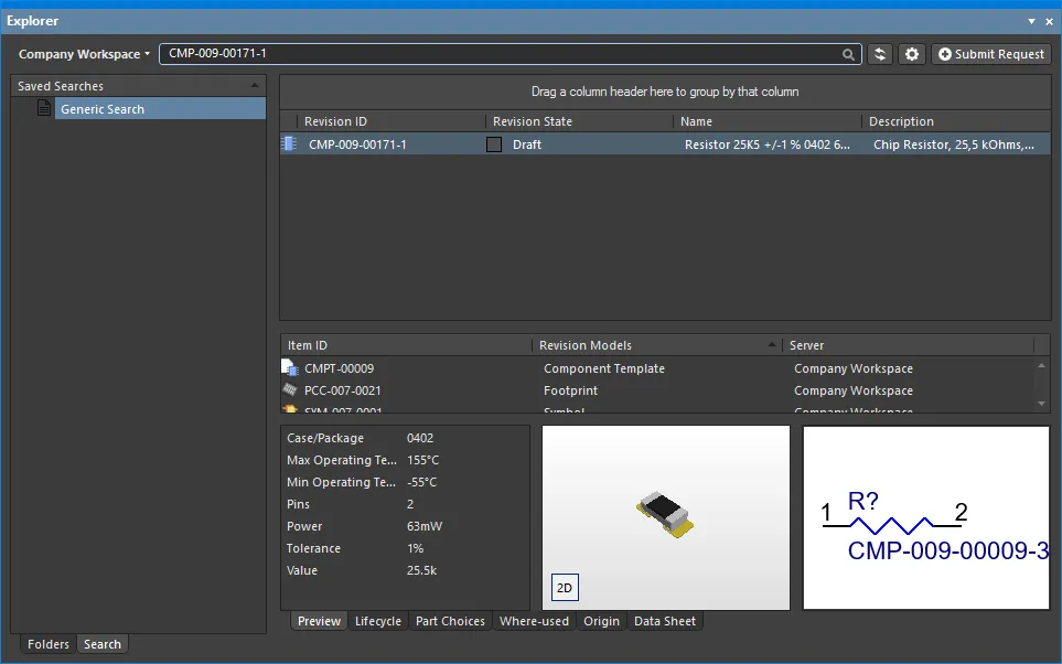
The interface for the search facility – the Search view – is accessed through the Explorer panel by clicking the Search tab at the bottom-left of the panel. The view is comprised of three key elements, as shown in the following image and detailed thereafter.
Alternatively, the Search view is accessed when performing a generic search – using the Search field at the top of the panel, or if a keyboard shortcut assigned to a saved search is invoked. The view can also be accessed from the Folders view, by clicking the Search Results entry, within the Server Folders region (available after a search has been performed).

The Search view – a dedicated user interface within the Explorer panel.
-
Generic Search field – facilitating standard-type searching. Enter a search string and press Enter.
-
Saved Searches – facilitating targeted searches that can be saved for reuse. These types of searches can target components by their type and also cater for enhanced searches based on the values of unit-aware parameters.
-
Search Results.
Double-clicking on the Generic Search entry in the Saved Searches pane will apply the last search term entered into the generic search field at the top of the Explorer panel. This applies only to the current session of the design software.
Creating a Saved Search
To create a new saved search, right-click in the Saved Searches region and choose New from the context menu. The New Search dialog will appear, in which to define the search.

Creating a new saved search.
Use the dialog to configure a component search as follows:
-
Give the search a meaningful name (e.g. Resistors) using the Saved Search Name.
You will be prevented from adding a new search with the same name as that of an existing saved search.
-
Define an optional keyboard Shortcut for quick access to the search (populate the field by clicking inside it, then performing the required shortcut on the keyboard).
-
Set the Content Type field to Component. The drop-down listing includes all supported content types for the Workspace (allowing other searches to be created based on other content types).

Select Component in the Content Type field drop-down for searching by components in the Workspace.
-
Use the Parameters region to configure search parameters as required. All parameters detected for the Component content type will be listed. For each parameter, the following three options can be defined:
-
Show Filter – enable to show a corresponding filter field for the parameter, above the Search Results region on the Search tab. It is through such a field that you can fine-tune your searches, based on value criteria stipulated for that parameter.
-
Default Visibility – enable to have a column for the parameter presented by default in the Search Results region on the Search tab. Columns for parametric data can be hidden, or made visible at any stage, directly from the view.
-
Parameter - the name of the parameter. This could be a system parameter or a user parameter. Remember that in order to use range searches, parameters must be defined through an assigned component template and be unit-aware (of a specific data type).
-
Type - the data type for the parameter. For ranged searches, the parameter should be set to a unit-aware data type. This can be done only through a component template that is then assigned to the component library prior to releasing the component definitions.
-
Default Value – use this field to constrain use of a parameter to a particular value, or range. A literal string search is performed on the contents of the field, with the search supporting both the single (?) and multiple-character (*) wildcards (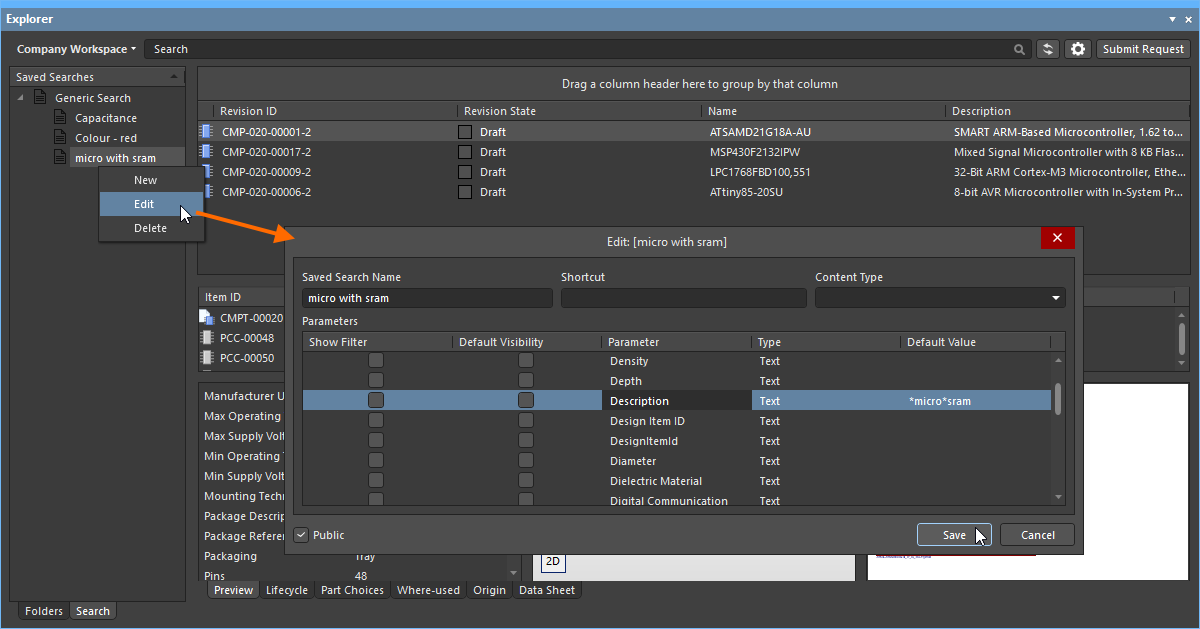 ).
).
When defining a value:
-
A range is depicted using the hyphen character, for example 1kOhm-10kOhm, or 1k-10k. You can also use greater than (>) and less than (<). Greater than and less than are inclusive.
-
A literal string search is performed, with the field supporting both the single (?) and multi-character (*) wildcards.
-
To narrow the search to a specific type of component, ensure to enter its type into the Default Value field for the ComponentType parameter (e.g. Resistors). It is very important that the ComponentType has been specified for your components prior to saving to the Workspace. This is typically set in the referenced component template, but can manually be set in the Component Editor, while editing a component.
-
Remember that in order to use range searches, parameters must be defined through an assigned component template and be unit-aware (of a specific data type).

Example defined search parameters.
-
If you want any user of your Workspace to see and use your saved search, leave the Public option enabled. If you want the search private to only yourself, disable this option.
With the search defined as required, click the Add button. The search will be saved as an entry under Generic Search in the Saved Searches region of the view.
-
A set of saved searches can quickly be generated by right-clicking in the Saved Searches region then choosing the Generate From Component Types command from the context menu. The set covers all supported component types.
-
By enabling the CreatedBy and/or ModifiedBy parameters, you can create a saved search that performs a search by a specified user who created/modified the content ( ).
).
Applying a Saved Search
A saved search can be applied in the following ways:
-
After clicking Add for a newly defined search, or Save after modifications to an existing search, the search will be automatically applied.
-
Select the search in the Saved Searches region, then press Enter.
-
Use the assigned shortcut to switch to the required saved search, then press Enter.
-
Double-click on the entry for the saved search.
Filtering of components will be performed based on the defined search criteria, and the results presented in the corresponding results region. If any parameters have their option to Show Filter enabled, as part of the applied saved search, dedicated fields for those parameters will be available above the results list.

Example results after application of a defined saved search – Resistors. The search has four parameters that have their Show Filter option enabled, so fields for those parameters are presented as part of the search interface.
For those parameters whose filter fields are shown:
-
If the parameter has a default value specified as part of the search, its field will initially be prefilled with that value, and that value will be applied when the search itself is applied.
-
A new value (specific or ranged) can be specified for the parameter by direct entry in the field.
Make any adjustments as necessary and press Enter to apply the revised filtering.
Use the standard controls available in the search results region to further sort, filter, and group results as required:
-
Click on a header to sort by that entity – once to sort ascending, again to sort descending.
-
Hover over a header to access a filter control with which to filter by that entity.
-
Click & Drag a header to change order of displayed columns.
-
Drag a column header to the region above the headers, to group results by that column.
Editing a Saved Search
To modify an existing saved search, select it in the Saved Searches region, right-click and choose Edit from the context menu. The Edit: [<SavedSearchName>] dialog will appear, from where to make any changes to the search as required.
Once changes have been made, click the Save button – the search will be applied in accordance with its new settings.
Deleting a Saved Search
To remove an existing saved search, select it in the Saved Searches region, right-click and choose Delete from the context menu. Click Yes in the subsequent confirmation dialog – the search will be removed from the listing of saved searches.