
Altium Documentation の使用
Altium が提供する各種設計ソリューションには、幅広い技術ドキュメントが用意されています。本ドキュメントでは、必要な情報を見つけるためにドキュメントを活用する際の便利な「ヒントとコツ」を紹介するとともに、これまで存在をご存じなかったかもしれない、ドキュメントの多岐にわたるさまざまな側面についても詳しく説明します。
技術ドキュメントへのアクセス
技術ドキュメントへの主要な入口、いわば「正面玄関」は次のとおりです:https://www.altium.com/documentation/。

このページの中心となるのは、次の 2 つのドキュメントセットです。
-
Altium Designer – デスクトップ設計ソフトウェア。ブランド名は次のとおりです:
-
Altium Designer Develop – Altium Develop ソリューションの一部である場合。
-
Altium Designer Agile – Altium Agile ソリューションの一部である場合。
-
Altium Designer – 現在も使用中(有効な期間ライセンス)で、プラットフォームソリューションの一部ではない場合。
-
-
Altium 365 – クラウドプラットフォーム。その中核となる Workspace のブランド名は次のとおりです:
-
Altium Develop Workspace - Altium Develop ソリューションの一部として作成された場合。
-
Altium Agile Workspace - Altium Agile ソリューションの一部として作成された場合。
-
Altium 365 Workspace – Altium Designer とともに現在も使用中(有効な期間ライセンス)で、プラットフォームソリューションの一部ではない場合。
-
いずれの場合も、すべてのソリューションをサポートするために単一のドキュメントセットが使用されている点に注意してください。Altium Designer documentation では、ソフトウェアを指す際に通常、短縮形の「Altium Designer」が使用されます。Altium 365 documentation では、プラットフォームを指す際には「Altium Platform」(または「Altium 365」)が使用され、プラットフォーム上でホストされる Workspace を指す際には「Altium Workspace」(または「Altium 365 Workspace」、あるいは単に「Workspace」)が使用されます。
ページの使い方:
-
タイルのメイン見出しをクリックすると、その特定の設計ソリューションのドキュメントのホームページにアクセスできます。
-
Altium Designer または Altium 365 のタイル内にあるリンクをクリックすると、その特定領域の情報にアクセスできます。
-
利用可能な QuickLinks メニューを使用して、追加の主要ページにアクセスします。以下に Altium Designer および Altium 365 のドキュメントタイルの例を示します。

-
ページ上部の Search フィールドを使用すると、すべての設計ソリューション(該当する場合はその各バージョンを含む)の全ドキュメント、および Knowledge Base を横断してすばやく検索できます。検索機能の詳細については、Documentation Search Facility を参照してください。
-
Other Products エントリをクリックするとページが展開され、Renesas 365、Altium On-Prem Enterprise Server、Company Dashboard、Altium CircuitMaker、Altium CircuitStudio、Altium Infrastructure Server など、その他のソリューション/領域のドキュメントにアクセスできます。

-
See Also エントリをクリックするとページが展開され、Knowledge Base、Learning Hub(業界の専門家によるものを含む、興味深く焦点を絞った記事が多数掲載)、Altium Professional Training、Altium Forums(ユーザー同士から直接得られる情報を含む非常に価値の高い学習リソース)など、Altium が提供するその他の有用なリソースにアクセスできます。

「F1」による直接アクセス
Altium Designer を含む設計ソフトウェアでは、F1 キーボードショートカットはぜひ覚えておきたい機能です。ソフトウェア環境内のさまざまなリソース、たとえばメニューコマンド、ダイアログ、パネル、設計オブジェクト、またはクエリ言語キーワードの上にマウスカーソルを置き、F1 を押すと、その項目のドキュメントにアクセスできます。ソフトウェア内のリソースと技術ドキュメントとのこの対応付けを実現しているのが、マッピングファイル(*.HelpID)で、これはメインインストールの \Program Files\Altium\AD<Solution>\Help フォルダー内にあります。
次の画像は、この機能の動作例を示しています。ここでは、F1 キーボードショートカットを使用して、Layer Stack Manager を使って PCB のレイヤースタックを編集する際に利用できる Material Library コマンドのドキュメントにアクセスしています。

F1 の更新
サポート対象の設計ソフトウェアでは、インストール先のメイン \Help フォルダーにある HelpID マッピングファイルは、そのソフトウェアの新しいリリースごとに更新されます。ただし、Technical Documentation チームがリリースの合間にこのマッピングファイルを更新することもあります。次回のソフトウェアリリースを待たずに最新の F1 変更をユーザーに提供するため、Preferences ダイアログの System - Installation ページにある Check frequency 設定を利用したオンザフライ更新方式を採用しています。

チェック間隔が経過していれば、次回 F1 機能が使用されたときに、より新しいバージョンのマッピングファイルが \ProgramData\Altium\Altium Designer <Solution> <GUID>\Help フォルダーにダウンロードされます。この新しい HelpID ファイルは、メインインストールの \Help フォルダーにあるデフォルトファイルより優先されます。
その他のアクセス方法
技術ドキュメントには、次のようなさまざまな追加方法でもアクセスできます。
-
たとえば Google など、Web ブラウザーの検索エンジンを使用した外部検索からアクセスする方法です。検索対象を Altium のドキュメントに絞るには、
site:altium.com/documentation <Search String>(例:site:altium.com/documentation PCB Layout Replication)の形式でサイトをプレフィックスとして入力します。 -
Altium の公式 Forum Post に記載されたリンクをたどる方法。
-
メインの altium.com Web サイト内の他の領域(たとえば Learning Hub 領域や、専用の「What's New」ページ、機能別ページ)にあるリンクをたどる方法。
-
ソフトウェア内の専用リンクをたどる方法。たとえば Help メニューから、または「Learn More」のようなリンクを使用します。
ドキュメントインターフェース
ドキュメントインターフェースは通常、最大 14 の個別領域で構成されます。これらは次の画像に示されており、その後で詳しく説明します。

-
Product Documentation Selector – このコントロールを使用して、利用可能な専用ドキュメントセットを切り替えます。
-
Theme Selector – このコントロールを使用して、ライト(
 )表示モードとダーク(
 )表示モードを切り替えます。以下の例を参照してください。


-
Search – このフィールドを使用して検索文字列を入力し、現在表示中の製品ドキュメント内の情報を検索します。関連する検索フィルターにより、その後で検索範囲を調整できます。詳細については、Documentation Search Facility を参照してください。
-
Nav Tree Pane – 現在表示中の製品ドキュメントを構成するすべてのページを表示します。論理的に整理されており、エントリをクリックするとそのページが表示されます。ペイン右上のコントロールを使用して、サイズ変更や表示/非表示の切り替えができます。
-
QuickLinks – Nav Tree ペインの専用かつ固定のコンポーネントで、表示中の製品ドキュメントに関係なく常に表示されます。このページ、著作権情報、メインのドキュメントゲートウェイへのアクセスを提供するとともに、Knowledge Base へのクイックアクセスも提供します。
-
Breadcrumbs – 現在読んでいるアクティブページに基づき、階層内の上位ページへ移動するための補助的なナビゲーション手段を提供します。パンくずリストの経路に多数のページが含まれる場合は、表示を見やすく保つために省略記号コントロールが使用されます。これをクリックすると、経路内の追加の中間ページをすべて含むポップアップが表示され、それぞれ対応するページへのアクティブリンクになっています。

-
Main Page Content – これはインターフェースのメイン領域で、Nav Tree ペインで選択されたページを表示します。ページ内容のさまざまな側面や、構成機能のヒントについて詳しくは、Viewing a Technical Document を参照してください。
-
Feature Availability Note – これは、ドキュメント内の特定のセットに含まれる各ページに表示されます。テクニカルドキュメントでは、製品またはソリューション全体を構成する要素のすべての機能と機能性について説明しています。Altium Designer および Altium 365 の場合、ページに記載された機能を利用できるかどうかは、ご利用の Altium ソリューションによって異なります。つまり、Altium Develop、Altium Agile のエディション(Agile Teams または Agile Enterprise)、または Altium Designer(有効な契約期間中)です。実際のソフトウェア上で説明されている機能が見当たらない場合は、詳細について contact Altium Sales をご利用ください。
-
Legacy Documentation Note – これは Altium Designer ドキュメント内の各ページに表示されます。ソフトウェアの旧バージョンに関するドキュメントを参照するために、Legacy Documentation セクション(Other Installers ページ内)へすばやくアクセスできます。
-
Table of Contents – 右側ペインの Content 領域には、該当する場合、アクティブなページの構成が見出し単位(レベル 2~4。レベル 1 はページタイトル)で表示されます。項目をクリックすると、そのページ内の該当箇所へジャンプできます。逆に、ページをスクロールすると、Content 領域も更新され、ドキュメント内の現在位置を追跡します。
-
Like/Dislike – おなじみの「thumbs up/down」機能です。ページが役に立ったかどうかをすばやく評価でき、役に立たなかった場合はその理由を知らせることもできます(Altium アカウントにサインインしている場合に利用可能)。詳細は Like/Dislike Functionality を参照してください。
-
Language Selector – 公式にサポートされている複数の言語のいずれかでドキュメントを表示するよう、すばやく切り替えるための機能です。
-
Documentation Feedback (Altium アカウントにサインインしているときに表示) – この機能を使用すると、ページに関するフィードバックをテクニカルドキュメントチームへすばやく送信できます。主に、誤字、誤った情報/古い情報、または不足している情報の指摘を目的としています。ページ上のテキストや画像を選択し、
Ctrl+Enterキーボードショートカットを使用してこの機能にアクセスしてください。詳細は Documentation Feedback Mechanism を参照してください。 -
Printer-friendly version – 印刷しやすいように特別に整えられたページ版をその場で生成するための機能です(たとえば PDF として保存する場合など)。
Structure Paging
インターフェースの Nav Tree ペイン内では、クリックしてもドキュメントページが表示されない項目に遭遇することがあります。これは意図された動作であり、ツリー構造に追加の階層を持たせるために使用されています。つまり、複数のページを包括する「親」の下にグループ化する必要はあるものの、親ページ自体には情報が不要な場合に用いられます。この種のページ(Structure ページ)は、まさにその役割だけを果たしています。そのような項目にカーソルを合わせても、通常のドキュメントページ項目のように下線は表示されません。こうした項目をクリックすると、そのツリーセクションが展開されます。もう一度クリックすると折りたたまれます。

Viewing a Technical Document
以下のセクションでは、ページ内容そのものに関するさまざまな側面について説明します。
Document Conventions
| Bold | 本文中で参照されるメニューコマンド、ダイアログコントロール、ボタン、またはツールバーを強調表示するために使用します。 Examples:
|
| Italic | 本文中で参照されるパネルまたはダイアログを強調表示するために使用します。 Examples:
イタリック体は、必要に応じて重要なポイントを強調するためにも使用されます。 |
Monospace |
本文中で参照されるハードドライブ上の場所、ファイル名、ファイル拡張子、クエリ言語式、または言語キーワードを強調表示するために使用します。 Examples:
|
Bold + Monospace |
本文中で参照されるキーボードショートカットを強調表示するために使用します。 Examples:
|
| Menu » Menu Item | Altium Designer ドキュメント内のメインメニュー参照では、区切り文字として » を使用します。最初の項目はメニュー自体を示し、その後にそのメニュー上のコマンドが続きます。コマンドがサブメニューからアクセスされる場合は、追加の » を使用してそれを示します。 Examples:
|
| Tab | Group | Button | Altium CircuitStudio および Altium CircuitMaker のドキュメントでは、メインメニュー参照の区切り文字として | を使用します。最初の項目はリボンメニューの特定のタブを示し、次にそのタブのグループ(または領域)、最後にそのグループ内のボタンが続きます。コマンドがボタンに関連付けられたメニューからアクセスされる場合は、» を使用してそれを示します。 Examples:
|
Key1+Key2 |
ショートカットを示す場合、プラス記号 (+) は、示された順序で複数のキーを同時に押し続けることを意味します。 Examples:
|
Key1, Key2 |
アクセラレータキーのシーケンスを示す場合、コンマ (,) は、シーケンス内の各キーを順番に押すことを意味します。 Examples:
|
| Link | リンク先は次のいずれかとなる通常のハイパーリンクです。
|
ページで説明している特定のトピックに関する重要な追加情報を強調するために使用します。 Example: |
|
注意すべき特定の機能や機能性、またはその活用のヒントを強調するために使用します。 Example: |
|
注意しておくべき重要事項、または実行すべき事項を強調するために使用します。 Example: |
 )を見つけて使用します。
Engaging Visuals
ドキュメント全体を通して、情報をより魅力的に伝えるために、さまざまな視覚要素が使用されています。以下のセクションでは、これらがページ上でどのように表示され、どのように使われるかを説明します。
静止画像
一般的な静止画像はドキュメントの基本要素の1つであり、周囲のテキストと組み合わせて、ソフトウェアの重要な側面に関する詳細を正確に伝えるために使用されます。
ドキュメントの見た目(および読みやすさ)を適切に保つため、ページには固定幅が設定されています。そのため、通常は画像を初期状態でフルサイズ表示できません。画像の上にカーソルを合わせると、カーソルアイコンがポインター( )から虫眼鏡アイコン(
 )に変わります。これは、画像をクリックすると、そのフルサイズ版がフローティングウィンドウで表示されることを示しています(該当する場合で、かつブラウザーウィンドウの現在のサイズに応じます)。次の画像は、ドキュメント内の静止画像でこれがどのように機能するかを示しています(皮肉なことに、これもフルサイズで見るには画像をクリックする必要があります)。

スライドショー
スライドショー要素には、複数の画像(および動画)とキャプションを含めることができ、より多くの視覚情報をすっきりと表示できます。この要素は、ソフトウェアの特定機能を使用する際の進行状況や手順の流れを示す場合に特に便利です。
次の画像は、ドキュメント内のスライドショーの例を示しており、その後で説明するいくつかの重要な領域を強調しています。

-
これらのコントロールを使用して、スライドショーをそれぞれ前後に切り替えます。領域にカーソルを合わせると、その部分が濃く表示されます。矢印アイコンそのものだけでなく、「矢印フレーム」内のどこをクリックしても操作できます。
-
これらの「バブル」は、スライドショー内のスライド数と、現在どの位置にいるか(濃い色のバブル)を示します。バブルをクリックすると、そのスライドへすばやく移動できます。
-
スライドショーにはキャプションを含めることができます。キャプションはスライドごとに1つずつ設定され、別のスライドをクリックすると更新されます。
アニメーションGIF
アニメーションGIFは、ソフトウェアの処理や側面を動画のように表現する必要があるものの、表示内容が短く、動画を使うほどではない場合に使用されます。ドキュメント内のアニメーションGIFは、次の画像に示すように中央に目立つ「再生」ボタンがあることで識別できます。ボタンをクリックすると、GIFは最後まで再生されて停止し、再び再生ボタンが表示されます。

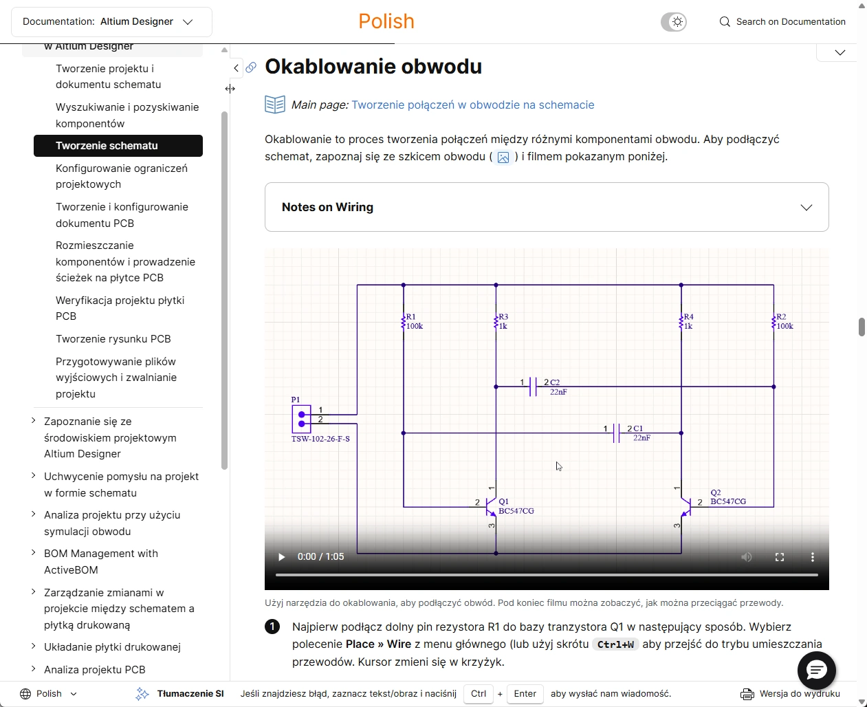
動画(MP4)
動画はGIFと同様に、ソフトウェアの処理や機能が「実行されている」様子を視覚的に示す必要があり、その内容がGIFに適した長さよりも長い場合に使用されます。ドキュメント内の動画は、次の画像に示すように下部付近にコントロールパネルがあることで識別できます。動画上のどこでもクリックすると再生が始まります(左下の再生矢印をクリックする必要はありません)。もう一度クリックすると一時停止します。利用可能な動画コントロールを使って、たとえばフルサイズ表示への切り替えと元に戻す操作、タイムライン上での早送りや巻き戻し、再生速度の変更などが行えます。

ホバー画像
ホバー画像は、ソフトウェアの機能や動作に関する「前後比較」や何らかの比較を示すために使用されます。これは2枚の画像のみで構成されます。ページ上では通常の静止画像と同じように表示され、初期状態では1枚目の画像が表示されます。その上にカーソルを合わせると、2枚目の画像が表示されます。
以下は、ドキュメント内で使用されているホバー画像の実例です。この例では、シールディングビア(初期表示/1枚目の画像)とステッチングビア(2枚目の画像、ホバー時に表示)を示しています。

ポップアップ画像
ポップアップ画像は、画像自体をコンテンツの流れに直接追加することなく、周囲のテキストとの文脈の中で何かを示すために使用されます。この意味では、本文中のコメントや記述を補強する「補足」や例と考えることができます。この要素は、2種類のアイコンのいずれかで表示されます。 (ポップアップ画像)または
  (ポップアップのアニメーションGIFまたは動画)です。次の画像は、クリックしたときのポップアップ要素を示しており、この場合は「画像」タイプのポップアップで、フルサイズ画像が表示されます。

ホバーテキスト(ツールチップ)
ホバーテキスト(またはツールチップ)は、ページ上の特定の項目に関連して、追加の役立つガイダンスを提供するために使用されます。たとえば、項目に対する説明メモや、使用されている用語に関する用語集的な説明などです。ツールチップは次の2つの方法で表示されます。
-
 アイコン。アイコンにカーソルを合わせるとツールチップが表示されます。

-
点線の下線が付いたテキスト。テキストにカーソルを合わせるとツールチップが表示されます。

折りたたみ可能セクション
ページ内容を整理し、情報量が多すぎて圧倒されないようにする手段として、折りたたみ可能セクションが使用されています。これらは、より深い情報を含むものの、通常のページの流れを理解するためには必ずしも必要ではなく(そのため常時表示する必要がない)情報に使われる傾向があります。たとえば、ダイアログやパネルで使用可能なオプション、あるいは本文で説明している機能の特定の側面に関する注意事項などです。このようなセクションは、ヘッダー内のどこかをクリックすることで展開/折りたたみできます。


ページまたは特定セクションへのリンクを取得する
ページを他の人と共有したい場合、そのURLをすばやく取得できる必要があります。これは次のいずれかの方法で取得できます(Windowsのクリップボードにコピーされます)。

-
ページに最初にアクセスしたときに、ブラウザーのアドレスバーから取得する。
-
左側のナビゲーションツリーでそのページの項目を右クリックし、コンテキストメニューから Copy link address コマンドを使用する。
さらに、現在読んでいるページ内の特定セクションへのURLも、次の方法で取得できます。

-
右側のペインを使用してページのコンテンツ構造内の目的のセクションに移動し、ブラウザーのアドレスバーからURLをコピーする。
-
ページを目的のセクションまでスクロールする。スクロールに応じて、ブラウザーのアドレスバーは現在到達しているセクションを反映するよう更新されます。
-
ページのコンテンツ構造内(右側ペイン)にある目的のセクションの項目を右クリックし、コンテキストメニューから Copy link address コマンドを使用する。
また、次の場所からすばやく「リンクを取得」することもできます。
-
Main Section Header - メインセクションのヘッダー左側にある「Copy Link」コントロールをクリックする。

-
Collapsible Section - 折りたたみ可能セクションのタイトル右側にある「Copy Link」コントロールをクリックする。

バージョン管理されたドキュメント
Altium On-Prem Enterprise Server に関連するドキュメントはバージョン管理されています。これにより、使用しているソフトウェアのバージョンに対応する正しいドキュメントバージョンを選択できます。バージョンは、メインのドキュメントゲートウェイ(製品タイルの QuickLinks メニューから)またはドキュメント内の任意の場所で、上部バナー領域にあるバージョンセレクターを使用して選択できます。以下にその例を示します。

バージョン管理システムは、閲覧中のページがそのページの最新バージョンではない場合に通知します。通知方法は次の2つです。
- ドロップダウンのバージョンセレクター内のバージョン番号が別の色で表示され、警告記号が付加されます。
- ページ上部に警告が表示され、最新バージョンへのリンクが提供されます。そのリンクをたどると、バージョンセレクターの項目は自動的に利用可能な最新バージョンへ切り替わります。

適用可能なバージョン
ソフトウェアはバージョンごとに進化し、新機能や機能強化が追加されますが、Altium On-Prem Enterprise Server に関連するバージョン管理されたドキュメントへの影響は、特定の領域に限られる場合があります。多くのページはソフトウェアの次期バージョンの影響を受けないため、以前のバージョンに適用される同じ内容が、その後のバージョンにもそのまま適用されます。そのため各ページには、そのページの内容がどのバージョンのソフトウェアで利用できるかを示す表示が用意されています。
次の画像は、そのような表示の例を示しています。ここでは、Project History 機能を説明するページのバージョン 8.0 が開かれています。この内容は、ソフトウェアのバージョン 7.0、7.1、7.2 にも同様に適用されます。つまり、ドキュメントのバージョンセレクターを 7.0、7.1、7.2、または 8.0 に設定しても、このページの内容に違いはありません。

ドキュメント検索機能
Altium の設計ソリューションに関する技術ドキュメント内の情報を見つけやすくするために、強力な Search 機能が用意されています。これは Google によって提供されており、実際には altium.com サイト全体に対して 1 つの検索機能が存在します。検索へのアクセス方法と場所によって、最初の検索結果がどの程度「絞り込まれる」かが決まります。
-
サイト最上部のバナーから - 次のスライドショーに示すようにアクセスして使用します。検索はサイト全体を対象に実行され、結果は別のブラウザータブに表示されます。


-
技術ドキュメントの「入口」(altium.com/documentation)から - 次のスライドショーに示すようにアクセスして使用します。検索は、各種 Altium 設計ソリューション向けに提供されているすべてのドキュメントセットと Knowledge Base を対象に実行されます。結果は同じブラウザータブに表示されます。


-
技術ドキュメント内のページから - 次のスライドショーに示すようにアクセスして使用します。検索は、現在表示中のアクティブなドキュメントセット内でのみ実行されます。結果は同じブラウザータブに表示されます。


QuickNav ページング(Altium Designer ドキュメント)
Altium Designer における設計オブジェクトやパネルに関する情報は、Altium Designer ドキュメントセット内の非常に多くのページに分散しています。こうした情報へ簡単に移動できるようにするため、QuickNav ページングという概念が採用されています。ショッピングモールの「フロアガイド」マップに似ており、QuickNav ページは特定の設計領域で利用可能な設計要素に関するクイックリファレンス情報を提供し、それぞれの詳細情報へすばやく移動できる手段を提供します。
ほとんどの場合、QuickNav ページは 3 つの明確なセクションで情報を提示します。
- Graphical Overview - たとえば、よく使用されるオブジェクトをまとめたビジュアル。
- Slideshow - より頻繁に使用する要素の一部について、より概要的な情報を提示するセクション。
- A-Z Listing - 便利なアルファベット順リスト。余計な装飾はなく、必要十分。特定の要素の詳細へ直接リンクします。

QuickNav ページングは次の項目で利用できます。
QuickStart ページング(Altium Designer ドキュメント)
Altium Designer ドキュメントセット(Altium が提供するプラットフォームソリューションの基盤となり、それらを支えるもの)には、まとめて見ることで価値ある「QuickStart」情報セットを構成する、重要な最上位ページがあります。このようなページングでは、特定の設計領域を順にたどりながら、その領域の理解を深めてすぐに使い始められるだけの、ちょうどよい詳細度の情報を提供します。深く入り込みすぎることはありません。これらのページは次のとおりです。
Like/Dislike 機能
技術ドキュメント内のページに関する大まかな分析情報を取得できるようにするため、広く使われている「Thumbs Up/Down」機能が採用されています。これにより、ページがどの程度役立っているかを把握し、役立っていない場合には改善対応を予定できます。この機能のコントロールは、ページ右側ペインの Content (ToC)領域の下にあります。親指アイコンを 1 回クリックすると「投票」が登録され、もう一度クリックすると解除されます。Thumbs Down アイコンをクリックし、AND Altium アカウントにサインインしている場合、そのページが役に立たなかった理由についてフィードバックを提供する機会があります。これにより、Technical Documentation チームへ直接レポートが送信されます。

ドキュメントフィードバックの仕組み
文書内で、誤字、アクセス上の問題、不正確または不明瞭な情報、古くなった情報などの問題に遭遇したり発見したりすることがあります。誤りは人の常であり、私たちは読者の皆様の力を借りてそれらの問題を修正したいと考えています。そのため、技術ドキュメントには、どのページからでもアクセスでき、Technical Documentation チームへ直接レポートを送信できるフィードバック機構が組み込まれています。
このフィードバック機構には、Ctrl+Enter キーボードショートカットを使用してアクセスします。参照したい特定のテキストや画像がある場合は、Ctrl+Enter を押す前にそれを選択してください(最大 200 文字)。
この機能にアクセスすると、Report Document Issue ウィンドウが表示され、参照されたテキスト/画像が追加されます(該当する場合)。Issue フィールド(最大 500 文字)を使用して、できるだけ詳しく内容を記入してください。正当な問題をより迅速に調査し解決するうえで、本当に役立ちます。準備ができたら、Send Feedback ボタンをクリックして送信します。送信とレポート受領が正常に完了すると、確認の謝辞メッセージが表示されます。皆様からのフィードバックが私たちにとってどれほど重要であるかは、いくら強調してもしすぎることはありません。本当に感謝しています。


あらゆるデバイスでの表示をサポート
すべての設計者が 1280x1024 の単一モニターを備えたデスクトップコンピューターの前に座っていた時代は終わりました。現在では、デスクトップ PC にさまざまなサイズや解像度の複数モニターを接続するのが一般的です。また、現場や顧客先オフィスではノート PC で作業できる必要があります。さらに、私たちは知識を求めるタイプでもあるため、フライト待ちやオフィスへ向かうバスの中でも、タブレットやスマートフォンでさらに情報を得たいと考えています。
こうしたさまざまなデバイスすべてでコンテンツが適切に機能するように、技術ドキュメント(親サイトである altium.com Web サイトの一部として)は responsive web design を採用しています。レスポンシブ Web サイトは対象デバイスと連携し、そのデバイス、画面解像度、ブラウザーサイズに合わせてコンテンツのレイアウトやサイズを調整します。これはブラウザーのサイズを変更することで体感できます。幅を狭めると、ページ要素が再配置され、フォントや画像も小さくなります。5 インチ画面でもサイトは機能し、たとえばナビゲーションツリーはタブレットやスマートフォン上でもドロップダウンとして利用できます。

印刷用ドキュメント
技術ドキュメントを印刷したいですか? 当サイトでは「オンライン」機能を重視し、情報を伝えるために視覚効果も多用しているため、まずはページを印刷デバイスへ送信できる状態(またはPDFとして保存できる状態)に整える必要があります。これを行うためのコントロールは、下部バナー領域の右側にあります。これを使用すると、ページの印刷用バージョンを表示できます。

ローカライズされたドキュメント
一部のコンテンツは英語以外の言語でも提供されています。下部バナー領域の左側にある言語セレクターを使用して、現在サポートされている言語の中から希望の言語を選択してください。

特定バージョンのページについて代替言語のコンテンツが利用可能な場合は、自動的にその言語のコンテンツが表示されます。利用できない場合は英語のコンテンツが表示されます。以下のスライドショーでは、英語、日本語、中国語、韓国語、ポーランド語で利用可能なページを例に、ローカライズの動作を示しています。


 アイコンが表示されることで区別されます(たとえば、韓国語でページを表示している場合は
  )。このラベルは、翻訳コンテンツの品質確認が社内で完了すると削除されます。翻訳内容に問題を見つけた場合は、通常のフィードバック機能からぜひお知らせください。ページ上のテキストや画像を選択し、
ブラウザー翻訳(非公式)
使用しているWebブラウザーによっては、閲覧中のページを一時的にその場で翻訳する機能を利用できる場合があります。以下のスライドショーでは、Google Chrome の翻訳機能を使用して、この場合はドイツ語という、多数の対応言語の1つでページをすばやく表示する例を示しています。翻訳は一時的なものであり、別のページへ移動して戻る、またはページを更新すると、表示言語は元の言語に戻る点に注意してください。
ナレッジベース
Altium の Knowledge Base にたどり着いた人の多くは、それが当社の技術ドキュメントのすべてだと思いがちです。実際には、これはそれ自体で独立した別のリソースです。むしろ、Knowledge Base と技術ドキュメントは相互補完的な関係にあり、相互にリンクし合うことで、必要な情報へたどり着けるようになっています。
Knowledge Base はセルフサービスのための「頼れる」情報源であり、そのコンテンツは Altium のサポート部門のメンバー、つまり Altium ソリューションに精通した専門家によってキュレーションされています。その内容は、他のユーザーが実際に遭遇した問題をもとに直接構築されています。その結果、特定のトピックや例外的なケースに対して的確な回答や解決策を提供する記事の、有機的なリポジトリとなっています。要点を押さえた短時間で読める記事により、すぐに作業へ復帰できます。
Knowledge Base のインターフェースは非常にシンプルです。すべての記事を対象に検索することも、サポートされている設計ソリューションカテゴリのいずれかに絞って検索することもできます。あとは検索文字列を入力し始めるだけで、入力に応じて絞り込みが適用されます。興味のある記事が見つかったら、その項目をクリックして記事を開いてください。

ドキュメントの著作権
技術ドキュメントに関する著作権情報は、以下の画像にわかりやすく示されており、技術ドキュメント内の任意のページを表示しているときに利用できる Nav Tree ペインの QuickLinks セクション(Documentation Copyright Information)からアクセスできます。このページには、メインの altium.com Webサイト内の Copyrights & Trademarks ページへのリンクも含まれています。

最後にひとこと…
これはまさに、技術ドキュメントチームが指針として掲げ、実現に努めている考え方です。今後も技術ドキュメントは、特に使いやすさの観点から継続的に改善されていきます。結局のところ、どれほど豊富な情報があっても、ユーザーがそれを見つけられなければ意味がありません。新しい開発、機能強化、機能追加が行われるたびに、このページも更新され、それらの追加要素と、必要な情報に最適にアクセスする方法が反映・紹介されます。
 AI で翻訳