资源管理器面板_AD

This document is no longer available beyond version 22. Information can now be found here: The Explorer Panel for version 24

Applies to Altium Designer version: 22
 

Parent page: Workspace Content Types

The Explorer panel gives access to data stored in a Workspace.

The Explorer panel gives access to data stored in a Workspace.

Summary

The Explorer panel provides a direct interface to your connected Workspace. From the Explorer panel, you can perform many activities, including:

  • Create and manage the organizational structure used in the Workspace
  • Create any number of Items, each representative of a design object
  • Review and manage the lifecycle of Item revisions
  • Interrogate the usage of a particular Item revision (Where-Used)
  • Browse and manage supply chain information for Component Items

For your day-to-day activities in the realm of component management, you'll make frequent use of the Components panel. This panel provides a powerful interface with which to interact with all your components. For your Workspace components, the panel provides a filter-based parametric (faceted) search capability, for specifying target component parameters. In addition, the panel also offers options to edit a Workspace component through the Component Editor (in its Single Component Editing mode), view the component in its source Workspace, and perform component management functions such as component creation and cloning, or editing the selected component's Part Choices and Type. In short, the Components panel offers a streamlined, targeted interface to aid your component management activities, without having to venture into the Explorer panel.

See Component Management with a Connected Workspace for information about using and managing components in Altium Designer.

When working with Altium Workspace Library components in the Explorer and Components panels, it is important to note that:

  • The content of Component Folders in the Explorer panel is determined by what has been copied/imported into that folder.
  • The content of component Categories in the Components panel is determined by Component Type parameter setting of each component.

See Move Item below for information about how moving a component entry relates to the Components panel.

Panel Access

The Explorer panel can be accessed in the following ways:

  • Click the button at the bottom-right of the application window, then select the Explorer option.

    The Workspace icon next to a panel's name in the menu at the bottom-right of the design space indicates that a connection to a Workspace is required to view the associated panel's data. A blue icon (/) signifies that there is currently a connection to a Workspace. A gray icon () indicates that there is currently not a connection to a Workspace and you will be directed to connect to a Workspace before the panel's data can be accessed.
  • Select the View » Panels » Explorer command from the main menus.
  • When actively connected to a Workspace, click the Active Server control, at the top-right of the main application window (e.g.,  for an Altium 365 Workspace or for an Enterprise Server Workspace) and click the entry of the currently connected Workspace highlighted in the associated menu (and distinguished by the / icon).
    When actively connected to a Workspace, click the Active Server control, at the top-right of the main application window (e.g. for an Altium 365 Workspace or for a NEXUS Server Workspace) and click the entry of the currently connected Workspace highlighted in the associated menu (and distinguished by the / icon).
A variation of the Explorer panel that is essentially a 'trimmed-down' version and titled Choose Item is opened in some instances, for example, when you need to choose a model or template. For example: from the Schematic editor when using the Choose manually command from the right-click menu of the Item Manager dialog.

The Explorer panel is delivered through a purpose-made extension – the Explorer extension.

The Explorer extension.

This feature is only made available, provided the Explorer extension is installed as part of your Altium Designer installation. This extension is installed by default when installing the software, but in case of inadvertent uninstall, can be found back on the Purchased tab of the Extensions & Updates page (click on the current user control (e.g. ) at the top-right of the main application window and choose Extensions and Updates from the menu). Hover the cursor over the extension icon then click to install. Altium Designer must be restarted to complete the installation process.
You also will come across various places that offer the ability to access the Explorer panel directly for a given Item through an associated Show in Explorer or Show in Server command. For example, right-click over a placed Workspace library component and choose the Part Actions » Show <ItemID-RevisionID> (<ItemName>) in Server command, from the context menu, to open the Explorer panel with the specific revision of the corresponding Component Item selected/presented.

Choosing the Browsable Workspace

The Explorer panel can only interface to one Workspace at a time. The field at the top-left of the panel indicates the currently active Workspace – the Workspace whose content you will be able to browse and modify. To select a different Workspace, click on the Workspace name and choose a different Workspace from those currently connected.

Access controls for changing the browsable Workspace.

All currently connected Workspaces – the currently active Workspace and those from the Known Servers list for your instance of Altium Designer – are presented on the Data Management – Servers page of the Preferences dialog. Note that in the Explorer panel all connected Workspace will be listed, but only one will be active and is distinguished by the inclusion of the icon, and its name in bold.

If you are signed in to your Altium account and are attempting to open the Explorer panel but you are not currently connected to a Workspace, the panel will present a list of known Workspaces, which you may choose from to connect and ultimately view the contents of the panel.

If you are not signed in to your Altium account nor connected to a Workspace, you will be asked to sign in with your Altium account or register one to view the contents of the panel. Select Sign in to open the Sign In dialog, where you can sign in to your Altium account. Select register to be redirected to the Altium 365 registration page, where you may register or sign in with your AltiumLive credentials.

The Content Vault replaced with Manufacturer Part Search dialog opens if Learn more is selected from the Looking for Altium Content Vault? window in the top-left corner.

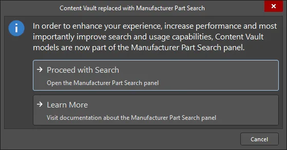
As the dialog states, items in the Content Vault are now part of the Manufacturer Part Search panel. Click Proceed with Search to open the panel and search for the required item. You can read about the Manufacturer Part Search panel by clicking Learn More.

Organizing a Workspace

Maintain order within a Workspace by creating a tree of folders for the various Items stored in the Workspace. A number of folder types are available. Use these folders to categorize the Workspace content. Right-click in the Server Folders region of the panel to add folders and define a storage structure of folders and sub-folders that suits your organization.

The right-click menu includes commands for defining a folder hierarchy. Note that the options change depending on where you click.

Workspace Folder Types

You have full control over the folder type and it can be changed at any time by right-clicking on a folder then selecting Properties to open the Edit Folder dialog.

For more information on the different folder types available for use in a Workspace, click here.

Workspace Folder Properties

When you add or edit a folder, the Folder Properties dialog will appear in which you can define the properties of the folder. The content of the dialog is the same whether a top-level or sub-folder is being added.

The dialog presents the following folder-related properties:

  • Folder Name – enter a meaningful name for the folder, perhaps an umbrella term that reflects the relationship of the Items that will be stored within it. The name can be a maximum of 160 characters.
  • Folder Type – this is already set to the folder type selected on adding the folder, either through a menu entry or through the Choose Folder Type dialog. If you need to change the type, click the arrow at the far right of the field then choose the required type from the drop-down list.
  • Description – enter any description for the folder, perhaps describing the content it is to hold. This field has a maximum of 255 characters.
  • Item Naming Scheme – this field provides a set of default naming schemes that can be used to quickly define the unique ID for any item subsequently created within the folder. Using a default naming scheme, the software will automatically assign the next available unique ID based on that scheme, having scanned the entire Workspace and identifiers of existing items. You can create your own scheme for a folder by typing it within the field, ensuring that the variable portion is enclosed in curly braces (e.g., SYMBOL-001-{J000}). See the Defining Naming Schemes for Item Revisions page for more information.
  • Share – click this link to access the Share For dialog in which you can specify the visibility of the folder in terms of who can 'see' and access it.
For more information regarding the multiple iterations of the Folder Properties dialog, visit the Folder Properties dialog page.
When releasing source domain models or component definitions to create models and components in the Workspace, an Item Naming Scheme is set as part of the release preparation and options. This is especially the case when items are being created automatically 'on-the-fly' rather than releasing to existing items that have been manually created directly within the target Workspace.

Moving Folders and Items

One or more Workspace folders, or Items within a folder, can be quickly moved using the drag and drop technique:

  • Folders – select the folder(s) to be moved (using standard Ctrl+Click, or Shift+Click techniques), then click, drag, and drop the selected folder(s) at the required place in the structure, as indicated by a horizontal indicator.
  • Items – select the Item(s) to be moved (using standard Ctrl+Click, Shift+Click, or Ctrl+A techniques), then click, drag, and drop the selected Item(s) onto a different folder in the structure.
Folders and Items can also be moved using the corresponding command available from the right-click menu (the command will reflect whether one or multiple folders/Items are being moved). Launching a command will give access to a dialog in which to select the target folder under which the folder(s) should be moved, or the Item(s) should be placed into, respectively.

Ability to Copy-Paste Workspace Folder Structure

Adding greater flexibility to the management of your Workspace content, the Explorer panel provides the ability to copy and paste a folder (and its descendant structure). This essentially allows you to quickly clone areas of your Workspace folder structure, which can prove a real time-saver when readying your Workspace for a deluge of component data, for example, where the structure is similar to a parent folder and sub-folders for the various domain models.

To use this feature:

  1. Select a folder in your existing folder structure, whose structure you wish to copy.
  2. Right-click and choose the Operations » Copy Folder Structure command from the context menu.
  3. Select the folder under which you want the cloned folder structure to be pasted.
  4. Right-click and choose the Operations » Paste Folder Structure command from the context menu.

Once pasted, you can make adjustments to the cloned folder structure as required.

You can only copy a single selected folder (and its descendant structure). The commands will be unavailable if multiple folders are selected.
Note that on paste, only the folder structure is pasted – Items within the copied folder structure are not copied.
Remember that when pasting, two folders cannot have the same name in the same area of the folder structure. Trying to do so will result in a Duplicate Folder HRID error. And while the parent folder will not be pasted, its descendant structure will be, and at the top level of the folder structure. So if you are trying to quickly create a set of cloned folders under the same parent area of the 'tree', what you can do is paste the folder structure to another temporary area of the main Workspace folder structure. Then rename the top-level folder, make any other adjustments, then drag and drop back to where you really want the folder to be.

Soft Deletion

Your Workspace provides you with flexible functionality for removing content from that Workspace directly from within Altium Designer, from the Explorer panel. This allows you to quickly delete:

  • Folders of content
  • One or more specific items
  • Projects
You will know if a Delete-based command within Altium Designer's Explorer panel is of the soft delete variety, as the subsequent confirmation dialog will confirm that the deleted item(s) will be moved to the Trash.

To delete a folder or project, right-click on that folder's entry in the panel and choose the Delete Folder command from the context menu. To delete a specific item, right-click on that Item's entry in the panel and choose the Delete Item command from the context menu. The Delete Items dialog will appear, in which to confirm the deletion. The action is actually a 'soft delete', whereby the folder/Item will be moved into the Trash area of the Workspace. The Trash is essentially a recycle bin into which any Item within your Workspace can be moved (through a soft delete action). It is isolated from the rest of the Workspace.

When deleting a Workspace folder (non-project) bear in mind that all sub-folders and items contained within the folder hierarchy will also be soft deleted.
With the soft-delete facility, you are able to delete an item that is currently being used. For a Component Item, you can also opt to delete the component's related items (e.g., symbol, footprint model(s), simulation model, datasheet). Note that these can only be deleted if they are not being used elsewhere (by one or more other components). When deleting a project, the project repository will be moved to the Trash and also all Releases and Packages (Manufacturing Packages).
Multiple Items can be deleted in a single action. Select all required Items using standard multi-select controls (Shift+Click, Ctrl+Click), then right-click and choose the Delete Items command from the context menu.

Example soft deletion of a Workspace project.

Example soft deletion of a Component Item, along with its associated Symbol and Footprint Items. All Items will be moved to the Workspace's Trash area.

To proceed with the deletion, click the button. The item will be removed and a Deletion Summary dialog will confirm the successful deletion. If there was an issue with deletion, this will be flagged to you.

All items deleted in this manner can be found on the Trash page of the Workspace's browser interface. Note that you can only view items that you have personally soft deleted. Administrators will be able to see the full content of the Trash page – so all items that have been soft deleted.

Things to consider in relation to a soft-deleted item:

  • The item will not be available from your design software, or from within the browser interface.
  • Anywhere the item was being used will reflect that the item has been deleted.

    Example of a soft deleted component being flagged as such elsewhere in the software.
    Example of a soft deleted component being flagged as such elsewhere in the software.

  • An item can be restored, or permanently deleted from the Trash page, provided you have editing rights. Permanent deletion is only possible provided it is not being used by a parent item (on a managed schematic sheet, or within a design).

    For a Project, only the owner or an administrator can permanently delete or restore.
Note that if you have soft deleted an item – moving it to the Trash – you can create a new item with that same name again. If you were to subsequently restore the original item, and the original name is taken, an integer suffix will be used, to keep its name unique within the Workspace.

Navigating a Workspace

You can navigate the content in a Workspace in several ways:

  • Click on a folder whose contents you want to peruse.
  • Use the Address Bar at the top of the panel. The Address Bar reflects the current folder being browsed along with the hierarchical path to that folder.
  • Use a Workspace's search feature. Enter a keyword-based on a comment or description then press Enter or click the magnifying glass icon. The entire Workspace will be scanned and the results of the search listed in terms of matching Items.
The entire folder structure can be expanded or collapsed using corresponding commands (Expand All and Collapse All) available on the panel's right-click menu. To expand fully a particular folder and all its descendant sub-folders, right-click on that folder and use the Expand Subtree command.

Browsing Items

Each entity that is stored in the Workspace is called an Item. To support the need to be able to update an Item over time, what is actually stored in the Workspace is a series of Item Revisions that are specific revisions of that Item whose name is based on the chosen Revision Naming Scheme. Each new Item is created in a folder and once you have defined the required folders within a Workspace, you can create new Items in the selected folder in the Item region of the panel.

Refer to the Workspace Content Types page to learn more about Workspace items.

For each Item revision in a Workspace, the Explorer panel allows you to browse different aspects of that revision, where applicable. This is done using one or more views for that revision by using the tabs at the bottom of the panel.

The default-level view is the Preview. Click additional tabs to view more information (the available tabs will depend upon the type of Item that is currently selected):

  • Preview – view a composite depiction of the selected Item that includes graphic representations of documents and models, parameter data, associated sub-items, etc. The view is automatically set for different types of Items and whether the Classic or interpreted view modes (see above) are selected for Components and Projects.
  • Lifecycle – explore the Item's revisions levels and Lifecycle state change. The Lifecycle may be progressed through the states that are assigned to the item type – for example, the Component Lifecycles states (Draft, Prototype, etc) for a component.
  • Children – view sub-elements of an Item, such as the generated fabrication documents (Gerber, NC Drill, etc) in the Fabrication package (FAB-<project name>) of a released project or the schematic document and components used in a Managed Schematic Sheet.
  • Part Choices – view or add to the Part Choices (manufacturer part entries with associated supplier data) that are assigned to a component.

    To be able to manage part choices, a user must have Part Choice Management permission. Refer to the Setting Global Operation Permissions for a Workspace page to learn more.
  • Where-used – view where the selected Item revision is used by another Workspace item, for example, a project that uses the currently selected component.
  • Origin – view from where the Item originated, such as a Component that has been acquired from Altium's cloud resources. Full details of the source item are shown, where possible.
  • Data Sheet – view or add file-based datasheets stored with the selected component.

Browse different aspects of an Item revision using its associated views.

Browse different aspects of an Item revision using its associated views.

Clickable URLs

Further improving the usability of Workspaces, the Explorer panel supports clickable URLs. This functionality can be found in a variety of relevant areas, including:

  • Clicking on a component parameter whose value is a URL, opening the target page in an external web browser.
  • Clicking on a URL in the supply chain data for a component, opening the target page in an external web browser.
  • Clicking on a document in the Released Documents region – from the Preview aspect view tab for a revision of a PCB Fabrication Data Item, PCB Assembly Data Item, or PCB Project Design Item – to open that document.
For component parameters and Released Documents of a Project-related Item, this functionality is also available when viewing the full details for an Item, directly in Altium Designer. To access this view, right-click on the Item's entry in the Explorer panel, and choose History from the context menu.

Viewing Revisions

You can configure the revisions that are displayed in the panel by clicking the icon to access a drop-down of revision choices.

  • Load all pages – select to load all revisions.
  • Show Hidden Revisions – select to show any hidden revisions.
  • Show only latest – select to only show the latest revisions.
  • View – select whether you'd like to view the items in Classic View or interpreted view (Components View/Project View).

Folder Content Loading

When you click on any folder within the Server Folders structure region of the Explorer panel, only a portion of that folder content will be initially loaded, where applicable to do so. This greatly decreases the folder's initial load time. As you scroll to the end of the initial content, an additional portion of the folder content will be loaded.

To have all content for the folder loaded, click the button at the top of the panel, and use the Load all pages option on the associated menu to switch from portion loading of folder content (option disabled) to full loading of folder content (option enabled).

Showing Hidden Revisions

Related page: Defining Lifecycle Definitions for a Workspace – Controlling Item Revision Visibility and Applicability

For an Item Revision entering a lifecycle state that has its Visible in Vault panels attribute disabled, that revision will, by default, not be displayed in the Explorer panel. And if it is the latest revision of the Item, then the entire entry for that Item will effectively be hidden from view. This visibility state – defined at the state level – can be overridden globally for all Items.

To display all Item Revisions that are currently not visible, click the control, at the top-right of the Items region of the panel, and enable the Show Hidden Revisions option, on the associated menu.

Displaying hidden Item Revisions while browsing content in the Explorer panel. Hover over the image to see the result.

Showing only the Latest Item Revisions

Over time, the content in your Workspace may undergo changes as they evolve, with each change resulting in a new revision to accommodate the modified data. When browsing Items, it is typically only the latest revision that is required. All other previous revisions tend to become a level of noise, cluttering the designer's field of view. To alleviate this, the Explorer panel defaults to show only the latest revisions of Items.

To display all revisions of Items in the Explorer panel, click the control, at the top-right of the Items region of the panel, and disable the Show only latest option from the associated menu.

This option is a global setting that applies to all Items in the Workspace, irrespective of type, and the visual folder in which they reside.

By default, the Explorer panel shows only the latest revisions of Items. Hover over the image to see an example of the command disabled.

To declutter and return to only presenting the latest revisions, click on the option again to toggle it ON.

Interpreted Views

The panel also offers two special, interpreted views that apply to Components and Projects. The view will automatically switch to this style when a Component or Project is selected unless the panel display option has been changed to the Classic View mode.

The Classic or interpreted view (Component View / Project View) options are available from the view menu when one of the special item types has been selected.

  • Classic View – select to show just Items and their Revisions.
  • Components View – select to show revisions and interpreted component data. See Component View below for more information.
  • Project View – select to show a structured graphic version of the project that includes access to Project Release data and project Parameters. See Project View below for more information.

Item Revision Comparison

Using the power of Altium Designer's native file format comparison technology, the Workspace supports the visual comparison of two revisions – of the same, or different Items – for a range of supported content types, directly from within the Explorer panel. Revisions of Items of the following content types can be compared:

  • Component Item
  • Symbol Item
  • Footprint Item
  • Managed Schematic Sheet Item
  • Schematic Template Item
  • PCB Fabrication Data Item
  • PCB Assembly Data Item
  • PCB Project Design Item

Within the Explorer panel, browse to the relevant folder, select the two Item-Revisions that you wish to compare, then right-click and choose Operations » Compare from the context menu.

Export of Grid Data

The Explorer panel supports the export of data from grid views, to a csv- or xls-formatted file. Examples of where this functionality is available include:

  • Component Items grid (both Classic and Component views).
  • Items grid.
  • Linked models grid on the Preview aspect view tab (for a selected Component Item).
  • Search results grid.
  • Item grid on the Where-used aspect view tab.
  • Item grid on the Children aspect view tab.

Right-click within a grid and choose the Operations » Export Grid command from the context menu. The Select columns for data export dialog will appear. Use this to determine the data you wish to export. The dialog contains all possible columns for the grid, with those that are currently displayed in the panel enabled for export by default. After clicking OK, the standard Windows Save As dialog will appear. Use the dialog to define where, and with what name, the exported file is to be saved. Use the Save as type field to choose the format of the file – either Comma-Separated Values Files (*.csv) or Excel Files (*.xls).

Progress of the export is displayed in the Export Data dialog. Once successfully exported, use the Explore button to quickly explore the export folder. Alternatively, use the Open button to open the exported file directly.

An example of exporting data – the linked models for a selected Component Item revision – to an Excel-formatted file.

Working with Items

General Item Commands

Along with the view options, the panel's options area also includes the Add <item> command button, which applies to the currently selected type of folder.

This command invokes the creation of a new Workspace item of the selected type. When a component folder type is selected in the panel, for example, an button is offered. This will open a newly created component of that type in the Component Editor. Similarly, a button is shown when an Output Job type folder has been selected, and so on. The button will follow a component search, as entered in the component path field at the top of the panel, which creates a Part Request activity that applies to the component selected in the search results.

This command invokes the creation of a new Workspace item of the selected type. When a component folder type is selected in the panel, for example, an button is offered. This will open a newly created component of that type in the Component Editor. Similarly, a button is shown when an Output Job type folder has been selected, and so on. The button will follow a component search, as entered in the component path field at the top of the panel, which creates a Part Request activity that applies to the component selected in the search results.

Batch Lifecycle State Changes

Related page: Defining Lifecycle Definitions for a Workspace

All of the design Items stored in your Workspace have a Lifecycle State. The lifecycle state is used to reflect the readiness of that Item for use, for example, an Item might be New From Design, In Production, or Deprecated. The lifecycle state of multiple Items can be changed in a single batch process.

To perform a batch change:

  1. Select the required Items in the Explorer panel.
  2. Right-click and choose the Operations » Change state command from the context menu.
  3. The Batch state change dialog will open. The Next State column will default to the next lifecycle state for each Item involved. This can be changed on an individual Item basis, but editing of multiple selected entries in the column is also supported, for quickly setting the required state across Items.
  4. Once the Next State has been set as required, click the Process button to effect the lifecycle state changes.
  5. A Confirm dialog will appear, enter a comment if required (this is stored as part of the Item History) and click Yes to complete the batch lifecycle state change.

An example of quickly changing the lifecycle state of two components.

Ability to Clone Workspace Content

The Explorer panel provides the ability to clone a variety of Workspace Items. So rather than creating that required component, domain model, schematic sheet, or template from scratch, you can simply clone it. Direct Editing ensures any required changes – to a copy of the source data from the original Item Revision – is a streamlined affair, with the resulting changes released into an initial revision of a new Item of the same type. Done and dusted in record time, you can quickly expand your Workspace content without facing a blank canvas.

The following content types can be cloned:

  • Component
  • Footprint
  • Symbol
  • Simulation Model
  • Component Template
  • Managed Schematic Sheet
  • Schematic Template
  • Project Template
  • Draftsman Document Template
  • Draftsman Sheet Template
  • Layerstack
  • OutputJob

The command to clone one of the supported content types is accessed from the Explorer panel in the following ways:

  • By right-clicking over the entry for the source Item-Revision, and choosing the Operations » Clone command from the context menu.
  • By selecting the entry for the source Item-Revision and using the Ctrl+D keyboard shortcut.

The Clone command is available throughout the Explorer panel, wherever the applicable Item-Revision is presented, including:

  • The main Item listing within a folder.
  • Children aspect view tab (when viewing a Managed Schematic Sheet Item).
  • Where-used aspect view tab (when viewing a Component Item, Symbol Item, Footprint Item, Simulation Model Item, Component Template Item, or Schematic Template Item).
  • Preview aspect view tab (when viewing a Component Item, Managed Schematic Sheet Item, or Schematic Template Item).
When browsing the main listing of Items in a particular folder, access the Clone command from the top-level entry for an Item, to clone the latest revision of that Item.

Drag & Drop Placement

Placement of certain Workspace Items into a PCB design project in Altium Designer is streamlined with the ability to drag & drop revisions of these Item types onto the active (and applicable) document, directly from the Explorer panel. Support is available to drag:

  • A revision of a Component Item onto the active schematic document (or PCB document). The applicable model for the chosen domain will appear floating on the cursor accordingly.
  • A revision of a Managed Schematic Sheet Item onto the active schematic document. A sheet symbol that references the sheet will float attached to the cursor.
  • A revision of a 3D Model Item onto a PCB or PCB Library document, creating a 3D Body object that references that Item Revision.

Browse your Workspace for the required Item to be placed. Placement involves a specific revision of that Item, so be sure to expand the main Item entry to list all of its available revisions (click the button at the top-right of the panel and disable the Show only latest option to see all previous revisions). Then click on the required revision and drag an instance of it onto the design document.

Drag and drop the top-level entry for an Item itself, to place an instance of the latest revision of that Item.
Drag & Drop places a single instance of the Item Revision. If you need to place multiple instances, right-click on the required Item Revision (or top-level Item entry for the latest revision) and use the Place command.

In addition, Altium Designer supports access to, and placement of components from, the Components panel.

Project View

The panel's interpreted Project View displays the selected project in a process-orientated view that provides direct access to the relevant project data and its releases.

The Project View will show a preview of the project, core descriptions, parameters, and releases.

The Releases region will display a compilation of the Project Release(s) associated with the selected project, which includes a summary of each release and its constituent packages. Click the button in this region to open the Batch state change dialog, which you may use to change the lifecycle state of multiple items related to the same release, at once in a single batch process.

Controls at the top-right of the project view include:

  • Open – use to open to the target project in Altium Designer.
  • Open in Web – use to open the project in the Workspace's browser-based interface.
  • Share – use to open the Share dialog, which supports the ability to share your design projects with others, anywhere around the world, directly from within the software.
  • – click the button to access the following commands:
    • Clone – use to open the Create Project Copy dialog, which is used to copy a project, which is then stored in the connected Workspace. By default, the original project name will be used with the suffix ' - Copy'.
    • History – use to open the History view for a project is gained from the detailed CAD-centric management page for that project.
    • Delete – use this to delete the project, its folder, and all project content. Before the deletion is complete, you'll be asked to confirm.

Working with Component Folders and Items

An important distinction to make between the Explorer panel and the Components panel:

  • In the Explorer panel, you are browsing in the tree on the left by Folder Name. When you click on a Folder in the Explorer panel, the components stored in that folder are listed in the panel. These components do not have to be of the same Component Type. 
  • When you are browsing your Workspace components in the Components panel (or via the browser-based interface), you are browsing by Component Type - not by the name of the folder the components are stored in. The Components panel and the browser-based interface automatically search all Component Folders in the Workspace, and group the components by Component Type.

The association between the Component Type and the Component Folder is defined in the Data Management - Component Types page of the Preferences dialog. It is these settings that are used when you create a new component. When you create a component, you select a Component Type in the Create new component dialog. Your new component is then assigned the Component Type that you just chose and is stored in the Default Folder defined for that Component Type in the Preferences dialog. These settings can be checked by expanding the Advanced Settings section of the component properties during editing. (show image)

Component Folder Type Controls

When a folder of the Components type has no components in it yet, a number of controls will be presented here to assist you in populating the folder with components.

Use these controls to perform an appropriate action:

  • Import Library – click to open the standard Windows Open dialog and select a database or file-based library saved on your local or network folder. After opening a library file, the Library Importer in its Simple mode will launch with the selected library loaded.
  • Create Component – click to open the Component Editor in its Single Component Editing mode ready to define a new component.
  • Create Other Item Type – click to open the Create New Item dialog and create a new item of any type.

Irrespective of if there are components in the folder or not, these actions can also be performed using the options of the menu associated with the Add Component button at the top-right of the panel.

Library Health View

When browsing the content of a connected Altium 365 Workspace, the Explorer panel provides access to the Library Health view from where you can run health checks and inspect component health issues. Select the Library Health entry in the Server Folder region of the panel to access this view in the panel.

The Library Health view accessed from the Explorer panel

The Library Health view accessed from the Explorer panel

The top region of the view provides a summary of the health of your components, since last running a health check. Below are the health check analyses that are supported, gathered into various Issue Themes. Clicking on a health check analysis tile will provide a more detailed description of the check with steps to resolve (where available), as well as a detailed listing of all components failing that health check.

The Library Health view shares the same interface and functionality as the detailed Library Health dashboard page accessed from Altium 365 Workspace browser interface. See Accessing the Main Library Health Dashboard for more information on this page.

Component View

The Components type folder supports two viewing modes – the Classic View and the Components View. The latter, which is the default view for this folder type, allows you to browse the parametric data associated with all components in the current folder. What's more, you can set up the view exactly how you like it for different folders of components, and those configurations will remain between sessions.

To toggle between these two viewing modes, browse to a Components folder in the Explorer panel, click the button at the top-right of the components listing, and choose either the View » Classic View, or View » Components View command from the associated menu.

Access the Components View for a Components-type folder, presenting the components in terms of their parametric data. Hover over the image to see the result of switching back to the Classic View.

Take a look at the following sections for more information on working with the Components View.

Support for Multi-Part Components

When viewing the symbol for a multi-part component, the Preview aspect view tab will present each part – each with its own distinct symbol graphic – as a separate tab. In addition, the Place menu will present a sub-menu of all applicable parts that can be placed for that component.

Controlling Parameter Visibility when Placing Components

When placing components directly from the Explorer panel, control over the visibility of parameters associated with those components – or more specifically, their values – is performed from within the properties dialog for the parent folder.

The folder must be of type Components.

Right-click on the parent folder and choose the Properties command. The Edit Folder dialog will appear. Enable the Configure Parameters Visibility on Add option on the right-hand side. The parameters, taken from all components in the folder, will appear listed in the region. Use the Visible On Add checkbox associated with each parameter to control its visibility, when a component that has that parameter is placed on a schematic sheet.

The Name/Comment parameter is also included in the list. This is a system parameter.
Parametric visibility data is stored as part of the Workspace folder properties, in the Workspace itself, and is global to all users of the Workspace, and with whom the relevant folder(s) have been shared. Folder hierarchy is also taken into account, so parameter visibility configured for a parent folder will be passed down to (inherited by) all child folders below.

Determine, at the folder level, which parameters should be visible when components that use them are placed in a design.

Copying Component Parameter Information to the Clipboard

Parametric information for a revision of a component can be copied to the clipboard for subsequent use elsewhere in the design, or for pasting to an external application (such as Microsoft Excel). When browsing the Preview aspect view tab for a Component Item revision, select the required parameters – in the Parameters region of the view – and either use the Ctrl+C keyboard shortcut or right-click in the region and use the Copy command on the context menu.

Select multiple parameters as required using standard multi-select techniques (Ctrl+Click, Shift+Click).

Copy a Component Item revision's parametric information to the clipboard, for use elsewhere as required.

Changing a Released Component Type On-the-Fly

It is possible to change the component type for one or more components after release to a completely different type, on-the-fly. In the Explorer panel, select the component revision(s) that you want to change, then right-click and choose the Operations » Change component type command from the context menu. The Choose component type dialog will appear from which you can select the new component type.

An example of changing the component type for selected revisions of Component Items that have already been released – with the wrong type to begin with, to underline the feature!

Searching for Components

The Explorer panel caters for powerful searching functionality. You can either perform generic-level searching, or targeted searching through the use of saved search configurations. The latter allows you to search, with respect to your components, by a particular component type and also use ranged searching – a nice aspect of searching facilitated through unit-aware component parameter data types (supported through a referenced component template). Additionally, you can add a keyboard shortcut to your saved searches that allows you to quickly perform a search from wherever you are within the Explorer panel.

While the search facility provided through the Explorer panel is powerful, a far more convenient search facility is provided through the Components panel – right where you need it and within the same panel you will typically be using day-in, day-out, as you manage and place components within your design projects. The Components panel allows you to enter a search phrase, and/or use the panel's category and filter selections to narrow the component listing to your specific needs. Filters are supported for Workspace Library only, and like the Manufacturer Part Search panel, the Components panel supports unit-aware (text to number) search filters.

Prerequisites for Search

Related pages: Component, Component Template

To be able to fully appreciate and use all aspects of the Explorer panel's search facility when searching across your components, you need to meet the following requirements:

  • Be running Altium Designer and ensure the Component Template Editor and Explorer extensions are installed as part of that installation.

    These extensions are installed by default when installing the software, but in case of inadvertent uninstall, can be found back on the Purchased tab of the Extensions & Updates page (click on the current user control (e.g. ) at the top-right of the design space and choose Extensions and Updates from the menu).
  • Be using a Workspace to store your Workspace components.
  • If you have not already created your components with referenced component templates – delivering the support for unit-aware component parameter data types – you will need to edit and re-save them to the Workspace. This can be achieved by:
    1. Editing a component, to access its definition in a temporary instance of the Component Editor.
    2. Creating and releasing a component template (CMPT) with:
      • Default revisions of the symbol and primary footprint (as already used for the component).
      • The Default Value for the ComponentType system parameter set accordingly (e.g. Resistors, if editing a generic resistor). A variety of predefined component types are available, with the ability to create new ones where needed.
      • Component parameters defined that match all component parameters currently defined for the component (in this way, the existing values will be kept, while not duplicating any parameters).
      • For relevant parameters (e.g. Value, Tolerance, Power, etc.), set the data type accordingly – thus making those parameters unit-aware. A number of unit-aware component parameter data types are supported.
    3. Assigning this component template to the component being edited – from the Template field under Advanced Settings, when using the Component Editor in its Single Component Editing mode, or from the Add » Templates sub-menu associated to the Required Models/Parameters region, when using the Component Editor in its Batch Component Editing mode.
    4. Tweaking the values of any parameters that are shown in red (i.e. value not valid, or marked as required, but not yet defined).
    5. Committing the component to the Workspace, into the next revision of the component.

Accessing the Search Facility

The interface for the search facility – the Search view – is accessed through the Explorer panel by clicking the Search tab at the bottom-left of the panel. The view is comprised of three key elements, as shown in the following image and detailed thereafter.

Alternatively, the Search view is accessed when performing a generic search – using the Search field at the top of the panel, or if a keyboard shortcut assigned to a saved search is invoked. The view can also be accessed from the Folders view, by clicking the Search Results entry, within the Server Folders region (available after a search has been performed).

The Search view – a dedicated user interface within the Explorer panel.

  1. Generic Search field – facilitating standard-type searching. Enter a search string and press Enter.
  2. Saved Searches – facilitating targeted searches that can be saved for reuse. These types of searches can target components by their type and also cater for enhanced searches based on the values of unit-aware parameters.
  3. Search Results.
Double-clicking on the Generic Search entry in the Saved Searches pane will apply the last search term entered into the generic search field at the top of the Explorer panel. This applies only to the current session of the design software.

Creating a Saved Search

To create a new saved search, right-click in the Saved Searches region and choose New from the context menu. The New Search dialog will appear, in which to define the search.

Creating a new saved search.

Use the dialog to configure a component search as follows:

  • Give the search a meaningful name (e.g. Resistors).

    You will be prevented from adding a new search with the same name as that of an existing saved search.
  • Define an optional keyboard shortcut for quick access to the search (populate the field by clicking inside it, then performing the required shortcut on the keyboard).
  • Set the Content Type field to Component. The drop-down listing includes all supported content types for the Workspace (allowing other searches to be created based on other content types).

    Select Component in the Content Type field drop-down for searching by components in the Workspace.
    Select Component in the Content Type field drop-down for searching by components in the Workspace.

  • Use the Parameters region to configure search parameters as required. All parameters detected for the Component content type will be listed. For each parameter, the following three options can be defined:
    • Show Filter – enable to show a corresponding filter field for the parameter, above the search results region of the Search view. It is through such a field that you can fine-tune your searches, based on value criteria stipulated for that parameter.
    • Default Visibility – enable to have a column for the parameter presented by default in the search results region of the Search view. Columns for parametric data can be hidden, or made visible at any stage, directly from the view.
    • Default Value – use this field to constrain use of a parameter to a particular value, or range.

      To narrow the search to a specific type of component, ensure to enter its type into the Default Value field for the ComponentType parameter (e.g. Resistors). It is very important that the ComponentType has been specified for your components prior to saving to the Workspace. This is typically set in the referenced component template, but can manually be set in the Component Editor, while editing a component.
      Remember that in order to use range searches, parameters must be defined through an assigned component template and be unit-aware (of a specific data type).
      When defining a value, range is depicted using the hyphen character, for example 1kOhm-10kOhm, or 1k-10k. You can also use greater than (>) and less than (<). Greater than and less than are inclusive.

      Example defined search parameters.
      Example defined search parameters.

  • If you want any user of your Workspace to see and use your saved search, leave the Public option enabled. If you want the search private to only yourself, disable this option.

With the search defined as required, click the Add button. The search will be saved as an entry under Generic Search in the Saved Searches region of the view.

Applying a Saved Search

A saved search can be applied in the following ways:

  • After clicking Add for a newly defined search, or Save after modifications to an existing search, the search will be automatically applied.
  • Select the search in the Saved Searches region, then press Enter.
  • Use the assigned shortcut to switch to the required saved search, then press Enter.
  • Double-click on the entry for the saved search.

Filtering of components will be performed based on the defined search criteria, and the results presented in the corresponding results region. If any parameters have their option to Show Filter enabled, as part of the applied saved search, dedicated fields for those parameters will be available above the results list.

Example results after application of a defined saved search – Resistors. The search has four parameters that have their Show Filter option enabled, so fields for those parameters are presented as part of the search interface.

For those parameters whose filter fields are shown:

  • If the parameter has a default value specified as part of the search, its field will initially be prefilled with that value, and that value will be applied when the search itself is applied.
  • A new value (specific or ranged) can be specified for the parameter by direct entry in the field.

Make any adjustments as necessary and press Enter to apply the revised filtering.

Use the standard controls available in the search results region to further sort, filter, and group results as required:

  • Click on a header to sort by that entity – once to sort ascending, again to sort descending.
  • Hover over a header to access a filter control with which to filter by that entity.
  • Click & Drag a header to change order of displayed columns.
  • Drag a column header to the region above the headers, to group results by that column.

Editing a Saved Search

To modify an existing saved search, select it in the Saved Searches region, right-click and choose Edit from the context menu. The Edit: [<SavedSearchName>] dialog will appear, from where to make any changes to the search as required.

Once changes have been made, click the Save button – the search will be applied in accordance with its new settings.

Deleting a Saved Search

To remove an existing saved search, select it in the Saved Searches region, right-click and choose Delete from the context menu. Click Yes in the subsequent confirmation dialog – the search will be removed from the listing of saved searches.

Right-click Menus

Various commands are available from right-click menus in the panel. The exact listing of commands will depend on the region of the panel in which you right-click and the entity currently in focus within that region. The following sections cover the commands available.

Many of the commands in the below sections – particularly those that will modify an Item (edit, delete, etc) – require that the user has a suitable permission level. If you do not have sufficient privileges for a command it will be unavailable, grayed out, or a change you make will be rejected. You may need to be a Workspace administrator, the owner of an Item, have a specified User Name, or be a member of a particular user Role.

Sharing permissions are set via the Share For dialog or through the Workspace's browser interface.

Commands for the Server Folders Region

  • Add Top Level Folder – use to add a new top-level folder into the Workspace folder structure. A sub-menu offers folder types Components, Generic Folder, and Other Folder Type. To browse and choose a different folder type, click Other Folder Type. The Add Folder dialog will appear in which you can define the new folder properties.
  • Add Subfolder – use to add a new sub-level folder of type of the selected folder into the Workspace folder structure. To browse and choose a different folder type, click Other Folder Type. The Add Folder dialog will appear in which you can define the new folder properties.
  • Operations – use to access a sub-menu of commands including:
    • Copy Folder Structure – use to copy the selected folder's structure.
    • Paste Folder Structure– use to paste a copied folder's structure.
    • Add To Content Cart (for a Components or Generic Folder type folder) – use to add all Components in the selected folder to the Content Cart using the Content Cart dialog.
    • Expand – use this command to fully expand all folders in the Workspace folder structure.
    • Collapse – use this command to fully collapse all folders in the Workspace folder structure.
  • Move Folder – use this command to access the Move Folder dialog, which can be used to change the currently selected folder's location within the overall Workspace folder structure.
  • Delete Folder – use this command to delete the currently selected folder.
  • Refresh – use this command to refresh the connection with the Workspace currently being browsed.
  • Properties – use this command to access the Edit Folder dialog in which related properties for the currently selected folder can be viewed and modified.

Commands for the Items Region

  • Place – use to place an instance of the currently selected Item-Revision where such placement is supported, for example, placement of a component or managed sheet onto an active schematic sheet. The symbol for the component or the managed sheet symbol will appear floating on the cursor ready for placement.
  • Edit – use to open an item, such as a component, managed sheet, or template, in its associated editor. Once edited, it is released back to the Workspace as a new revision of the item.
  • Upload – use to upload a constituent object into an Item, such as a schematic document into a Managed Schematic Sheet or an OutJob file into an Output Job Template, via the Create new revision dialog.
  • Operations – use to access a sub-menu of commands including:
    • Add to Content Cart – use to add the currently selected Item(s) to your Content Cart using the Content Cart dialog.
    • Download – use to download the currently selected Item and save it to another location using the Browse for Folder dialog.
    • Change state – use to open the Batch State Change dialog to change the state of the currently selected Item Revision.
    • Clone – use to copy the currently selected Item-Revision. A cloned Item is opened for editing in its associated editor, such as the Component Editor when cloning a component.

      When in the Project View (rather than Classic View) mode, the Project clone operation is invoked from the Clone command of the button menu (top right). A cloned Project is opened for configuration in the Clone Project dialog.
    • Change component type – use to access the Choose component type dialog, where the selected component's ComponentType parameter may be set to a different type.
    • Export Grid – use to open the Select columns for data export dialog to specify the column data to be exported. The exported, semicolon-delimited, CSV file will include the data for all items in the current list grid view.
  • Create Item – use to add a new content item of the type that matches the current folder (Components, Templates, Managed Schematic Sheets, etc), which then will be opened in its associated editor. To create a different type of item, select the Other Item Type sub-option and then select an alternative type from the Content Type menu of the Create New Item dialog.
  • Move Item – use to access the Move Item dialog to determine the new placement of Items.

    Note: Moving a Component entry to a different Components Folder does not change the Category it is listed under in the Components panel. This is because the Category a component is listed under in the Components panel is defined by its Component Type parameter, and is not related to the Workspace folder it resides in.

    To specify or change a component's type on-the-fly, right-click on its entry in the Explorer panel and then select the Operations » Change Component Type option from the context menu to open the Choose component type dialog.

  • Delete Item – use to delete an Item.
  • History – use to access a detailed view for the currently selected Item, opened as a new tabbed view within the software. The Item View provides a highly detailed view of the Revision and Lifecycle history of a specific Item, as well as showing all of the elements that make up that Item. The view also includes a Timeline. Use the Timeline to examine the exact time and date of any change made to the Revision level or Lifecycle State of that Item and who made the change.
  • Properties – use to access the View Item Properties dialog in which you can view the properties for the currently selected Item. If no revisions for that Item have yet been released, the properties can be modified.
  • Navigate To <item> – from the Item ID column, use to open the selected item preview in the Explorer panel.

Commands for the Lifecycle View

The commands available when right-clicking a cell in the Explorer panel's Lifecycle aspect view are the same when right-clicking on a lifecycle cell in the detailed Item view for a design item. For information on these commands, see Lifecycle Cell Commands.

See Defining Lifecycle Definitions for a Workspace for information on working with Lifecycle Definitions.
Content
Content