
部品の検索と配置
Altium Essentials: Schematic Capture
This content is part of the official Altium Professional Training Program. For full courses, materials and certification, visit Altium Training.
あらゆる電子設計の中心となるのはコンポーネントです。最終的に基板にはんだ付けするコンポーネントは、各設計ドメインで表現、つまりモデリングされている必要があります。具体的には、回路図上ではシンボルとして、シミュレーターでは SPICE モデルとして、基板上ではフットプリントとして、そして機構設計者に引き渡すファイル内では 3D STEP モデルとして表現されます。
Building & Maintaining Your Components and Libraries の詳細をご覧ください。
Altium Designer の Components パネルは、Workspace と非 Workspace の両方を含むすべてのコンポーネントを操作できる強力なインターフェースを提供します。カテゴリを指定し、検索フィールドにクエリ(コンポーネント名の全部または一部、値など)を入力することで、必要なコンポーネントをシンプルな検索モードで探すことができます。さらに、このパネルでは、Workspace コンポーネントに対して、目的のコンポーネントパラメーターを指定するためのフィルターベースのパラメトリック(ファセット)検索機能も利用できます。また、このパネルでは、Single Component Editing mode の Component Editor を通じて Workspace コンポーネントを編集したり、元の Workspace でそのコンポーネントを表示したり、コンポーネントの作成や複製、選択したコンポーネントの Part Choices や Type の編集といったコンポーネント管理機能を実行したりすることもできます。コンポーネントは、ドラッグするか、コンポーネントの右クリックメニューにある Place コマンドを使用して回路図に配置できます。
Components パネルでは、Altium Designer で利用可能な Workspace components、database、および file-based のライブラリコンポーネントに直接アクセスできます。
このパネルは、接続された Workspace と、開いているまたはインストールされているすべてのライブラリからコンポーネントを取得します。選択したコンポーネントの完全な詳細情報(Parameters、Models、Part Choices、Supplier data など)、コンポーネント比較、さらに Workspace コンポーネントについては、対象コンポーネントのパラメーターを指定するためのフィルターベースのパラメトリック検索機能が提供されます。
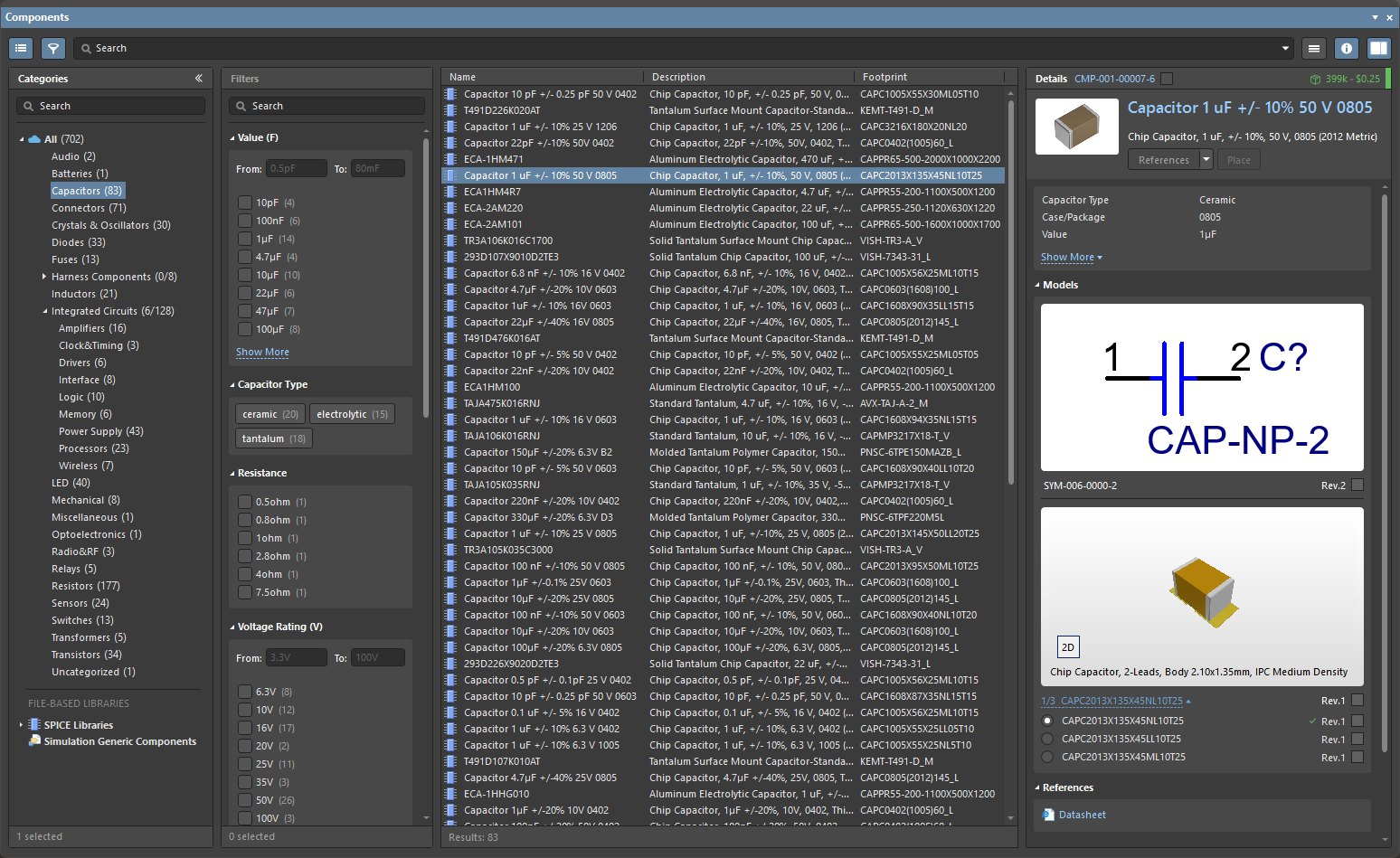
Components パネルは、Manufacturer Part Search panel に適用されている基本的な検索エンジン機能と表示を使用します。Manufacturer Part Search パネルは Altium Parts Provider サービスを活用し、コンポーネントメーカーおよびサプライヤーデータの検索に重点を置いていますが、Components パネルには 接続された Workspace、データベース、およびファイルベースのライブラリソースから、すぐに配置可能なコンポーネントが表示されます。
Components Panel へのアクセス
Components パネルを開くには、メインメニューから View » Panels » Components を選択するか、メイン画面右下の Components ボタンメニューから  オプションを選択します。レスポンシブなデザイン構成を使用している場合、パネルレイアウトは、フルスクリーンの通常モード(
 )と、Categories/Filters オプションがメニューに折りたたまれるコンパクトモード(
 )との間で動的に切り替わります。
回路図ドキュメント内では、P, P キーボードショートカットを使用して Components パネルを開きます。メインメニューの Place » Part コマンド、回路図エディターのデザインスペースを右クリックしたメニューの Place » Part コマンド、または Active Bar 上の Part ボタン( )を使用することもできます。
PCB ドキュメント内では、P, C キーボードショートカットを使用して Components パネルを開きます。メインメニューの Place » Component コマンド、PCB エディターのデザインスペースを右クリックしたメニューの Place » Component コマンド、または Active Bar 上の Component コマンド( )を使用することもできます。
現在の Altium Designer セッションで Components パネルを初めて起動した際、Workspace に接続されている場合は次のコントロールが利用できます。
-
Use Existing Components – クリックすると、パネル上部のドロップダウンで現在選択されているコンポーネントタイプを参照します。
-
Delete Existing Components – クリックすると Delete Existing Components ダイアログが開き、続いて Workspace の Data Cleanup ページが表示され、削除するコンテンツタイプを選択できます。
-
Import Library – クリックすると標準の Windows Open ダイアログが開き、ローカルまたはネットワークフォルダーに保存されたデータベースまたはファイルベースのライブラリを選択できます。ライブラリファイルを開くと、選択したライブラリを読み込んだ状態で Simple mode の Library Importer が起動します。
-
Create Component – クリックすると Create New Component dialog が開き、続いて Single Component Editing mode の Component Editor が開いて、新しいコンポーネントを定義できる状態になります。

パネルの Categories ペイン(コンパクトモードではドロップダウンメニュー)には、All カテゴリエントリー配下の利用可能なすべての Workspace コンポーネントと、利用可能なすべてのライブラリが一覧表示されます。パネルが通常モードのときは、Categories リストアイコン  または « アイコンをクリックして列表示を折りたたむ/展開し、
 ボタン(右上)を使用してコンポーネントの Details ペインの表示/非表示を切り替えます。Categories ペイン内を参照する際には、Up/Down および PgUp/PgDn のキーボードショートカットを使ってリストを順に移動できます。Left/Right のキーボードショートカットを使うと、個々のブランチを開閉できます。
Workspace コンポーネントの Categories グループ分けは、各コンポーネントに関連付けられた Component Type パラメーターに基づいています。たとえば、あるコンポーネントの Component Type が Resistor と指定されている場合、そのコンポーネントは Components パネルの Resistor カテゴリ配下に一覧表示されます(そのコンポーネントが格納されている Workspace フォルダーには関係ありません)。
Operations Menu
操作メニューのオプションでは、ファイルベースライブラリの設定、検索の実行、コンポーネントモデルコレクションを表示するかどうかの指定ができます。これらのオプションにアクセスするには、パネル右上にある操作メニューの  ボタンを選択します。
- Create Component – 選択すると Create new component ダイアログが開き、続いて Single Component Editing mode の Component Editor が開いて、新しいコンポーネントを定義できる状態になります。
- Import Library – 選択すると標準の Windows Open ダイアログが開き、ローカルまたはネットワークフォルダーに保存されたデータベースまたはファイルベースのライブラリを選択できます。ライブラリファイルを開くと、選択したライブラリを読み込んだ状態で Simple mode の Library Importer が起動します。
- Clean-up Library – 選択すると Delete Existing Components ダイアログが開き、続いて Workspace の Data Cleanup ページが表示され、削除するコンテンツタイプを選択できます。
-
Models – Categories の一覧にライブラリモデルコレクションのエントリを含める場合に選択します。この参照モードで追加表示されるエントリには、接続中の Workspace から取得された Symbol、Footprint、Simulation の各モデルコレクション、およびインストール済みの PCB フットプリントライブラリ(
*.PcbLib)が含まれます。 - File-based Libraries Preferences – 選択すると Available File-based Libraries ダイアログが開きます。このダイアログでは、データベースライブラリおよびファイルベースライブラリを現在のプロジェクトに追加または削除するためのコントロール、ライブラリのインストール、ライブラリ検索パスの指定を行えます。詳細は、Searching for Components in File-based & Database Libraries ページの Managing Available Database and File-based Libraries セクションを参照してください。
- File-based Library Search – 選択すると File-based Libraries Search ダイアログが開きます。コンポーネントがどのデータベースライブラリまたはファイルベースライブラリに含まれているかわからない場合、あるいは利用可能かどうかも不明な場合に、ここで検索できます。詳細は、Searching for Components in File-based & Database Libraries ページの Searching for Components in Database and File-based Libraries セクションを参照してください。
- Refresh – クリックするとパネルをすばやく更新します。現在選択中のコンポーネントは保持されます。
Components List
コンポーネント一覧グリッド内に表示される内容は、次の方法で管理されます。
- コンポーネント一覧の並べ替え順を設定する – 列見出しをクリックすると、その列のデータでコンポーネント一覧を並べ替えます。もう一度見出しをクリックすると、並べ替え順が逆になります。
- 表示列の順序を設定する – 列見出しをドラッグ&ドロップして新しい位置に移動します。
-
表示するパラメータ列を指定する – 列ヘッダー上で右クリックし、Select Columns を選択して Select Columns ダイアログを開きます。そこでパラメータ列の表示/非表示を切り替え、Up/Down ボタンで表示位置の順序を変更できます。

Select columns ダイアログOptions and Controls of the Select Columns Dialog
- Search - 一覧を絞り込むための文字を入力します。
-
左側の
 アイコン - クリックすると各種表示モードを切り替えます。
- (All) - クリックすると一覧内のすべての項目を表示します。
- (Blanks) - クリックすると一覧内の項目を何も表示しません。この機能でクリアされるのは Select columns ダイアログ内の項目のみであり、Components panel は対象外です。
- (Non blanks) - クリックすると、項目に対して以前どのような変更があったかに関係なく、一覧内のすべての項目を表示します。
-
(Unchecked) - クリックすると、一覧内の未チェック項目をすべて表示します。未チェック項目は
 アイコンで示されます。項目のチェックを外すには
  アイコンをクリックします。
-
(Checked) - クリックすると、一覧内のチェック済み項目をすべて表示します。チェック済み項目は アイコンで示されます。一覧内の項目に アイコンが表示されている場合は、それをクリックしてチェック済みアイコンに切り替えます。
列は、checked、blank、non blank、unchecked、check、および all の各条件でフィルタ表示できます。表示モードを選択すると、アイコンは青色
 になります。
-
右側の アイコン - クリックするとドロップダウンが開き、表示する列を選択できます。特定の列を選択すると、アイコンは青色 になります。
-
List - これは Components panel に表示可能なすべての列の一覧です。項目に が表示されている場合、その列は Components panel に表示されます。項目に が表示されている場合、その列は not 表示されませんComponents panel。各記号をクリックして表示/非表示を切り替えます。
- Up/Down - クリックすると、選択した項目を一覧内で上または下に移動します。移動できるのはチェックされている項目のみです。これにより、列が Components panel に表示される順序が決まります。
-
列データで一覧をグループ化する – 列ヘッダー上で右クリックし、Enable Columns Grouping オプションを選択してから、列見出し(例:
Footprint)を一覧上部のグループ化領域へドラッグします。一覧エントリは、指定したグループ化列の各一意パラメータ(例: フットプリントの種類)ごとにまとめられます。 -
特定の列エントリで一覧をフィルタする – 列ヘッダーの
 を選択すると、その列に含まれる一意のパラメータエントリ一覧が表示されます。そこでエントリを選択すると、指定したパラメータ(例: フットプリントタイプコード)を含むコンポーネントだけに一覧を絞り込めます。フィルタをリセットするには All オプションを選択します。(Custom) を選択すると Filter Editor ダイアログが開き、選択した列のフィルタ条件をさらに詳細に設定できます。
Displaying Columns
Components panel 内の内容は、いくつかの方法で表示できます。各列名(Name、Description、Footprint)を右クリックすると、コンポーネントの表示方法に応じて次のオプションを選択できます。

-
Best Fit – Name 列と Descriptions 列の内容を結合して、列間の余分な空間をなくし、近接して表示します。
-
Best Fit All Columns – すべての列の内容を結合して、列間の余分な空間をなくし、近接して表示します。
-
Clear Sorting – 列の並べ替えを解除するために使用します。
-
Enable Columns Grouping – 特定の列ごとに列ヘッダーをドラッグできるようにし、Name、Description、Footprint 列の順序を変更できます。
-
Select Columns – Select Columns ダイアログを開き、このセクションで表示したい他の列を選択できます。
-
Apply Column Visibility to Child Categories – 選択したカテゴリに子カテゴリがある場合、このコマンドを使用すると、親カテゴリの列表示設定を子カテゴリへ引き継げるようになります。このコマンドは子カテゴリが存在する場合にのみ使用できます。
Component Search and Functions
コンポーネントの検索
Components panel で利用可能なコンポーネントを検索するには、Search フィールドに語句を入力し、必要に応じてパネルの Categories および Filters の選択を使用して、目的に合うようにコンポーネント一覧を絞り込みます。フィルタは Workspace components に対してのみサポートされており、Manufacturer Part Search panel と同様に、Components panel は単位認識型(テキストから数値)の検索フィルタに対応しています。検索機能は、入力された検索条件に基づいて結果の優先順位を決定します。
Search 機能を使用すると、有効な Search 文字列を選択して編集したり、追加したりできます。

「アクティブ」な検索文字列をクリックすると、それが Search フィールドに入力されます。その検索は Search フィールドから再利用または編集できます。
一覧表示されたコンポーネントを右クリックして Find Similar Components を選択すると開く Find Similar Components ダイアログでは、選択したコンポーネントに基づく検索設定を定義できます。

最終的な検索結果は、選択したコンポーネントの種類が Workspace コンポーネントか非 Workspace コンポーネントか、また Workspace への接続状態によって異なります。たとえば、Workspace コンポーネントは非 Workspace コンポーネントより多くのパラメータを表示することが一般的です。選択したコンポーネントと同じ、または異なるコンポーネントやパラメータを特定して取得するには、ドロップダウンを使用して Same、Any、または Different を選択できます。
Options and Controls of the Find Similar Components Dialog
このダイアログは、選択したコンポーネントの属性を一覧表示する 3 つの主要セクションに分かれており、Component、Parameters、および Models.
属性グリッド
選択したコンポーネントの属性グリッドは、3 つの列に分かれています。
- Left Column - 選択したコンポーネントのすべての属性名を一覧表示します。
-
Center Column - 選択したコンポーネントから取得したそれらの属性値を一覧表示します。
-
Right Column - 関連する属性を類似コンポーネントの検索にどのように使用するかを指定するための、オプションのドロップダウン一覧を提供します。オプションは次のとおりです。
- Any - この属性について任意の値を持つ類似コンポーネントを検索します。
- Same - 選択したコンポーネントと同じ値がこの属性に設定されている類似コンポーネントを検索します。
- Different - 選択したコンポーネントとは異なる値がこの属性に設定されている類似コンポーネントを検索します。
追加コントロール
-
OK - クリックすると、選択した条件を保存してダイアログを閉じます。
-
Apply - クリックすると ダイアログを閉じずに検索条件をテストし、目的の結果が得られるようにします。
コンポーネントの配置
選択したコンポーネントは、ドラッグ&ドロップ、右クリックのコンテキストメニューから Place を選択、Details ペインの  ボタンを使用、必要なコンポーネントのエントリをダブルクリック、または Enter ホットキーを使用して回路図上に配置できます。
パネルからコンポーネントを配置するには、次の方法があります。
-
Component Details ペインの Place ボタンをクリックします。カーソルは自動的に回路図シートの範囲内へ移動し、コンポーネントがカーソルに追従して表示されます。位置を決めてクリックすると配置されます。コンポーネントを配置した後は、同じコンポーネントの次のインスタンスが再びカーソルに表示されます。配置モードを終了するには右クリックします。

-
コンポーネントを右クリックし、コンテキストメニューから Place を選択します。コンポーネントがカーソルに追従して表示されるので、位置を決めてクリックして配置します。パネルがデザインスペース上にフローティング表示されている場合は、回路図を見ながらコンポーネントを配置できるように、パネルがフェード表示される点に注意してください。コンポーネントを配置した後は、同じコンポーネントの次のインスタンスが再びカーソルに表示されます。配置モードを終了するには右クリックします。
-
Click, Hold&Drag – パネルのグリッド領域から回路図シートへコンポーネントをクリック&ドラッグします。このモードでは、カーソルを押したままにしておく必要があります。カーソルを離すとコンポーネントが配置されます。配置後は、別のコンポーネントや別のコマンドを自由に選択できます。
マルチパート・コンポーネントの配置
配置するコンポーネントが複数のパートを持つ場合、最初に配置されるのは、パネルの Models 領域でシンボルプレビュー画像の下に選択されているパートです。
マルチパート・コンポーネントの一部を配置した後、そのパートを選択した状態で Properties パネルの Part ドロップダウンを使用して同じコンポーネントの別パートに変更できます。また、メインメニューの Edit » Increment Part Number コマンド、またはパートを右クリックしたときのメニューにある Part Actions » Increment Part Number コマンドを使って、次に使用可能なパートへ切り替えることもできます。
 )を使用して、1 つのコンポーネントだけでマルチパート・コンポーネントを単一シンボル(すべてのサブパート)または複数シンボル(各サブパートごと)として表示できます。
 )。
)。
 )。
)。
 )。そのようなエントリをドロップダウンで選択すると、警告アイコンが表示されます(
 )。
)。
コンポーネントのフィルタリング
Workspace コンポーネントを表示しているとき、Filters ペインには、現在の検索条件と利用可能なパラメータに基づいて選択されたフィルタオプションが表示されます。一覧表示されたコンポーネントに対するパラメトリックフィルタリングにより、特定のコンポーネントやコンポーネント種別を見つけるための追加オプションが提供されます。Categories ペインの上にある  ボタンから Filters ペインを開いてください。パネルのコンパクトモードでは、 ボタンをクリックして Filters をパネル拡張としてポップアウト表示します。
フィルタは Workspace components のみでサポートされている点に注意してください。特定のパラメータフィルタを見つけるには、ペイン内の Filter Search フィールドを使用します。


パネルの Filters オプションは、特定のパラメータタイプを Favorites として選択することで、ニーズに合わせて調整できます。これにより、それらは現在のコンポーネントカテゴリのリスト上部へ移動します。パラメータフィルタ名の右側にカーソルを合わせ、 アイコンをクリックすると、そのフィルタを Favorite として設定できます。Favorite フィルタ設定は、個々のコンポーネントカテゴリごとに適用され、保存されます。

Workspace コンポーネントでは、右クリックメニューから、Component Editor を通じてコンポーネントを編集するオプション(Edit)や、コンポーネントの作成・複製、選択したコンポーネントの Part Choices や Type の編集などのコンポーネント管理機能(Operations)を利用できます。

コンポーネントの Details ペインにある追加情報オプションには、モデル画像の表示、オンラインデータシートの表示(References)、ライブ Supplier 情報(Part Choices)、その部品が Workspace プロジェクト、管理シート、および再利用ブロックでどこに使用されているかの確認(Where Used)が含まれます。さらに右クリックメニューから、選択した、またはすべてのコンポーネントパラメータデータ(技術詳細)をタブ区切り形式でコピーしたり、お気に入りとしてマークされたパラメータを 5 つのデフォルトパラメータにリセットしたりできます。

接続された Altium 365 Workspace 内のコンポーネントを参照しているとき、選択したコンポーネントの健全性に関する問題が見つかった場合は、コンポーネント パラメータ一覧の上にある Component issues 行に、 (エラー)または
  (致命的エラー)アイコンで示されます。アイコンの右側の数字は、見つかった問題の件数を示します。問題の簡単な説明を表示するには、数字の右側にある下向き矢印をクリックします。

見つかったライブラリ健全性の問題の例。
カスタム フィルタリング機能を使用すると、Components パネルでのフィルタリングをさらに絞り込めます。

この機能は次の方法で利用できます:
-
ヘッダーのフィルタ(
 )アイコンをクリックして Filter ドロップダウンを表示し、
-
そこで Filter Value(既定)を選択してフィルタリングするか、ユーザー定義の Filter Rule を設定できます。リストから値を選択すると、自動的に式に変換されます(その後編集可能です)。
-
Filter Rules を選択して独自のフィルタを定義する場合は、まず 1 つ目のドロップダウンから演算子を選択し、
-
次に 2 つ目のドロップダウンでフィルタ値を選択または入力します。
-
現在のフィルタは結果一覧の下に表示されます。
 ボタンをクリックすると Filter Editor ダイアログが開き、フィルタを編集できます。
使用箇所
Components パネルで Workspace コンポーネントを選択すると、Where Used 領域に、その最新リビジョンが現在どこで使用されているかの情報が表示されます。この領域では、次の項目に対するクイック フィルタ情報が提供されます:
-
Projects – コンポーネントが使用されている Workspace プロジェクト。情報は、プロジェクトが Workspace に保存された後に only 表示されます。
-
Managed Sheets – コンポーネントが使用されている管理対象回路図シート。
-
Reuse Blocks – 接続された Workspace のライブラリの一部として保存されている Reuse Blocks。

 )が表示されます。
コンポーネント データ キャッシュ
Components パネルを使用すると、Workspace コンポーネントのデータが Workspace からローカル マシンにキャッシュされます。これにより、Altium Designer が Workspace に接続されていない場合でも、Workspace コンポーネントへのオフライン アクセス モードが提供され、通常どおりコンポーネントの参照や配置などを行えます。
現在の Altium Designer セッションで Components パネルを初めて起動した際、オフライン モードの場合は、キャッシュされたコンポーネント データを引き続き使用するか、キャッシュをクリアするかを選択するためのコントロールとともに、パネルに警告が表示されます。
キャッシュには時間の経過とともにコンポーネント データが蓄積され、Preferences ダイアログの Data Management – Servers page にある Known Servers の下で利用できる Clear Cache オプションを使用して、いつでも(すべての Workspaces に対して)クリアできます。
Part Choices List
Workspace コンポーネントに関連付けられた Part Choices List を編集するには、エントリの右クリック メニューから Operations » Create/Edit Part Choices オプションを選択します。
続いて表示される Edit Part Choices ダイアログの  ボタンを使用して Add Part Choices ダイアログを開くと、選択したコンポーネントの
 Name パラメータに基づいて部品メーカーが自動検索されます。定義済みの検索語を解除すると、代替候補を手動で検索できます。機能的には、このダイアログは Manufacturer Part Search panel のモーダル版です。

Part Choice リストは、適切な星アイコン レベルを選択して順位付けできます。これにより、最も高く評価されたメーカーの候補が先頭に来るようにリストが自動的に並べ替えられます。

Part Choices は、回路図設計、BOM ドキュメント、出力レポートなど、コンポーネント データが適用されるあらゆる場所でコンポーネントとともに引き継がれます。

Components Panel の右クリック メニュー

パネルの右クリック ポップアップ メニューでは、次のコマンドを使用できます:
-
Place [ComponentName/FootprintName/SimulationModelName] – 現在選択されているコンポーネントまたはシミュレーション モデルをアクティブな回路図ドキュメントに配置するか、現在選択されているフットプリントをアクティブな PCB ドキュメントに配置します。
-
Find Similar Components – Find Similar Components dialog を開き、選択したコンポーネントに類似するコンポーネントを検索するための条件を設定します。
-
Navigate to [ComponentName] – 選択した Workspace コンポーネントを Explorer panel で開きます。ここでは、詳細な Item 情報へのアクセス、Item のリビジョンやライフサイクル設定の管理、使用箇所やサプライ チェーンの詳細の確認などを行えます。
-
Edit – クリックすると、選択した Workspace コンポーネントを Component Editor(Single Component Editing または Batch Component Editing モード)で編集するか、選択したドメイン モデル(シンボル、フットプリント、またはシミュレーション モデル)をそれぞれのエディタで編集します。現在のコンポーネント タイプが現在使用中のテンプレートと異なる場合は、Change component type ダイアログが開きます(
 )。このダイアログを使用して、選択したコンポーネントのコンポーネント タイプを変更します。
-
Create – 新しいコンポーネントを追加する際に、コンポーネントのタイプを選択するための Create new component ダイアログを開くにはクリックします。
-
Delete – 接続されている Workspace から選択したコンポーネントを削除するにはクリックします。
-
Operations – 以下で説明する、Workspace コンポーネント用の追加機能のドロップダウンメニューにアクセスするために使用します。
-
Submit Request – アクティブなパートリクエストのプロセス定義にアクセスするために使用します。Part Requests のプロセステーマで利用可能なアクティブなプロセス定義がない場合、Submit Request ボタンはグレー表示され、使用できません。更新するには、Workspace からサインアウトして再度サインインするか、Altium Designer を再起動する必要がある場合があります。
-
Download – 選択したコンポーネントを、圧縮されたコンパイル済み Integrated Library (
*.IntLib)、そのソースライブラリパッケージ (*.LibPkg)、およびライブラリファイルとしてダウンロードするために使用します。複数のコンポーネントエントリを選択すると、それらのコンポーネントを 1 回のセッションでダウンロードできます。 -
Make a copy – 選択したコンポーネントをコピーするにはクリックします。コンポーネントエディターが Single Component Editor モードで開きます。
-
Change Component Type – Choose component type ダイアログ (
 ) を開くために使用します。このダイアログでは、現在のコンポーネントのタイプを、一覧内の他の既存の定義済みタイプに変更できます。ダイアログには、コンポーネントタイプに関連付けられているコンポーネントテンプレートに関する情報、およびそのタイプのコンポーネントが接続先 Workspace 内のどのフォルダーで検索/保存されるかが表示されます。利用可能な Component Types の一覧を管理するには、Preferences ダイアログの Data Management – Component Types ページで
  ボタンをクリックします。
-
Change State – 選択したコンポーネントのリビジョン状態を変更するために使用します。このコマンドを使用すると、Batch state change dialog が開き、コンポーネントのリビジョン状態を変更できます。
-
Create/Edit Part Choices – Edit Part Choices ダイアログにアクセスするために使用します。ここでは、Workspace コンポーネントに関連付けられた part choices リストを作成または編集できます。
-
Full Item History – 現在選択されているコンポーネントの詳細ビューにアクセスするために使用します。このビューは、Altium Designer 内の新しいタブ付きビューとして開かれます。Item View では、特定の Item の Revision と Lifecycle の履歴を非常に詳細に確認できるほか、その Item を構成するすべての要素も表示されます。このビューには Timeline も含まれています。Timeline を使用すると、その Item の Revision レベルまたは Lifecycle State に対して行われた変更の正確な日時と、その変更を行ったユーザーを確認できます。
-
-
Refresh – パネルをすばやく更新するにはクリックします。現在のコンポーネント選択は保持されます。
Component Compare 機能
Compare 機能を使用すると、選択した 2 つのコンポーネント(パーツ)のパラメーターを比較できます。この機能には、グリッド領域で 2 つのコンポーネントを選択し、 アイコンが有効(青色)になっている状態でアクセスします。 Selected Component Details 領域がグリッド領域の右側に開きます。上部領域(下図の領域 1)には、選択したコンポーネントの画像、名前、説明、価格が並べて表示されます。関連するコンポーネントのメーカーのデータシート(利用可能な場合)を開くには、Datasheet ボタンをクリックします。コンポーネントを設計スペースに配置するには、Place ボタンをクリックします。コンポーネントは設計スペース上でフローティング状態で表示されるので、クリックして目的の位置に配置します。追加のコンポーネントを続けて配置することもでき、右クリックまたは Esc を使用して配置モードを終了し、Components パネルに戻ることもできます。
下部領域(下図の領域 2)には、コンポーネントのパラメーターが左右に並べて表示され、相違点は赤字で強調表示されるため、容易に比較できます。

Compare 機能は、Components パネルがコンパクトモードの場合でも利用できますが、動作は少し異なります。この機能には、グリッド領域で 2 つのコンポーネントを選択してアクセスします。Selected Component Details 領域がグリッド領域の下に開きます。上部領域には、コンポーネント名、価格、およびコンポーネントのパラメーター表示が示され、相違点は赤字で強調表示されるため、容易に比較できます。下部領域には、コンポーネントの Symbols と Models が左右に並べて表示されます。

コンポーネントシンボルとフットプリントの編集
特定のコンポーネントのシンボルとフットプリントは、右上の をクリックしてアクセスする Details ペインの Models セクション内で非表示にできます。非表示にすると、シンボルとフットプリントはクリック可能なリンクに置き換えられ、非表示にした項目を元の表示に戻せます。さらに、表示されるモデルのサイズを拡大・縮小する機能もあります。シンボルとフットプリントの両方について、モデル領域の下端をクリックしてドラッグすると、画像サイズを変更できます。


*.SchLib ファイルの Schematic Library (*.SchLib) を Components パネルで参照している場合、選択したコンポーネントのシンボルとフットプリントは、モデルプレビュー右下の  ボタンを使用して編集できます。

フットプリントの編集機能は、Components にアクセスしたときに利用可能であり、有効でリンク済みのフットプリントがすでに存在していることが条件です。
コンポーネント選択ダイアログ
Components パネルで使用される検索エンジンとビューは、コンポーネントを選択する他の Altium Designer アプリケーションにも適用されます。コンポーネント検索機能は、OK 確認ボタンおよび利用可能なアクションコマンドのわずかな違いとともに、これらの(モーダル)ダイアログに組み込まれています。このダイアログは通常 Component Search と呼ばれます。
- ActiveBOM ドキュメント – Components 検索ビューは、Workspace component を代替コンポーネントに変更する際に使用されます。リスト内のコンポーネント項目を右クリックし、コンテキストメニューから Change [component name] を選択すると、Replace Component ダイアログが開きます。
- Item Manager – Components 検索ビューは、現在のコンポーネントを置き換える Workspace component を手動で選択する際に使用されます。リスト内のコンポーネント項目を右クリックし、コンテキストメニューから Choose manually を選択すると、Replace Component dialog が開きます。
- Variant Management – Components 検索ビューは、代替コンポーネントのプロジェクトバリエーションを選択する際に使用されます。Alternate part を Component Variation として選択し、Edit Component Variation dialog で Choose をクリックすると、Replace Component dialog が開きます。
汎用コンポーネントへのアクセスと配置

設計の初期段階のレイアウト作業を迅速化するために、標準的で基本的な Generic Components という概念が用意されています。汎用コンポーネントを使用すると、利用可能なコンポーネントソースから特定のメーカー部品を探して選択する必要なく、設計内にすばやく配置できます。汎用コンポーネントはプレースホルダーとして使用することを目的としており、設計プロセスの後半で 適切なコンポーネントに置き換える ことが容易です。また、仮想コンポーネントまたはパラメトリックコンポーネントと見なすこともできます。
汎用コンポーネントの作成の詳細については、Creating Generic Components ページを参照してください。
Altium Designer が Workspace に接続されている 場合、利用可能な Generic Components は、Categories ペインで All オプションを選択すると表示される panel から、または panel がコンパクトモードのときは上部のドロップダウンメニューからアクセスできます。アクティブな回路図ドキュメント内に配置するためにコンポーネントをカーソルにアタッチするには、Generic Component タイル内の ボタンをクリックします。コンポーネントが回路図に配置されると、シンボルのピン、ライン、ボーダーのプリミティブ、つまり実質的にその外形が赤色で表示され、汎用コンポーネントが使用されていることを示します。Components パネルでタイル自体を選択すると、そのコンポーネントタイプのカテゴリがパネル内で開きます。

Components パネルから汎用コンポーネントを配置する
配置済みの Generic Component を選択すると、Properties panel でそのプロパティにアクセスできます。このパネルには、このタイプのコンポーネントに関連する設定とパラメーターのみが表示されます。利用可能なパラメーターは、関連する Component Template によって決まります(ここで示している例では Resistors)。パラメーター値は手動で入力することも、該当タイプの利用可能なすべてのコンポーネントから取得した値を提供するドロップダウンメニューから選択することもできます。
|
汎用コンポーネントのパラメーター指定 – ドロップダウンからパラメーター値を選択します。 汎用コンポーネントのパラメーター指定 – 結果。 |


ジャンパーコンポーネントのサポート
ジャンパー(wire link とも呼ばれます)を使用すると、配線をジャンパーコンポーネントに置き換えることができ、これは片面基板の設計を成功させるうえで重要な要素となることがよくあります。Altium Designer は、Jumper という特別なコンポーネントタイプを通じてジャンパーコンポーネントの使用をサポートしています。
ジャンパーフットプリントを PCB に直接配置して作業を始めることもできますが、推奨されるワークフローは回路図から開始する方法です。詳細については、Working with Jumper Components ページを参照してください。
 AI で翻訳